
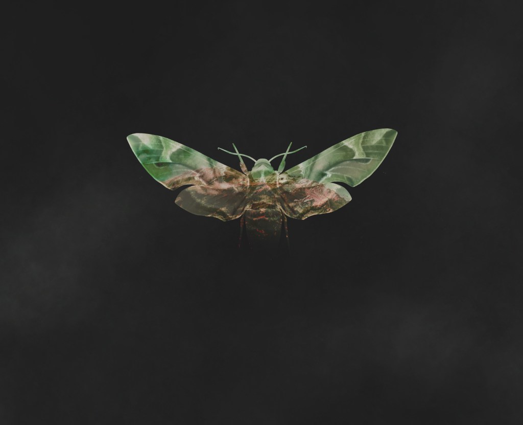
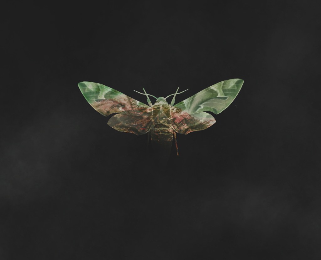
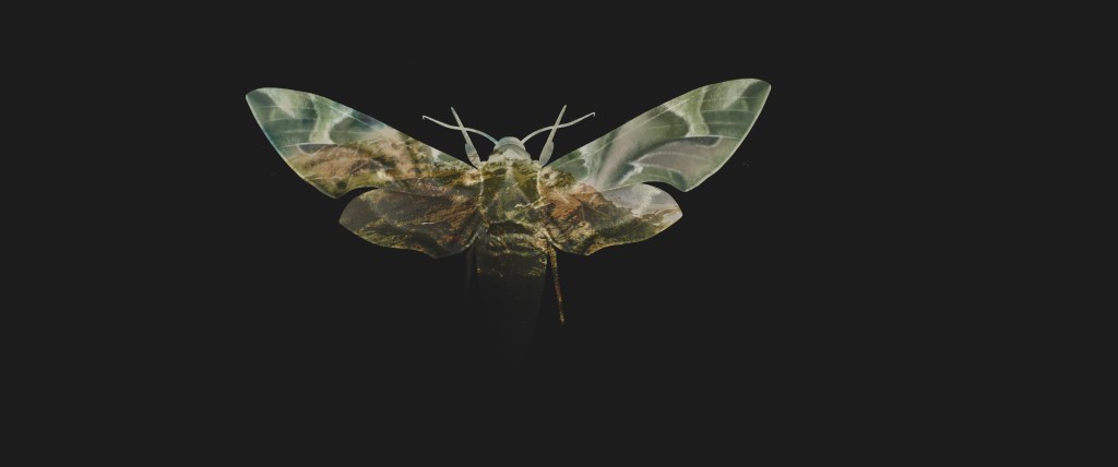
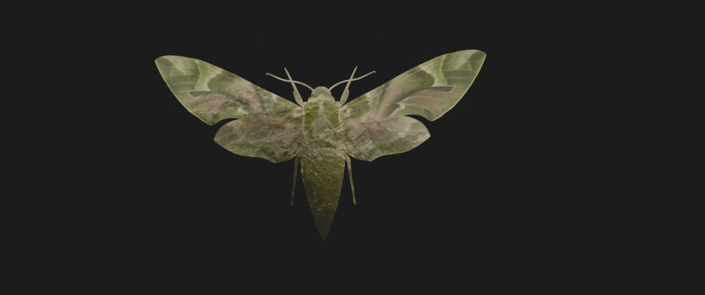
The original study of the Lime Hawk Moth has evolved into a recurring motif within my recent practice, explored through both illustration and pattern design.
Traditionally associated with darkness and marginality—often overshadowed by the more conventionally celebrated butterfly—the moth also became a central element in GDE730, where I incorporated it into the Imprint logo as a visual metaphor for transformation, creativity, and nonconformity, aiming to resonate with alternative audiences.
Symbolically, the moth evokes themes of fragility and ephemerality, which I sought to interrogate within the framework of sublime aesthetics and the broader discourse of the Anthropocene. These design outcomes experiment with scale by juxtaposing the small, delicate moth against vast, infinite landscapes, while the use of blending modes, texture, and warm tones visually alludes to environmental concerns, particularly the impact of climate change.


Visual Strategy
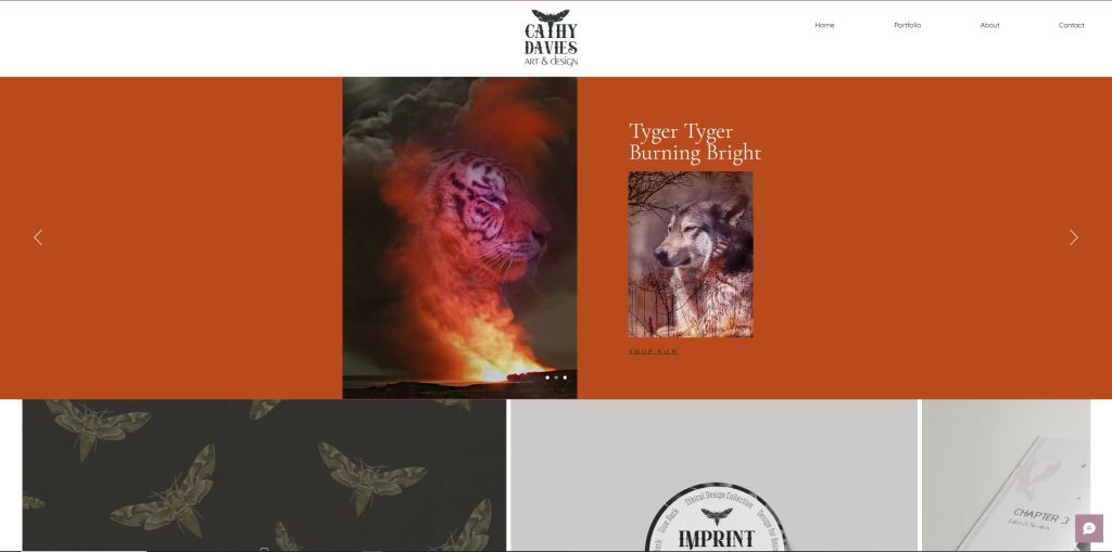
Being interested in the spiritualisation of nature in subcultures such as Druidry, witchcraft and paganism, I am deeply inspired by branding design that creates nature inspired and folkloric visual stories.
However, this visual approach may be too niche for certain categories of my target audience (e.g small start up businesses) who may respond to a less eccentric and reliable tone of voice.
Therefore, my goal for my personal brand is to evoke the awe of nature in a way that strikes a balance between ethereality and grounded mysticism, allowing for a sense of wonder that feels reflective and elemental rather than overtly esoteric or ritualistic.


Further Refinement
Initially, I intended to align my personal branding closely with the Imprint Collective, with the goal of presenting them as sister brands with a cohesive visual relationship. However, through the practical application of the initial branding—particularly on assets such as letterheads—I began to identify key distinctions between my own practice, audience, and brand tone, and those of the Imprint Collective.
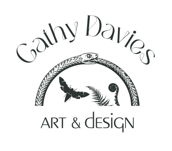
The use of a heavily weighted, ornate typeface in the single-word brand ‘Imprint’ effectively reinforces the initiative’s core values, visually signifying strength, permanence, and a commitment to boundary-pushing design. While this visual language is appropriate for the collective’s bold, conceptual positioning, it proved less effective when applied to my personal brand, Cathy Davies Art & Design.
In this context, the typeface felt overly stylised and visually dominant, competing with the illustrative elements that are central to expressing my brand personality and creative focus. As my practice requires versatility—appealing both to professional clients and direct art buyers—I concluded that a more understated, trustworthy tone of voice was needed. This approach allows the artwork and illustration to take visual precedence, ensuring the brand identity supports rather than overwhelms the creative output.


Experimentation with Web Design Tool and Processes:
Figma:

Wix:
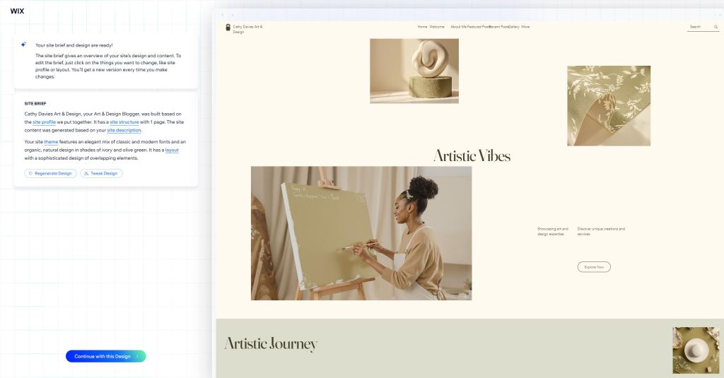
Having experimented with Wix’s drag-and-drop web development tools, I also explored its AI web design feature to assess its potential for creating a personalised site.
After several iterations, I ultimately chose to design the website from scratch in order to achieve a more professional finish and ensure a closer alignment with the specific visual language of my branding.
This process was valuable during the brand development stage, as it allowed me to critically assess how key design decisions would translate into a digital context and helped refine the coherence of the brand across platforms.

Experimental Wix Web Design:
Although I found experimenting with Wix’s drag-and-drop web design extremely useful for learning more about web features and interactive functionalities, I became preoccupied with the animation features and felt the need to return to the basics in order to focus more on web strategy and page structure. Therefore, I decided to build the wireframes in Adobe Illustrator, with the intention of developing them later in WordPress or Wix.


Adobe Web Design:

