- McCandless, David (2008), Information is Beautiful Links to an external site., (New York: HarperCollins).

- Cheng, Joanne (2014, updated 2015) ‘Analyzing Minard’s Visualization Of Napoleon’s 1812 March Links to an external site.’, [online], Thoughtbot, 8 June, (Accessed: 7th December 2018)
WRITE UP NOTES
- Interaction Design Foundation (2016) Information Visualization – A Brief Pre-20th Century History Links to an external site., [online], (Accessed: 7th December 2018)
- Information visualization is a primitive and ancient process evidenced as early as 200 BC: record finances, mapping and surveying.
- 17th century: measurements and theories: rise in mathematics and physics caused introduction of formal geometric systems used to plot information visually.
- Galileo – visualization of theoretic models
- “It might be said that the 17th century in information visualisation was the century which gave birth to “visual thinking” in a range of disciplines.
- Felton, Nicholas (2015) Transforming data into meaningful stories | The Conference 2015 Links to an external site., [online], 14 January, (Accessed: 7th December 2018)
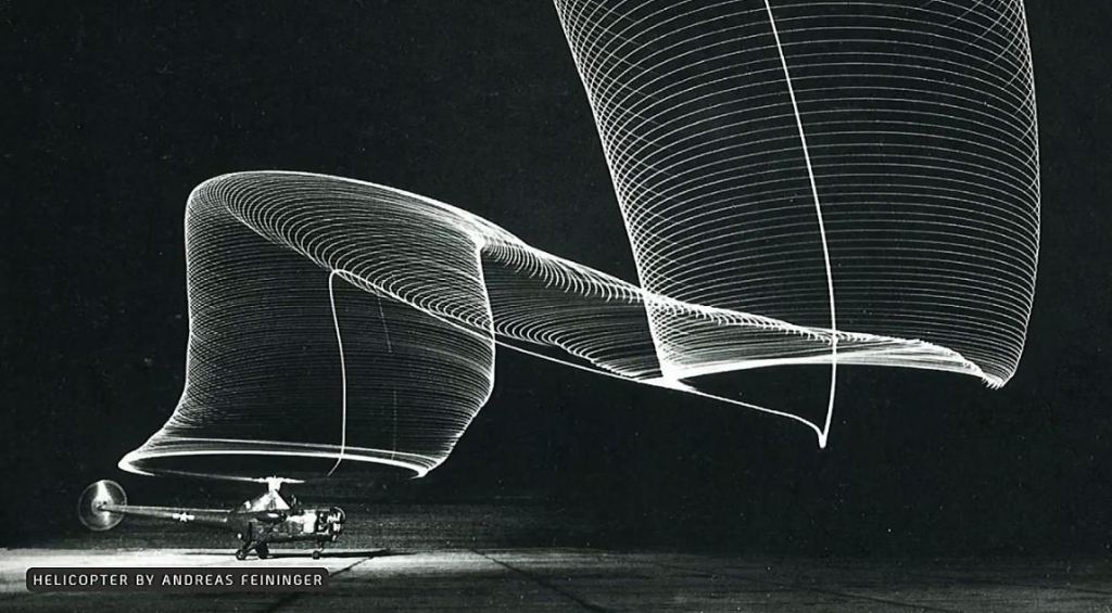
Fenton’s perspective was extremely valuable to my practice which is largely inspired by my previous experience in fine art. The concept of photo vis blends creative disciplines, enabling data to be represented in more artistically expressive and technologically innovative ways. In some cases, the final artefact becomes an interesting piece of visual poetry itself, communicating data in more visceral and instinctively intelligible ways.
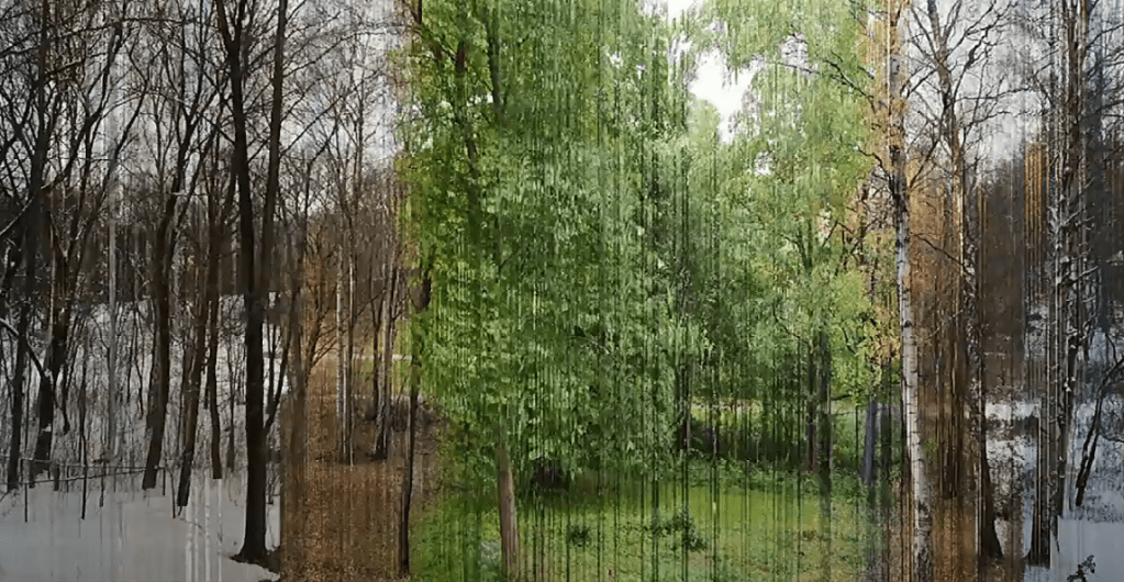
For example, fig 3 combines lighting and long exposure to reveal the flight path of a helicopter. Fig 4 uses collage/ mosaic to represent a particular landscape at different points in time. Felton’s cross disciplinary approach to data visualisation, informed by specialist photographic techniques highlights the artistic capabilities for data to be explored as a creative medium through which to revealing complex data stories.
He best expresses this by describing data as the ‘new wood’. In contrast to the idea of data as the ‘new oil’, Fenton proposes a more innovative approach, arguing that data is a ‘creative material to be embraced, rather than thinking it as an oil [which is] something to be exploited, it is something we can make beautiful objects from’.
- Information is Beautiful (2018) Information is BeautifulLinks to an external site., [online], (Accessed 10th December 2018)
‘We examined data on intelligence, longevity, genetic ailments and other markers to create a “data-score” and then plotted it against public popularity of various breeds, according to the American Kennel Club.’

Morton, Timothy (2013), ‘Chapter 1: What Are Hyperobjects? and Chapter 2: The Time of Hyperobjects’ in Hyperobjects: Philosophy and Ecology after the End of the World Links to an external site., (Minneapolis: University of Minnesota Press).
- McCandless, David (2010) The beauty of data visualization Links to an external site., [online] July, (Accessed: 7th December 2018)
McCandless’s approach to data visualisation explores the relationship between the ‘two languages of the mind’ (data and the visual) and their ability to speak together to create new meanings.
His works emphasis on the ability of data visualisation to alter perspectives is emphasised in his analogy of data as ‘soil’, a fertile creative medium through which flowers can effortlessly bloom and be made visible to the viewer. Patterns and connections can then be articulated in the form of a data ‘landscape that you can explore with your eyes’, creating trust and transparency in a world overwhelmed by visual saturation and scepticism. This challenges the idea that ‘data is the new oil’, upon which systems run, making a poignant argument that data, like oil can be exploited. This highlights the ethical consideration of data visualisation in a contemporary context. McCandless’s work however, exemplifies an authentic approach to the discovery of knowledge and understanding through the experimental processes of data visualisation.
“ I went for subjects that sprang from my own curiosity and ignorance, I avoided straightforward facts and dry statistics. Instead I focused on the relationships between facts, the context, the connections that make information meaningful.”
In addition to McCandless’s work, the ‘Information is Beautiful website offers insight into experimental data visualisation approaches by other designers (see fig. 5-7). Interactive works such as ‘The Four Seasons’ and the ‘Snake Oil app’ act as a living, responsive images which demonstrate McCandless’s progressive attitude towards data as being ‘alive’.
Lecture
This week’s lecture broadened my understanding of data visualisation, examining its primitive function to record and communicate stories and knowledge, as well as influential factors including culture, language, and technology. Artefacts from early civilisations such as cave paintings and Christological narrative artwork and architecture, demonstrate the critical role of visual communication to connect with illiterate audiences. For instance, cave paintings include universally interpretable pictorial depictions which detail the lives of prehistoric tribes and their relationships with animal species, tools and local materials. This instinctual approach to data representation manifests in contemporary design of international iconography used to accommodate a global audience.
Christological artwork similarly used figurative representation to depict stories, such as the events of the crucifixion and the theological dimensions of eternal life (heaven, purgatory and hell). Scale, materiality and architectural practices enabled the creation of new layers of meaning and emotive responses of awe and transcendence to inspire spiritual alignment and social conformity.
In addition to its storytelling functionalities, the expressive characteristics of historical narrative art enable the creation profound emotional responses of the sublime, awe and terror which influence to moral sensibility of the viewer. Considering this week’s emphasis on data visualisation ethics and the potentiality of new meanings to be discovered and told through data, I find the balance between visual descriptiveness and subjective expression interesting in the context of art history.
- Information and infogration – using visuual techniques to express complex ideas
- Visualisations act as a campfire around which we gather and tell stories – Antoine de Saint-Exupry
- International imagery – cave paintings – sharing knowledge and stories – instinctual interpretations – culture of ancient ancestry – early civilisations —illiterate audiences — awe inspiring scale – Christological imagery – grandeur – transcendence – ancient narrative arrt in –series of frames – manuscripts, stain glass windows, tryptichs
- hyroglyphics – logogram system – written / pictori
- al system to rep a whole word — emojio
- colonisation and globalisation – shared similarities and information and semiotics – road signage – serve a purpose to inform and keep people safe – information in a 3d sapce –
- “A designer knows he/she has achieved perfection not when there is nothing left to add, but when there is nothing left to take away” – Antoine de Saint-Exupry
- Harry Beck – London Underground Map – 1931 – diagram rather than map – bringing experience in electric draftmanship to GD
- john snow – analysis of data in real time – cholera
- ikea cook book
- power of icoagrams — With so data to consume now, it is a very important time for information design. We are
saturated with exaggerated facts or fake news – statistics and break downs of complex
information are essential to the general public. - monacle
- form and function
- technology – animation where data meets design
- colour size orientation – visual ques that the human brain processes within 250 miliseconds
- correlation, quantity, trends
- processes, hierarchy, chronology, anatomy
- Forensic architecture – humanitarian disasters
- klana pay – real time data – never the same
- generative design – technology and data visualisation – charming and exciting that you cant always predict what data will look like
- generative art
https://forensic-architecture.org/programme/exhibitions
webinar:
- Marginalised unseen voices
- age of visual saturation – boredom/ apathy
- speculative approaches
- story telling as data – turning words/ feelings into visuals – act of collecting data, research methodology – opportunity to seek hidden local stories
- hyperobjects – denial of factual data
- birth of the steam engine – precipitated the industrial age
- discourse around
- rebranding of fabrication
- climate change – denial
- appropriate level of shock and anxiety concerning a specific ecological trauma, indeed the eco trauma of our age, the very thing that defines the anthropecen as such.
- data visualisation and senses – what we cant see becomes more poewersful
- images no longer have the emotonal grip they used to in
- sound ancient swamp site on urban african village
- speculative approaches for alternative or experimental data representation
- the smell of data – instinctive altert
- erasure – absence of images
- Case study: consumer society – impact on environmen
Further Research:


https://www.tableau.com/en-gb/learn/articles/data-visualization
The Challenge
This week we want you to analyse one of the pre-selected examples Download pre-selected examplesof information design to determine its effectiveness. Consider clarity, communication, message and the role of design in communicating the message to you. Be critical and write a synopsis about its effectiveness, which we want you to present as a piece for editorial design.
- Open the PDF in Acrobat, as it contains hyperlinks and an interactive video.
- Select one of the five examples of information design provided.
- Analyse its effectiveness, the story revealed and the role both design theory and practice took in producing the work.
- Write a 500-word synopsis of your analysis in your research journal and include visual references and highlights of the piece examined.
- Create a piece of editorial design to portray your final synopsis and visual references.
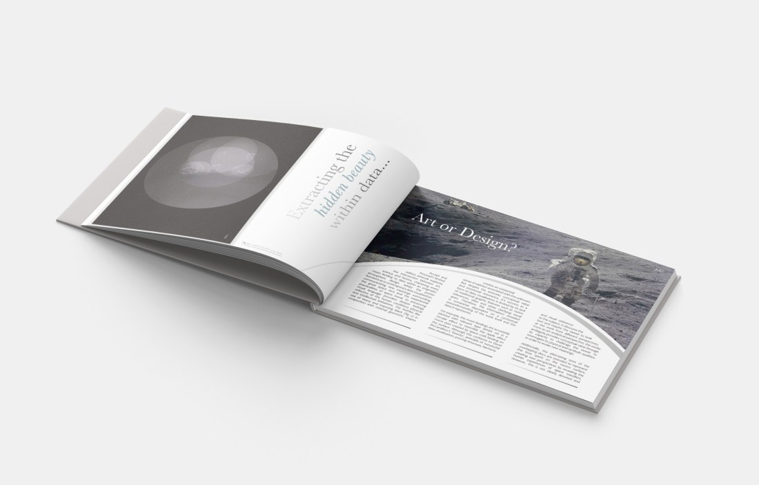
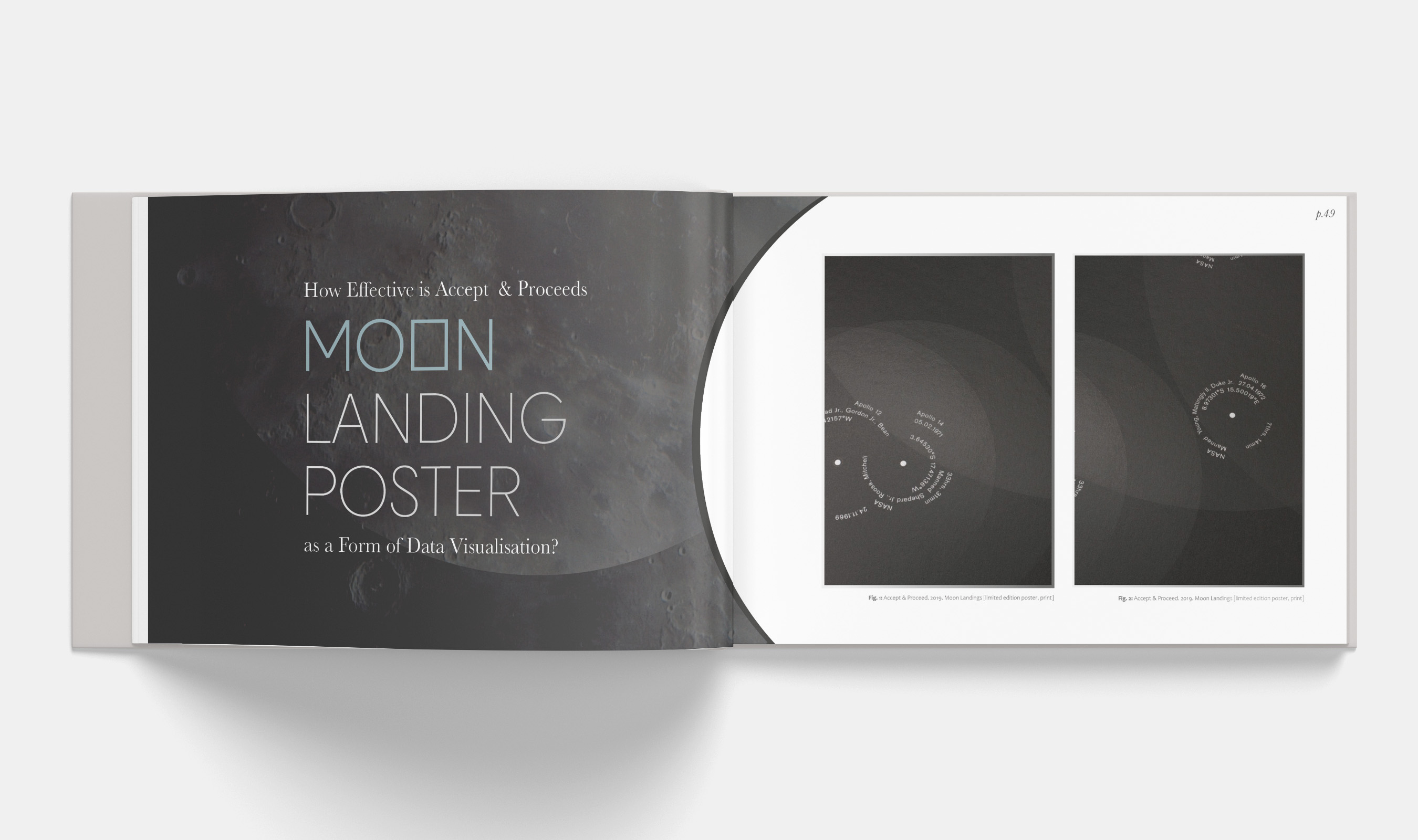
How Effective is Accept & Proceeds Moon Landing Poster as a form of Data Visualisation?
Accept and Proceed’s limited edition artwork explores the intersection between art, science and history, chartering every moon landing to date within an enigmatic atmospheric design. Whilst the poster functions as a contemporary data visualisation, communicating new meanings surrounding the great space race and the experiential practicalities of space travel, its entrancing visual language provokes deeper feelings reflective of the human condition and the boundaries of knowledge. The Rothko like use of heavy and imposing black (fig 2) in conjunction with minimal geometric shapes creates an existential sense of void, the unknown and oblivion and associated with death and before birth.
But despite the artworks conceptual value and emotional resonance, it’s success as a form of data visualisation is limited by its lack of traditional graphic features such as metric references, titles and other clarifying visual ques. Therefore, the information revealed is somewhat dependent on a contextual preunderstanding of the work itself and the data it represents.
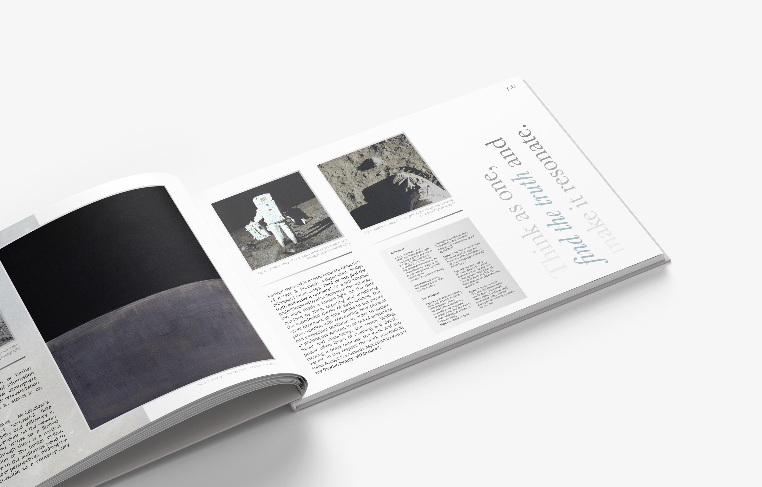
For example, the moon landings are accurately plotted with relevant type details set in a circular effect to resemble the ripple effect moon dust created by space craft landing on the surface. Although this conforms to David McCandless’s ‘beauty’, principle of successful data visualisation, proving structure, harmony and visual reference to the subject, it obscures the text and require the viewer to look at the work from different perspectives.
From an analytical perspective, this provides conceptual value to the piece’s primary role as an art work rather than an information graphic as the additional layers of ambiguity and visual metaphor challenges the viewer engage more intensely with the works physical, intellectual and symbolic content in order to evoke new meanings.
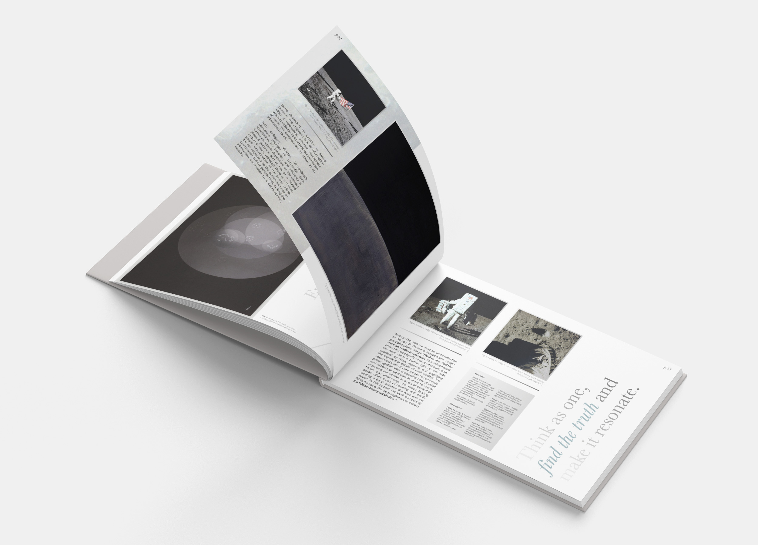
Additionally, the alternating sizes of the overlapping discs are intended to represent the time spent on the moons surface, creating new perspectives by revealing the human experiences of space travellers. However, this is not clearly denoted and seems dependent on intuition or further research. The enigmatic lack of information offers a minimalistic, ethereal atmosphere which contributes to its artistic representation of space, yet compromises its status as an information graphic.
Such ambiguity violates McCandless’s usefulness principle of successful data visualisation. It’s useability and efficiency is further exclusively dependent on the viewers physical presence and access to a limited edition artefact. Although there is a motion graphic interpretation of the poster online, it is not responsive to the audiences need to pause or look closer or from different perspectives, making the information inaccessible to a contemporary majority.
Perhaps the work is a more accurate reflection of Accept & Proceeds independent design principles (ref): ‘Think as one, find the truth and make it resonate’. As a self-initiated project inspired by a fascination of the universe, the work sheds a human light on the data provided by Nasa, exposing and amplifying the experiential details of each landing. The visual treatment of data speaks to our innate preoccupation with conquering new physical and intellectual territories in order to secure or prolong our survival. In an era of existential threat and uncertainty, the moon landing poster offers layers of meaning and depth, creating a bond between the work and the viewer. In this respect the work successfully fulfils Accept & Proceeds aspiration to extract the ‘hidden beauty within data”.
