Reforming and projecting a new future in a type design
I don’t expect using 33% less ink to save the word directly, but I expect it to be one step in a bigger conversation about how we can save things. I expect it to be one gesture that triggers you to think about what else you can do to make an impact.
Dan Rhatigan
Grey London (2014) Dan Rhatigan on Ryman Eco Links to an external site.[online] 20 August, (Accessed: 24th November 2022)
- personality – readability – secret sauce
- marraige of functionality of beauty
- Ryman Eco – ink saving font — save plastic packaging – minimise surface area of every letter – producing illusion of fully formed letter
- Alphabetic poster project – 26 typographers, designers and illustrators were invited to take individual letters from the Ryman Eco type face and create an artwork which celebrates it’s connections with sustainabiltiy —tp get creative communiries to get imaginative with the possibiliets of the typeface.
‘Be considerate’
BY RICHARD HOGG
Richard Hogg is an artist, illustrator and graphic designer. In addition to traditional print media he also makes video games and was responsible for the recent playstation game Hohokum.
“Here you see a brown letter B wearing brogues and bowing to a beetle; thereby expressing a deep and earnest respect for nature. Whether the beetle appreciates this gesture is unknown. He endures it with a dignity and stoicism typical of his species. He is a Japanese rhinoceros beetle, or kabutomushi.”

‘Germinate’
BY STEVE DAVIES
Steve Davies is an award winning Design Director who has worked for some of the UK’s most respected creative agencies and collaborated with some of the world’s most iconic brands.
“The lowercase ‘g’ is I think one of the most attractive letter forms in the Ryman Eco font set. I wanted to convey the fact that the font was cultivated for a specific purpose. That being – to create a sustainable typeface that was beautiful enough that people would actually want to use it. Traditionally products that are designed to be eco friendly often compromise on aesthetic or function. With Ryman Eco I think Monotype have achieved a near perfect hybrid of sexiness and sustainability. The font is still in its infancy so a germinating ‘g’ seemed to capture the stage of its lifecycle.”

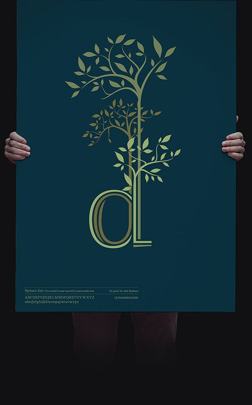
‘Do good’
BY ASH REYKSEN
Ash Reyksen is an independent London based conceptual designer / illustrator working in print, film and digital media.
“The ascenders of lower case ‘d’ reminded me of saplings. Young trees at the beginning of life. The Ryman Eco font is designed to use less ink and so lessen the impact on the environment. There seemed something really powerful about telling this story via the letter form itself. I chose a natural colour palette to reinforce the environmental aspect of the font.”
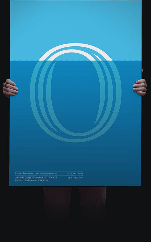
‘Iceberg’
BY RYAN CONNOLLY
Ryan is a Design Partner at Stellar, a London-based, media neutral boutique creative agency.
“A lowercase ‘O’ becomes a semi-submerged iceberg. Fat fonts take up ink, Ryman Eco reduces ink, thus decreasing print cartridge production. In turn this slows the effects of global warming, subsequently saving the poles from melting and people from drowning.”
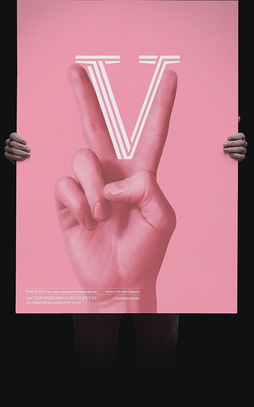
‘Victory’
BY CHRIS CHAPMAN
Chris is an award-winning designer from New Zealand, now based in London. He leads a team of Integrated Designers at ad agency Grey London and is co-owner of Glasshouse Salon.
“The brief was two words: Beautifully Sustainable. The beautiful part was easy — I just had to make my letter, V, nice and big. It is an unusual font to work with in that it was designed to look good printed small. The vast majority of printed words are not much larger than 12pt so this makes sense. But the unique grooves that have been dug out of the characters to make them inky-nomical[TM] mean that what prints out small like a nice regular serif font looks interesting at larger sizes. Communicating the fonts sustainability credentials was more challenging given the nature of the overall poster project — a very similar brief was being given to 25 other designers — I wanted to avoid the usual environmental tropes as far as possible. So I tried to take a slightly different angle: let’s make Ryman Eco a part of popular culture — a pink peace sign is a very pop art symbol to me — and once it’s popular we are that little bit closer to making peace with our environment, in terms of ink and in terms of all the other little things this project might remind people of.”
Typo Labs (2017) Dan Rhatigan | Variable Fonts: Progress Report Links to an external site., [online] 6 April, (Accessed: 7th December 2018)

https://www.axis-praxis.org/specimens/DEFAULT
- Variable Fonts: Easier to load in web development and are adaptable when rendereing and being viewed on various screen sizes. Doesn’t need to load various fonts
- https://www.axis-praxis.org/specimens/DEFAULT
- should controls be allowed to be tailored specifically to fonts themsleves – exciting to explore possibilities
- beyond the boundaries of styable static fonts when they can be used like software with respomsive benefits
99% Invisible (2017) Mexico 68 Links to an external site., [podcast] 27 June, (Accessed: 7th December 2018)
Creative Review (2018) The CR podcast episode 14: Making, changing and documenting places Links to an external site., [podcast] 1 November, (Accessed: 7th December 2018)
Lecture:
Colophon Foundry
- olophon Foundry to discuss the logistical and creative complications when designing a typeface for the Welsh Government;
- Examine how contemporary design practice has engaged with provenancial and historical issues when portraying national and global identity;
- Identify a link between historical reference and cultural development, in contrast to more strategic alignment to a design’s positioning;
- Identify case studies of modern type design that relate to place and location.
- Anthony Sherat Director
- Ed Harrington – Director – Head of Production
- Working within the
- Cultural differences – language – tone of voice aesthetics – typography
- big brand and self releases
- responding to particular client problems – how type is utilised in particular businesses
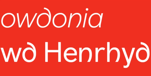
- national identity – language and typography – brief to create contempory clean sanse serif — respect for medievil gaelic, celtic heritage. curled harp shape – recontextualised
- diagraph characters
- kink in stems of letterforms
- demonstrating how
- appropriate research into provincial and historical issues are imperative to the success of a
- project that portrays national identity.
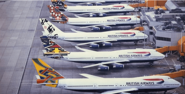
However, by 1997 the Landor identity was replaced, as its overtly national visual language
was perceived to be too British and projected an image of being too conservative, oldfashioned, stuffy and staid.
Newell & Sorrell was commissioned to create a new identity with the aim of positioning the
airline in a global, but more customer-centric, marketplace in which the airline was
competing.
Newell & Sorrell developed a less formal identity, which was accompanied by development
of the warmer, more human, ‘Mylius’ typeface, created by MonoType.
Slide 13:
This new logo upgade was a logical progression, but it was Newell & Sorrell’s suggestion to
replace the consistent tailfin graphics with 50 original artworks, which were commissioned
to reflect Britain’s multicultural society.
The new ‘World Image’ airplane tail fin designs were created by artists from all around the
world, to represent countries served by British Airways from the UK to Australia, via the rest
of Europe, Africa, Asia and the Americas.
The idea of a range of different tailfin designs was incredibly daring for the time. Today it’s
become commonplace for companies to apply differentiated versions of a corporate
identity across the business, tied together with some underlying design consistency.
Slide 14:
As Campaign magazine noted at the time, Newell and Sorrell’s approach was “one of the
most daring implementations of a new corporate identity. The company risks tabloid
ridicule and the antagonism of customers who disapprove of, or are confused by, the
brightly coloured images which seem far from the airline’s establishment roots.”
Sadly, this was to be the case as the British tabloid press ran articles accusing the company
of being a traitor to the British identity.
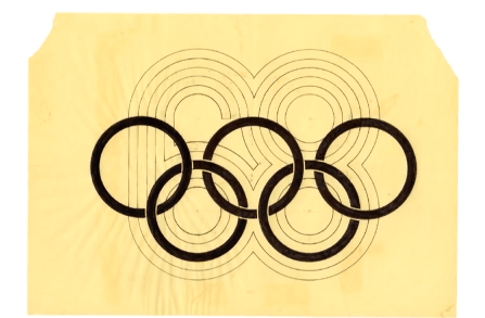
Lance Wyman, who created the
groundbreaking logo for the Mexico 68 Olympics, possibly one of the most influential
logotypes and signage systems ever developed.
The video is a segment of a longer talk, given by Lance, at the Walker Art Center in 2014.
During this section of the video, he outlines the design development, its relationship to
location, and how the logo design created a link between historical reference and cultural
development.
folk art – non steriotyped – seeing the unseen. parrallel lines – precolumbian – we


Further Research
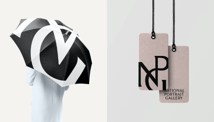
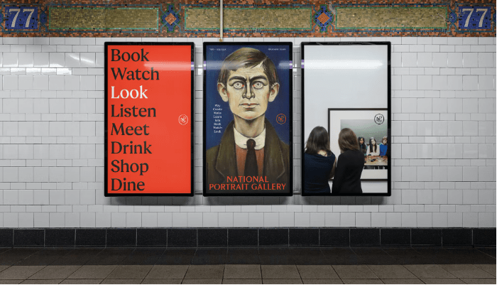
The National Portrait Gallery: Brand Facelift
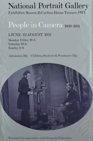
- Opening the gallery up to new audieces – timeless and contemporary – grade 1 listed building and contemporary collection – diversity — architectural transform based on reimagination — rich heritage and collection – more relevent – modern context – Ty
- sketch by Gallerys first Directors authentic and distinctive asset rooted in the galleries origins – potential to be reimagined and adapted to the needs of a 21st century brand.
- Worked with Type Foumdary Monotype to create a bespoke logo and typeface, influenced by historic typographic features found in and around the gallery
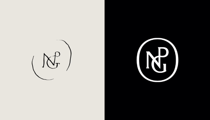
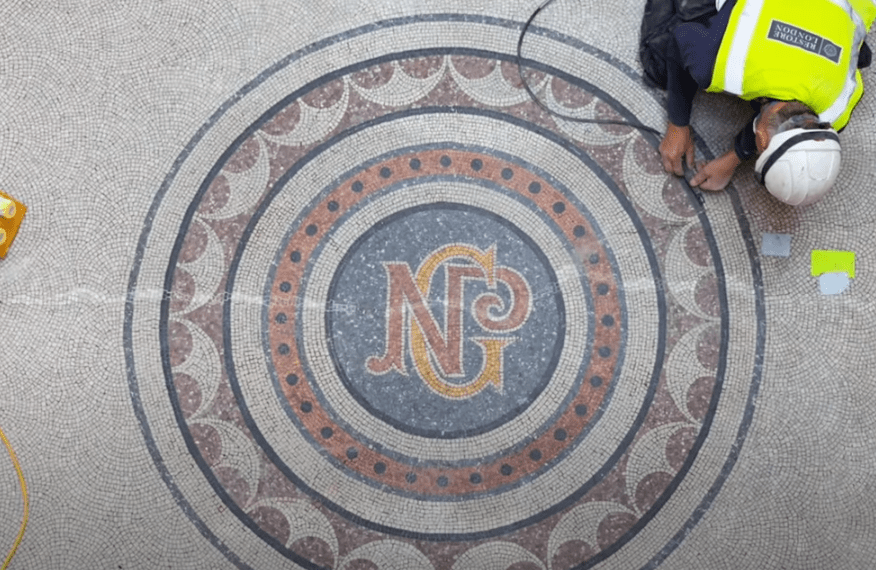
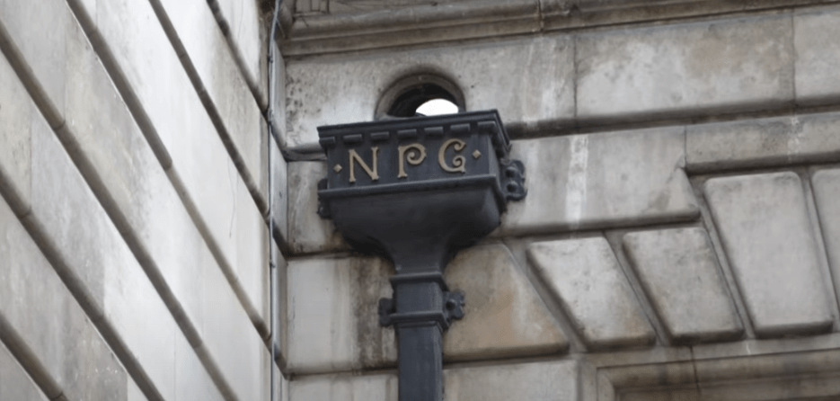
- A new symbol for the gallery has been created which is based on an original sketch by its first director, Sir George Scharf, who entwined and encircled ‘NPG’ in a workbook, dated 1893. Discovered in the archive, this sketch has been transformed by the illustrator and typographer, Peter Horridge, known for his logos and crests for everyone from the Royal Household and King Charles III to Liverpool Football Club.
- The new logo joins other uses of the initials NPG throughout the gallery’s building, within the metalwork of railings, embossed onto furniture, and as part of original mosaics.
- Design considerations – flexibility to to be used with a vast range of unique artwork, being modest enough to enable the artworks to be the main feature represeted — avoid covering faces and other features and can be flexible enogh to exist in the physical and digistal space required in a 21st century markegting environment. Values of connecting peopl – a gallery of people for people, requiring a brand identity which to be extended to other features of the gallery such as the cafe, shop and web in order to be inclusive and welcoming o the general public.
Loughborough University Rebrand Controversy
https://www.change.org/p/loughborough-university-revoke-2015-rebrand
https://thetab.com/uk/loughborough/2015/04/24/loughboroughs-new-logo-causes-outrage-13625
webinar – illustrative type
- print outs – manupulate physically and rescan as far as it can go
- unusual textures
- craig ward – bacteria – representing location –
- unconventional organic ways of creating letterforms
- rust – brick – smoke – coal
- play with legibility
- step away from the computer
- chris briggs wabi sabi
- introducing chance
- free form painted shapes – looseness – free of structure and format
- braulio amado: free form painted shapes – looseness – free of structure and forma
- non format – thriving by accident – manipulating existing type – leaves – deleting parts of the letterforms to make them abstract
- distorting type forms – overlating textures in black and white and deleting
- kinetic type


The Challenge
This week we want you to use your visual research into letterforms from Week 1 to create a new and unique piece of illustrative typography. Do not forget to document your visual developments, and be experimental with form and legibility to create something entirely new.
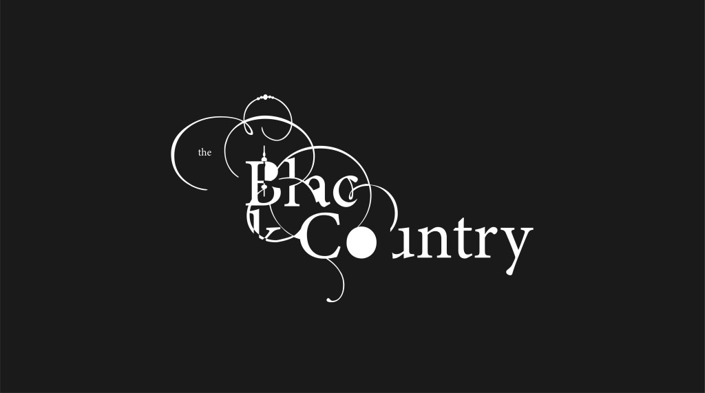
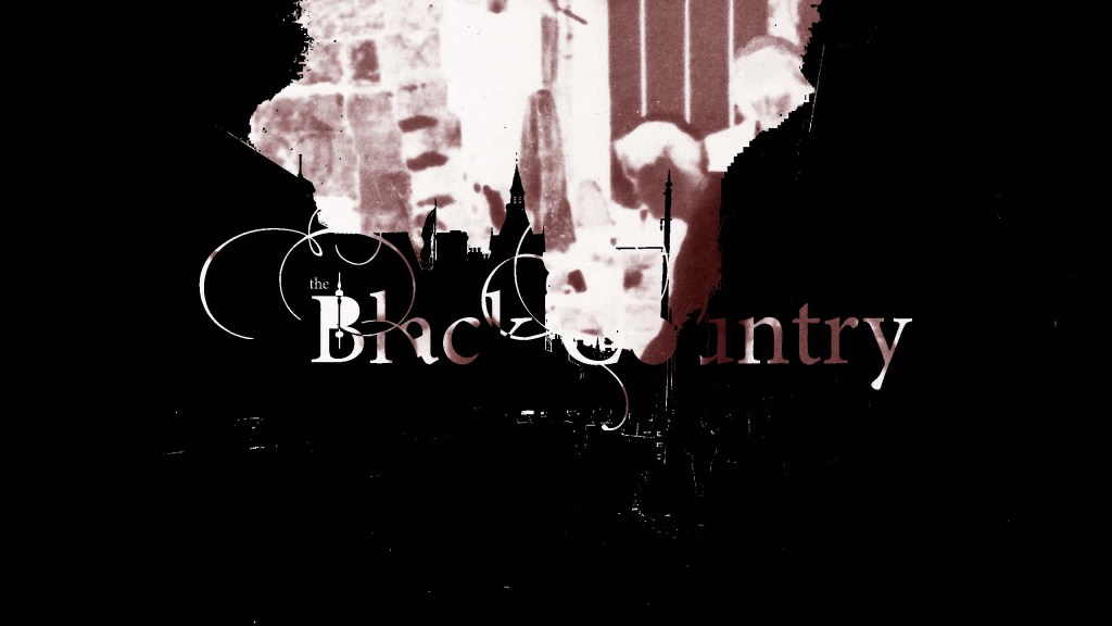
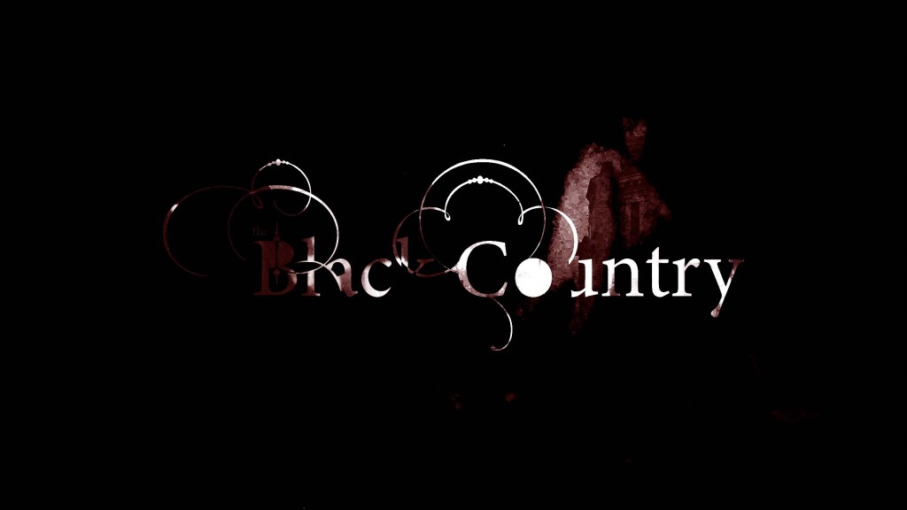
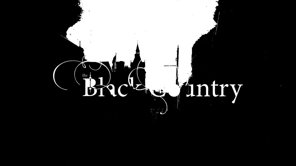
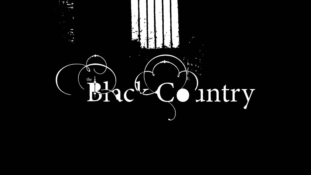
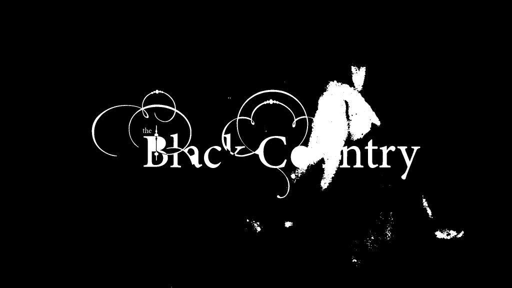
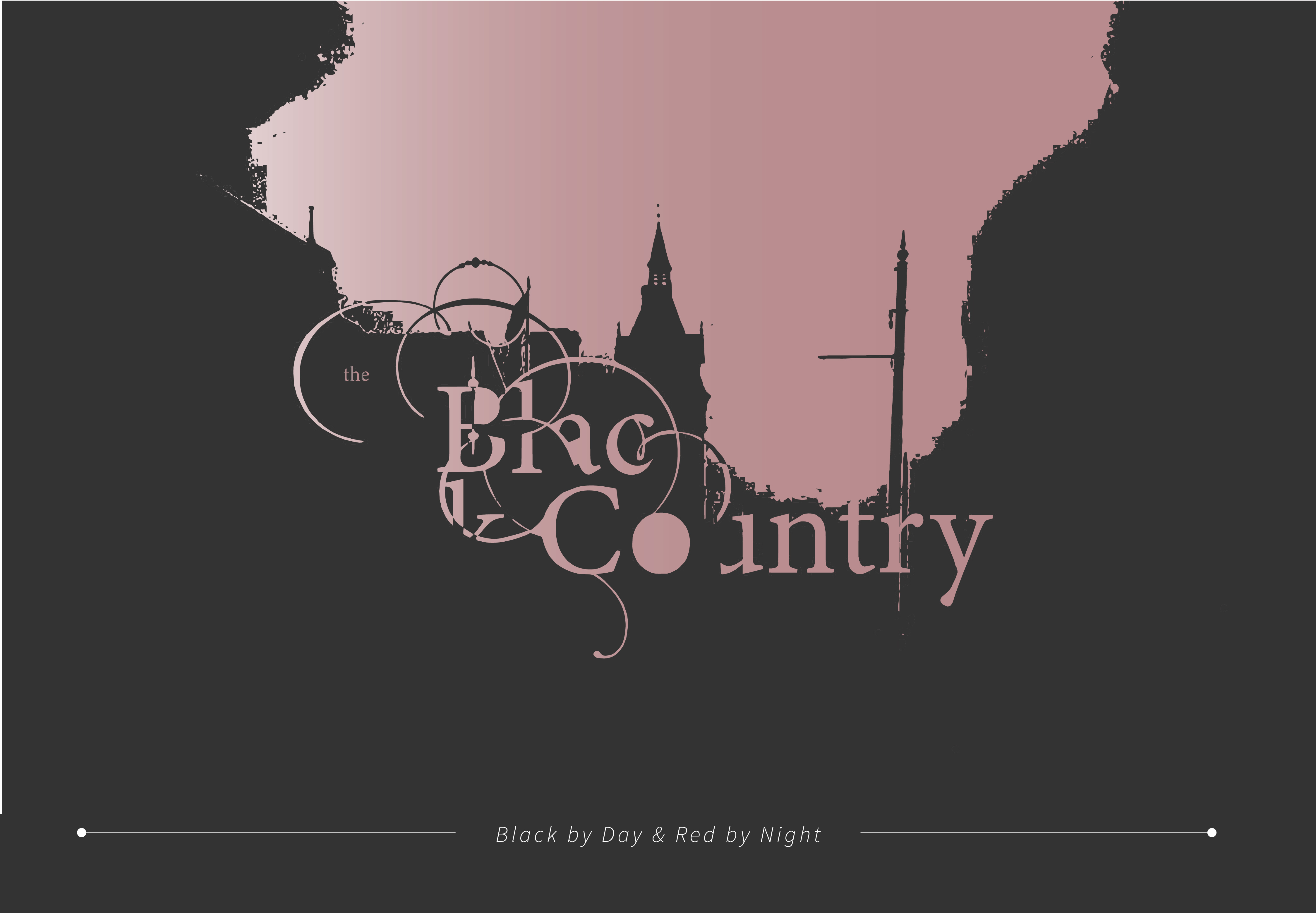
Use the DNA of your initial visual research from Week 1 to create a new and unique piece of typography that spells out the name of your town or city.
Your new title lettering should reflect the identity of your town or city.
Consider the interplay between provenance and historical story, in contrast to more strategic alignment to a design’s positioning.


https://www.expressandstar.com/news/2018/11/15/new-jewel-coloured-wolf-unveiled
