Click to access Complete%20Mem%20Index%20Part%202pp.pdf
BRICK Making
Lockdown Learning: Black Country Bricks
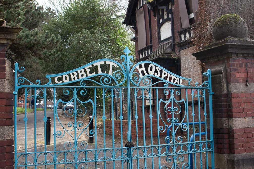
https://www.expressandstar.com/news/2012/12/21/delight-as-corbett-hospital-site-gates-renovated/
https://www.dorothearestorations.com/case-studies/corbett-hospital-gates
Resource Material Critical Reflection:
Baines, Phil (2003) Signs, Lettering and Environment
Baines (2003) examines the social function of signage systems and how the visual texture of a specific location can be influenced by an ongoing tension between utility vs personality. As the overarching theme in his book, he dissects the specialist design requirements and functionalities of site-specific signage and their role in sculpting urban environments.
Wayfinding for example in the globalised context of cities and major roads requires neutrality and legibility and is dependent on variables including the readers distance, speed of travel and ability to process certain amounts of information at high speeds, and the interpretation of pictorial and abstract iconography.
Baines’ informative categorisations of typography enabled me to examine the multitude of ways in which type functionalities can influence the experiential nature of particular environments. For example, urban landscapes in particular rely heavily on informatory and regulatory visual communication in order to maintain order and prohibit unwanted behaviour.
Despite a growing requirement for uniformity, standardisation and potential universality of international wayfinding systems, Baines highlights that signage is an important vehicle to assert cultural identity through historical resonance of certain materials, production methods and typographic styles. This encouraged me to examine the relationships between standardised and site-specific signage and question how typography carry political resonance and communicate the ideologies of my locales.
Baine’s also encouraged me to look more closely at smaller details, particularly in the form of recording in order to examine how unnoticed, subtle artefacts can communicate an areas history and context in unique ways.
Hustwit, Gary (2015) ‘A Rare Interview with Graphic Design Legend Massimo Vignelli
“The life of a designer is a life of fight against the ugliness. Just light a doctor fights against disease”.
Massimo Vignelli
Vignelli offers of an extremely functional perspective towards typography’s social role and its requirements for complex, specialist consideration in the context of urban navigation and way finding. For example, he reflects on how his design for the New York Subway system could be even more abstracted and minimal like Breck’s London Underground map which is non literal and offers “no suggestion of geography whatsoever”.
This gave me a deeper appreciation of types significance in aiding our navigation of the urban environment, and moreover how design practice has evolved to support an increasingly complex human civilisation. Vignelli subsequently argues that the technological advances which have democratized typographic tools and processes have lead to an era of “visual pollution” whereby the boundaries and conventions of typographic forms are being exploited in order for businesses to compete for the consumers attention in a post-industrial mass consumer. He also analogises the task of contemporary design as a “continuous fight against noise instead of music”.
The exposure to a range of environmental signage during this week’s task, enabled me to identify examples of what Vignelli describes as ‘visual pollution’ in typography that seemed ephemeral, meaningless and with no deeper function other than to promote arbitrary products. In the current context of ongoing politics surround the climate crisis ‘visual pollution’ seems more offensive due to its layered capacity to contribute towards environmental damage, both through the production processes and physical footprint of the products prompted and through the signage artefacts itself. This encouraged me to think more critically and selectively about individual type forms and what varying degrees of visual saturation can say about an area. What is the relationship between co-existing type forms in a particular visual landscape, eg. Working with Vignelli’s musical metaphor, is it a well curated harmony of meaningful and functional communications or is it a loud clunky noise of transitory messages? And how does this visually describe a location in light of historical context?
Blackwell, Lewis (2000) ‘Edward Fella: Letters on America
Blackwell (2000) examines the influence of American signage on Edward Fellas’s practice. In contrast to Vignellii’s argument that design is a ‘fight against ugliness’ and ‘visual noise’, Fella’s works, characterised as quirky, accentric and authentic seems to be a celebration of the expressive rich and diverse qualities of saturated American vernacular.
Fella’s work challenges Vignelli’s conservative view that “type should not be expressive at all” and that “intellect, intelligence and intellectual elegance” can prevent vulgarity, or “visual pollution” from “taking over the world more than it has already”.
Having adopted a selective caution with regards to typographic examples, Fella’s work encouraged me to embrace the creative diversity of modern urban spaces and think more optimistically about how the unique visual texture of a locale can be determined.
Bentley, Alexander and O’Brian, Michael J. (2017) ‘Chapter 2: Change is not Norman’) in The Acceleration of Cultural Change
Edward Fella: Graphic design visionary
[CGTN America 2016]
Fella’s professional career exposes the creative parameters imposed on design in the context of commercial advertising and the allowances to be taken when working within conventions which prioritise readability, function and audience. Although Fella’s experimental and provocative practice challenged the contemporary Swiss influence on typographic cleanliness, readability and function, his personal work following his retirement poses interesting questions surrounding the ambiguities between what constitutes art and design.
He argues that his personal experimentations, involving handmade compositions ‘became art’ as they never ‘functioned as communication’. This body of work – independent from any marketing strategy or commercialised design criteria – adopts a role more characteristic of fine art through its individualistic expression which transcends the commercial objectives of modern graphic design.
“Art starts when it’s shown. And then it’s there forever. It has a beginning an no end. Graphic design has an end. The end is always the event, the communication”.
Although unique, idiosyncratic and eccentric qualities of Fella’s work are highly aspirational, his emphasis on his role as a ‘model for practice not a model the work… not a style or an answer’ inspired me to think more strategically about my own personal voice as a designer and pursue personal projects as opportunities to explore the boundaries between art and graphic design in a meaningful way. His quotation of Barnett Newman: ‘I paint so I have something to look at’ further encouraged me to prioritise my own creative pleasure and desire for meaning in order to create a deeper level of authenticity and social value in my practice.
“What I am to people is a model for practice not a model the work… not a style or an answer. People have to, and want to, make their own”.
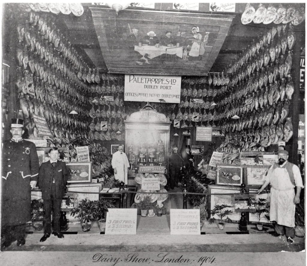
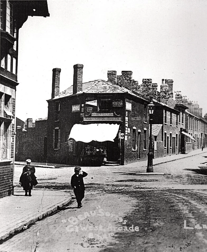
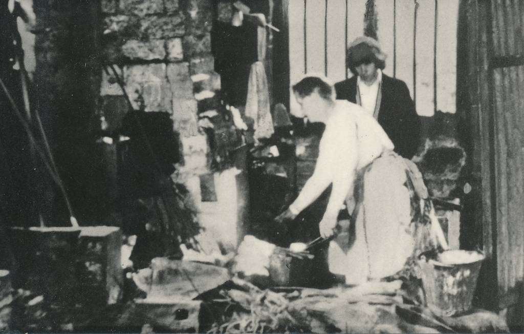
Further Research: Black Country History
The name ‘Black Country’ may have originated in the Middle Ages from where the coal seams came to the surface discolouring the heath land. The industrial revolution is also believed to have contributed to the name due to the black soot that would emanate from its aforementioned factories. While the term is believed to have been used since the mid-19th century, it wasn’t until 1987 that the local government officially began to call the region the Black Country in a marketing move to bring official recognition to the area, agree on its boundaries and push tourism.Black Country’s official boundaries, it’s still a topic of hot debate to many traditionalists. This is because Black Country boundaries are traditionally said to consist of areas where the coal seam comes to the surface.
Identity: Unveiled in 2009, the Black Country tartan, designed by Philip Tibbetts of Halesowen, was the first to start a trend in its regional identification, and shortly after, its official flag followed.
The flag, which represents Elihu Burritt’s description of the Black Country as ‘black by day and red by night’.
Mineral Resources
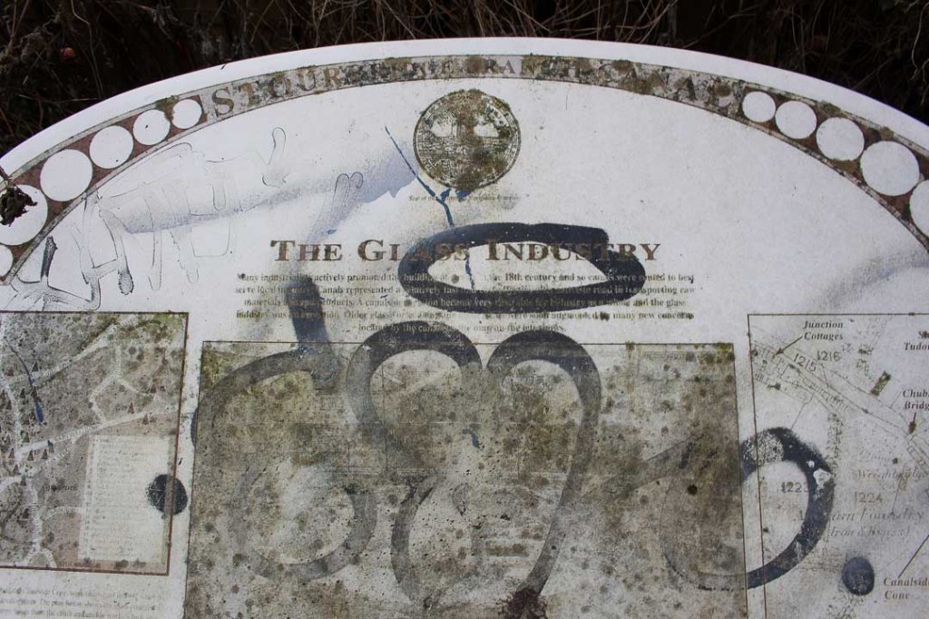
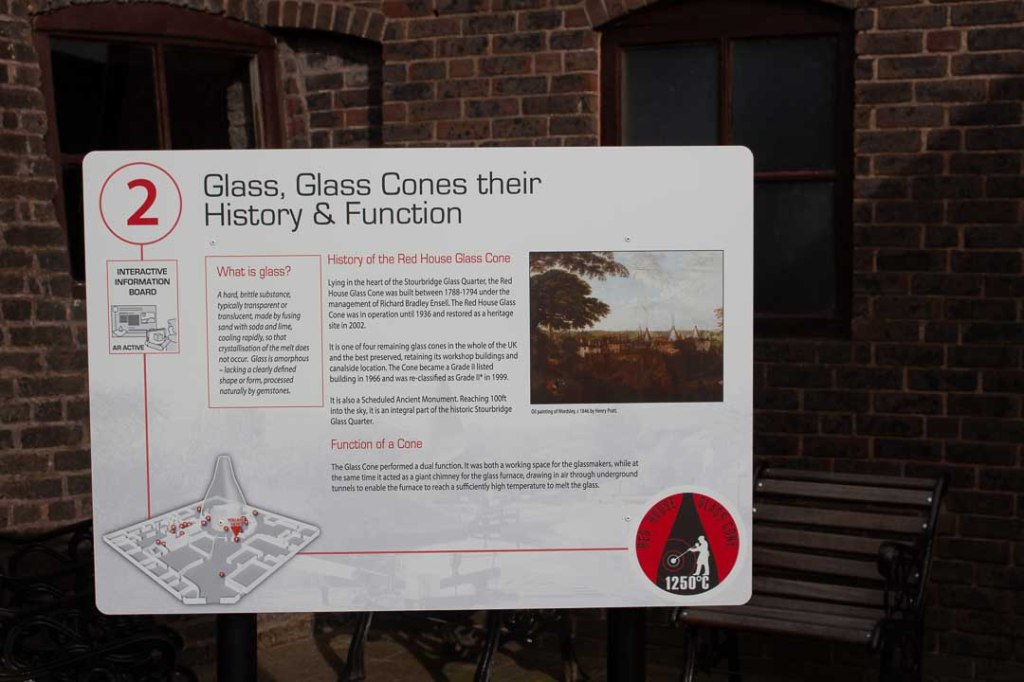
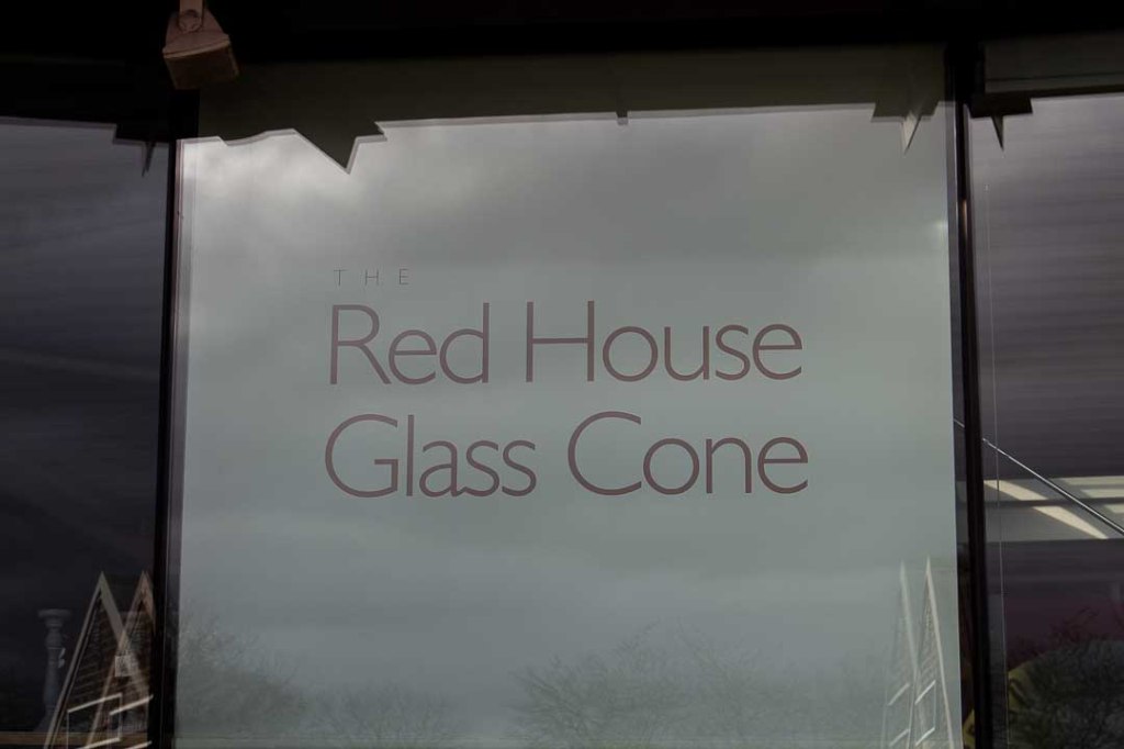
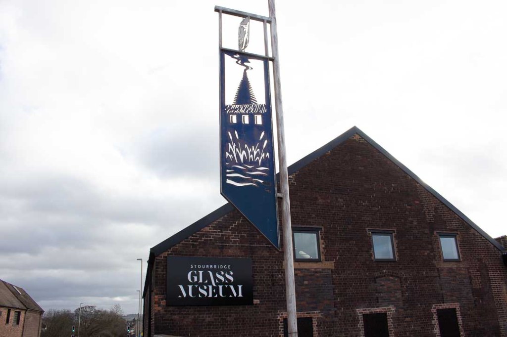
Glass: From the 17th century glass makers have been attracted to the Stourbridge due to its rich natural resources of coal and fireclay for lining furnaces, making it the perfect location for the industry. Stourbridge Glass is internationally recognised as amongst the finest in the world and has been used countless times as gifts for royalty and visiting dignitaries to the UK. The local clays also lended themselves to well to brick making and have been used to make many houses and churches in the area. This gives the architectural landsape an iconic, rustic gold/ red property. Other important industries included steel, sandstone and limestone quarrying and manufacturing.
Dialect
The people who live in the area are called “Yam Yams”, have speak the oldest surviving dialect of Saxon influenced English.
http://www.lowergornal.co.uk/dialect.htm
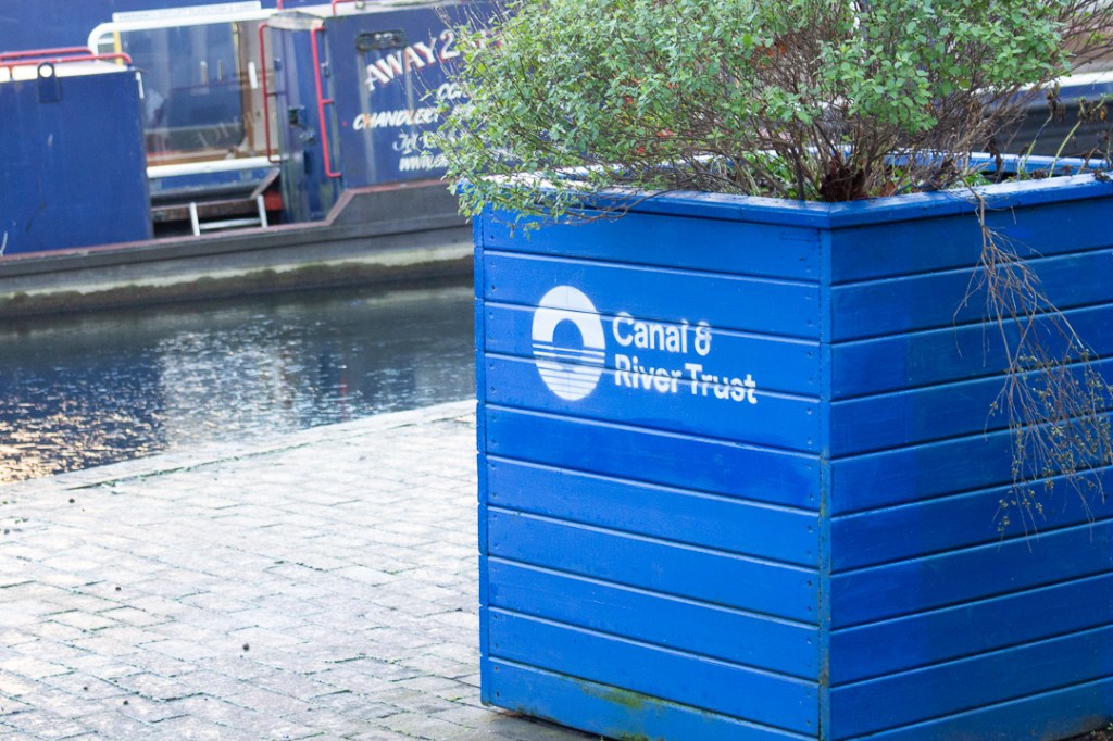
- Industrial; revolution – trading via canal systems
- Culture: fiercely loyal, resilient and hardworking
- https://www.blackcountrysociety.com/black-country-images
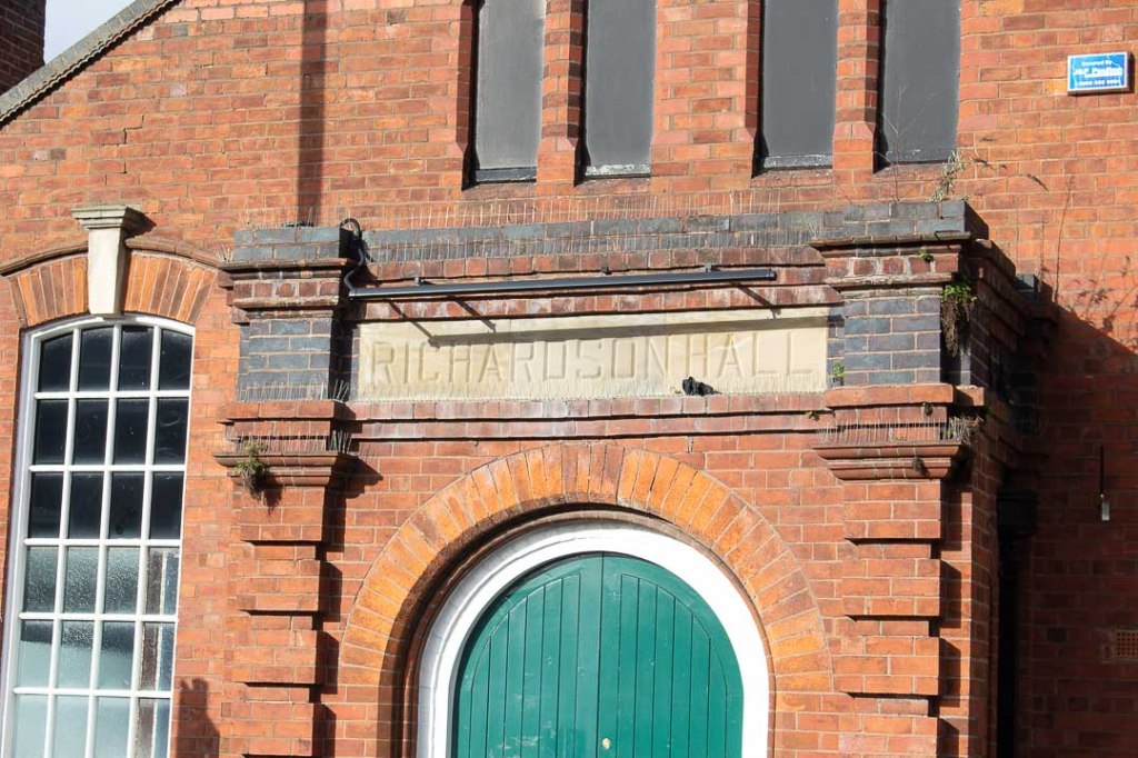
- http://www.lowergornal.co.uk/i_bricks.htm


Workshop Challenge:
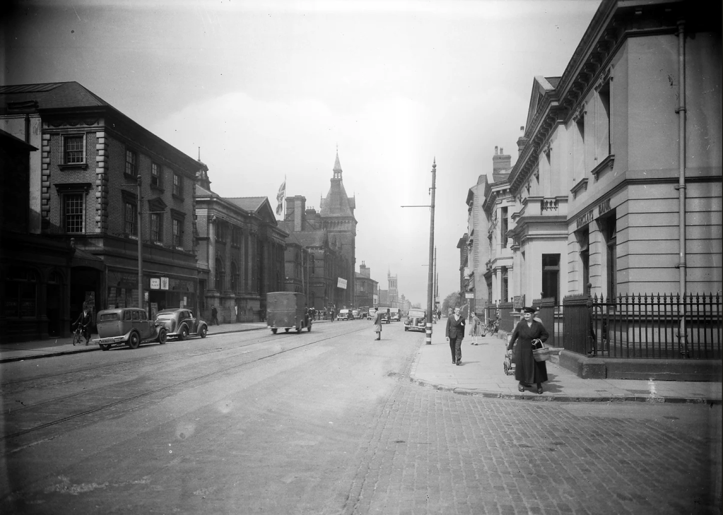
Initially I explored Birmingham City Centre as the nearest larger city, feeling that there would be a richer selection of examples to analyse, however after reflecting on this week’s resources I wanted to refine my area of focus to the Black Country.
This also gave me the opportunity to compare both areas individually and examine how vernacular differs. For example, Birmingham offers some authentic preserved glimpses into original typography, specifically wayfinding and commemorative from the industrial revolution of post war periods. However due to its urban nature and ongoing development, this is contrasted by heavily by contemporary pristine signage and gentrified interpretations of old ghost signs. This creates a more romanticised atmosphere, nostalgically references the West Midlands’ industrial heritage.
The Black Country on the other hand, seems to have a much richer supply of untouched original artefacts, however feels less glamourous due to a limited amount of contrasting contemporary signage. It also has a much more rugged, and organic feel, being a collection of smaller towns and villages closer towards the country towns, with smaller populations and a larger focus on small independent local businesses, particularly pubs and craft outlets.
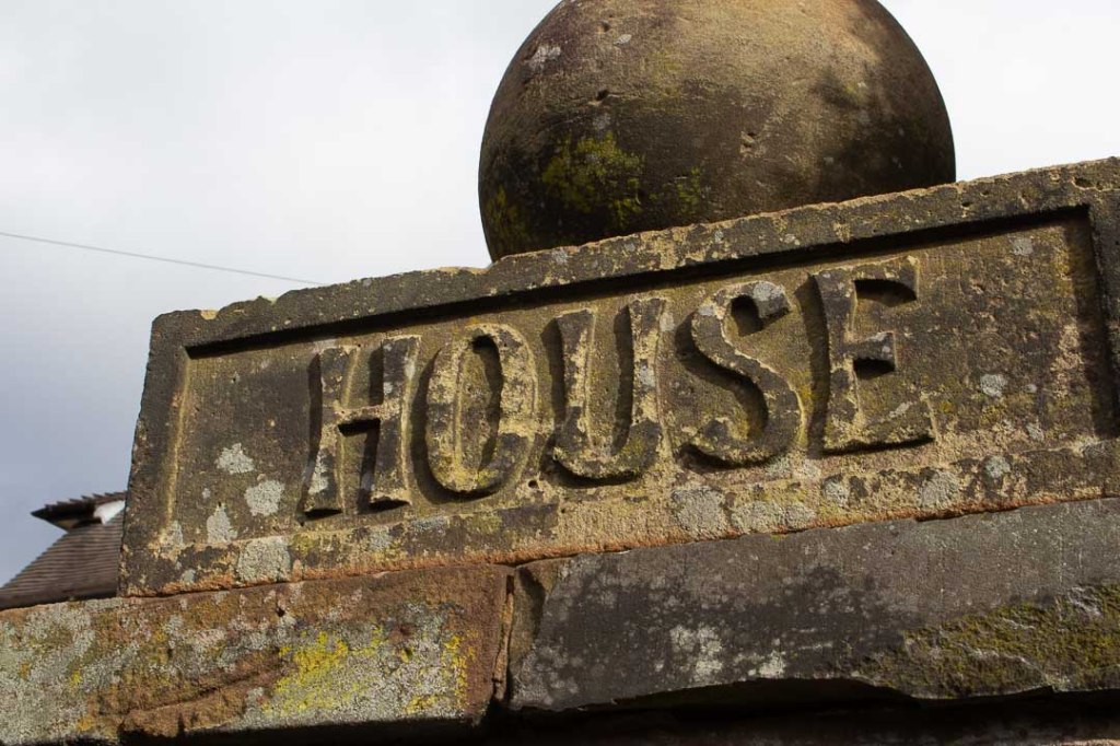
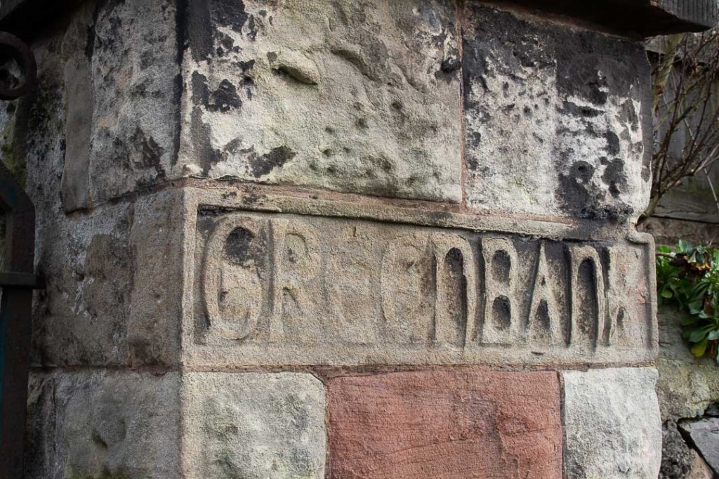
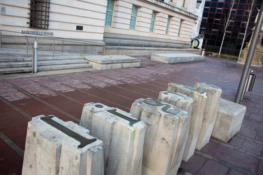
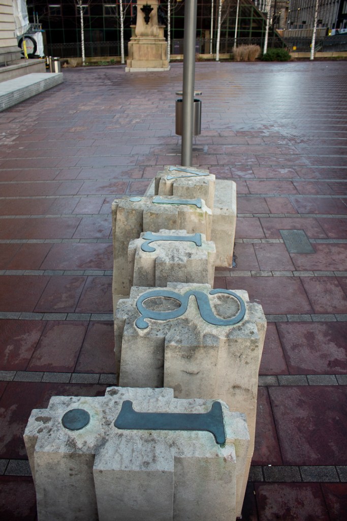
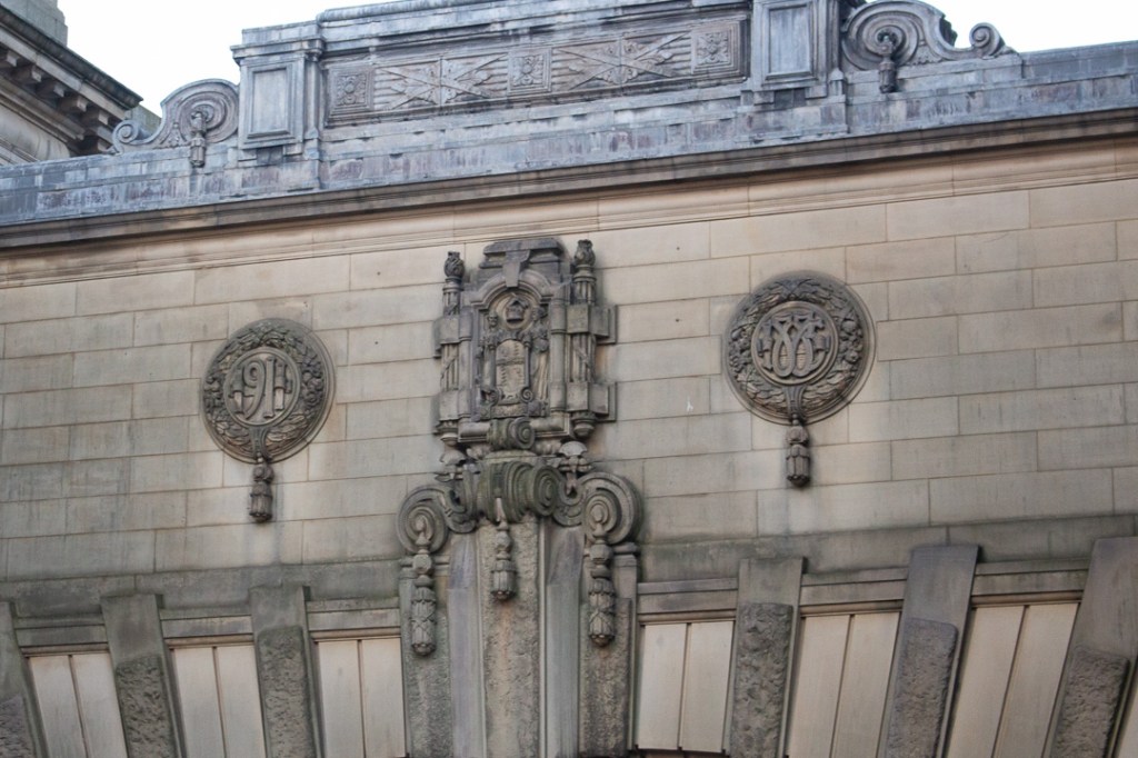
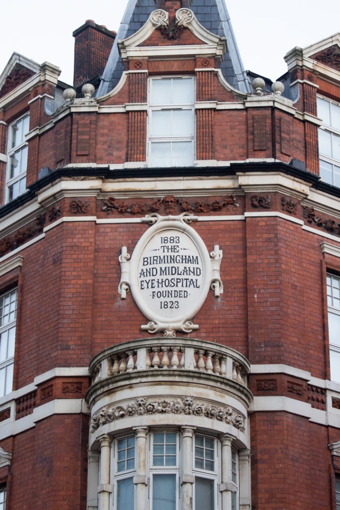
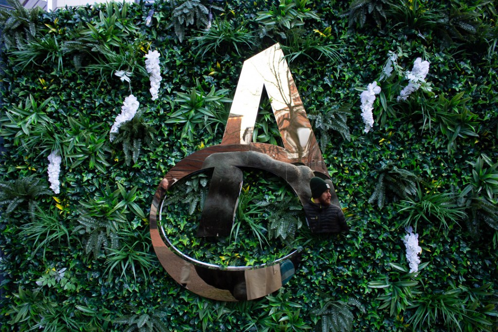
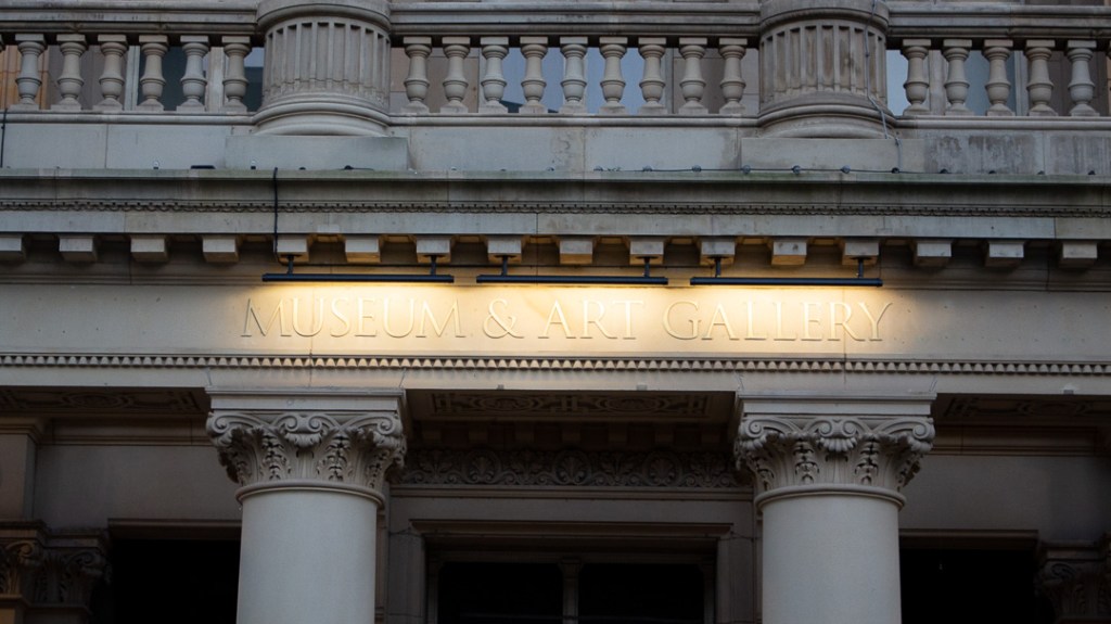
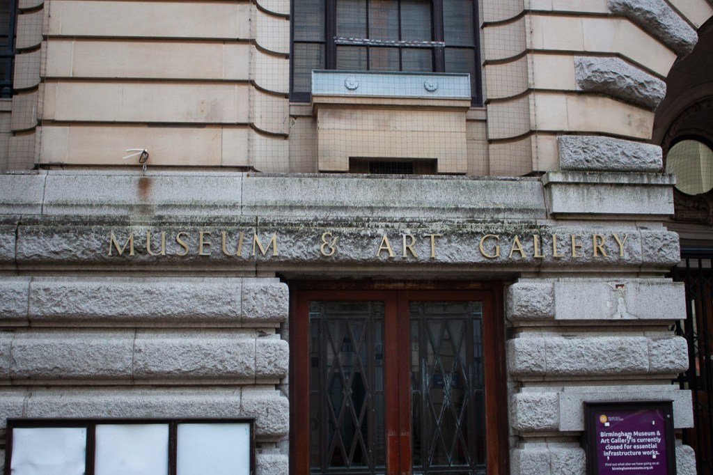
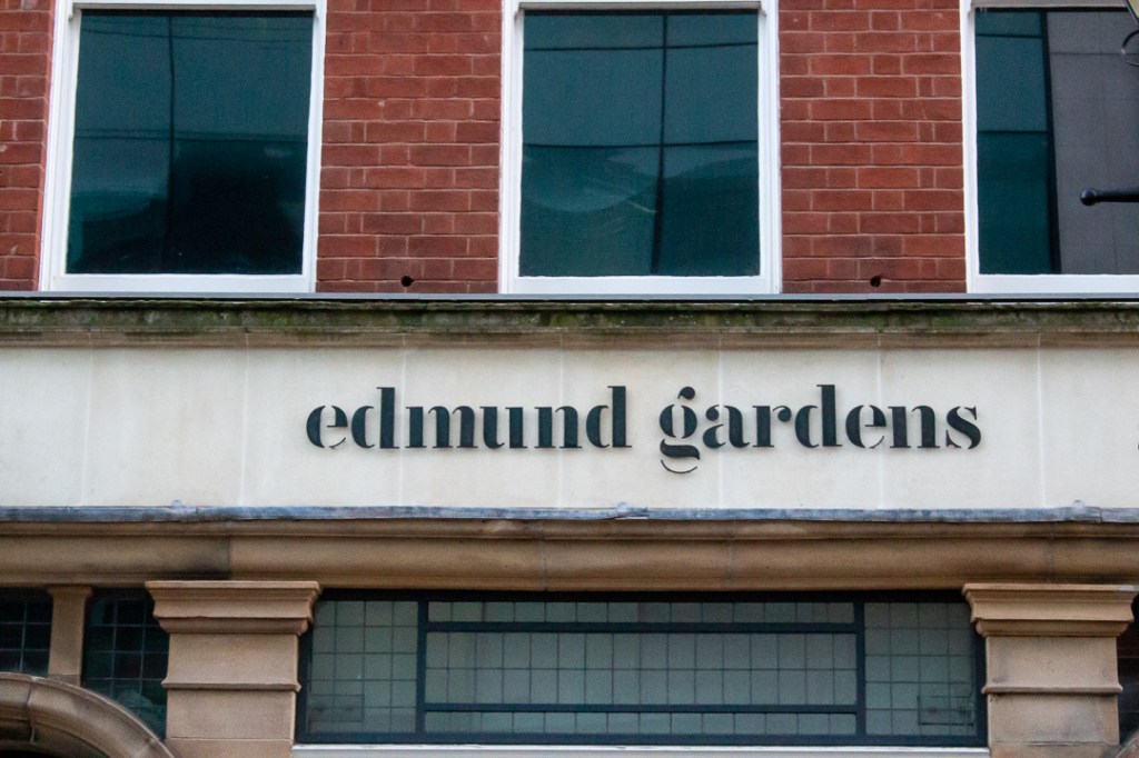
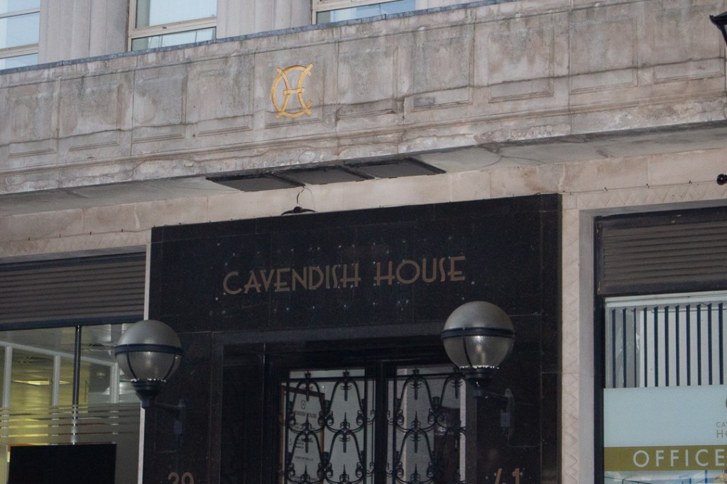
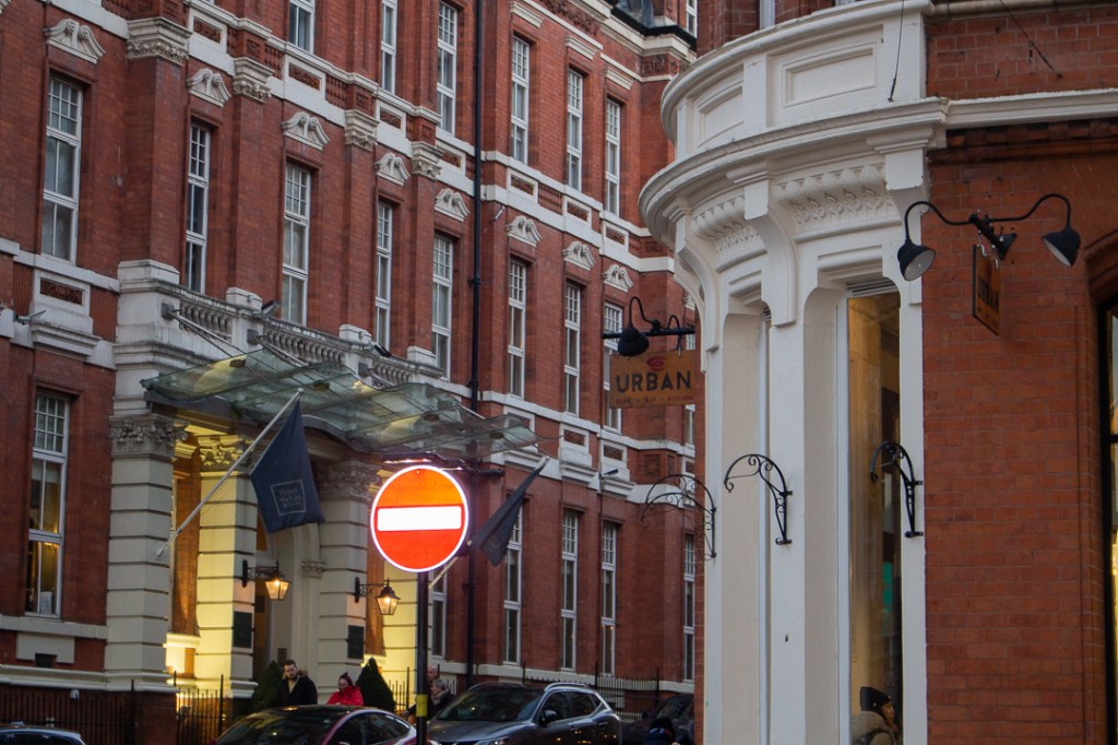
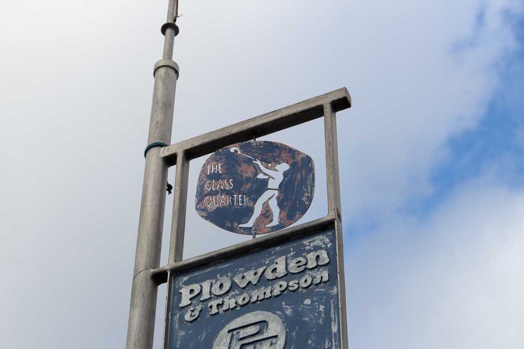
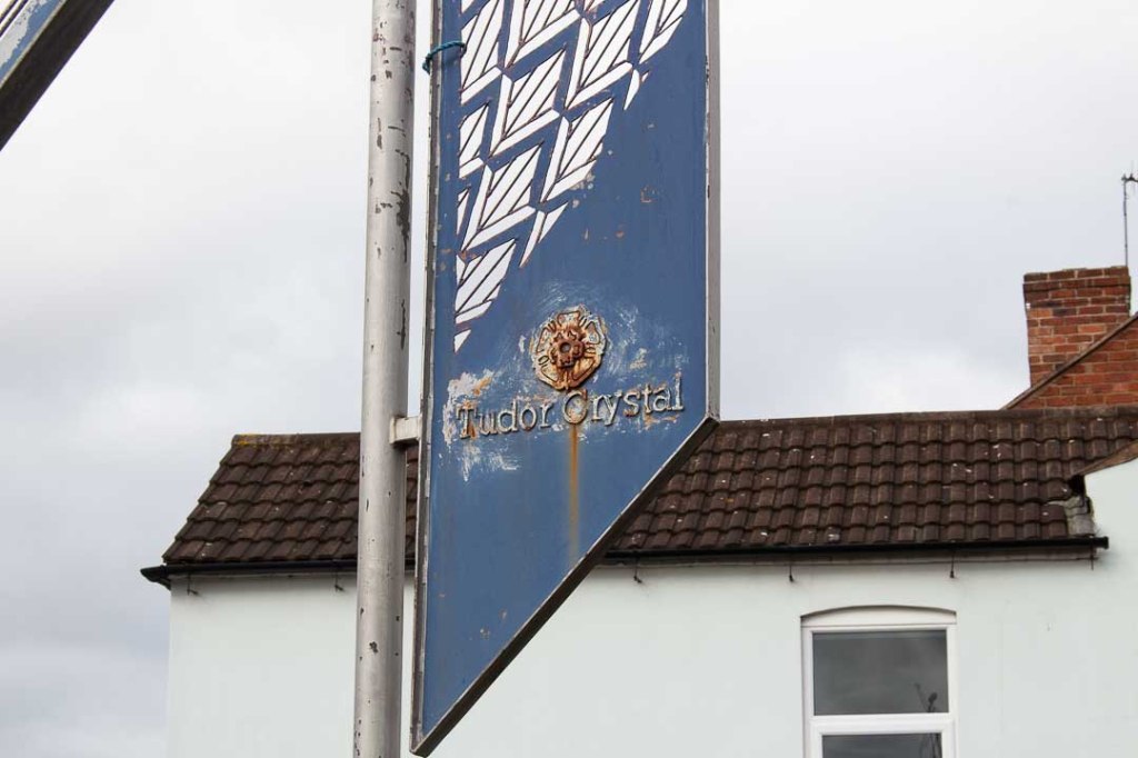
Architectural Type Forms
Black Country


Birmingham
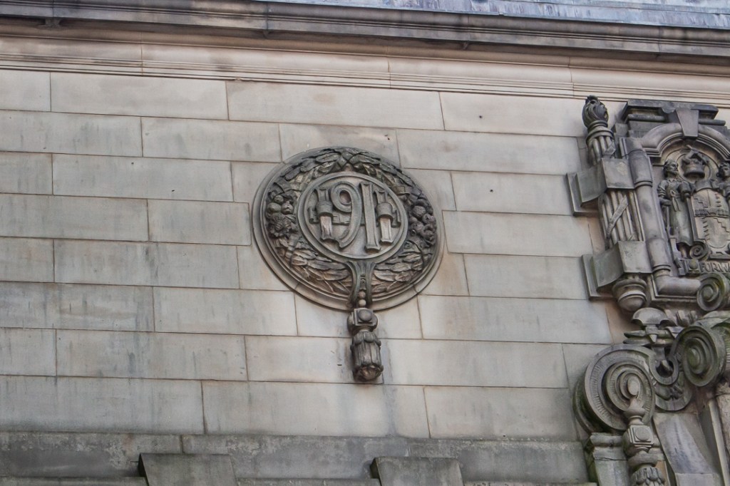


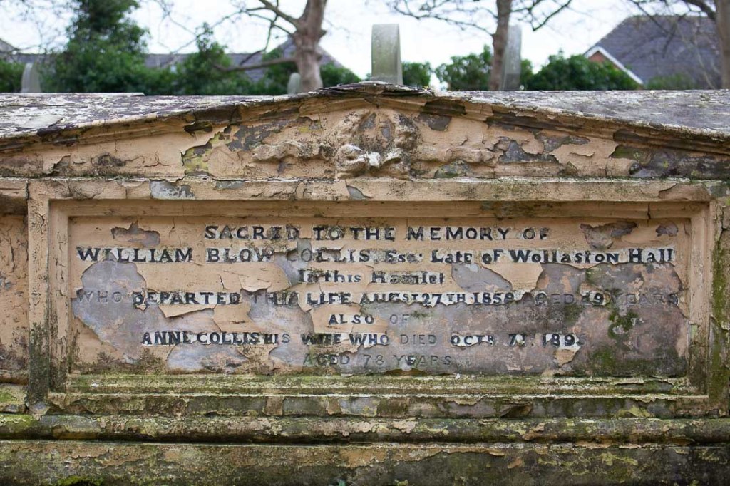
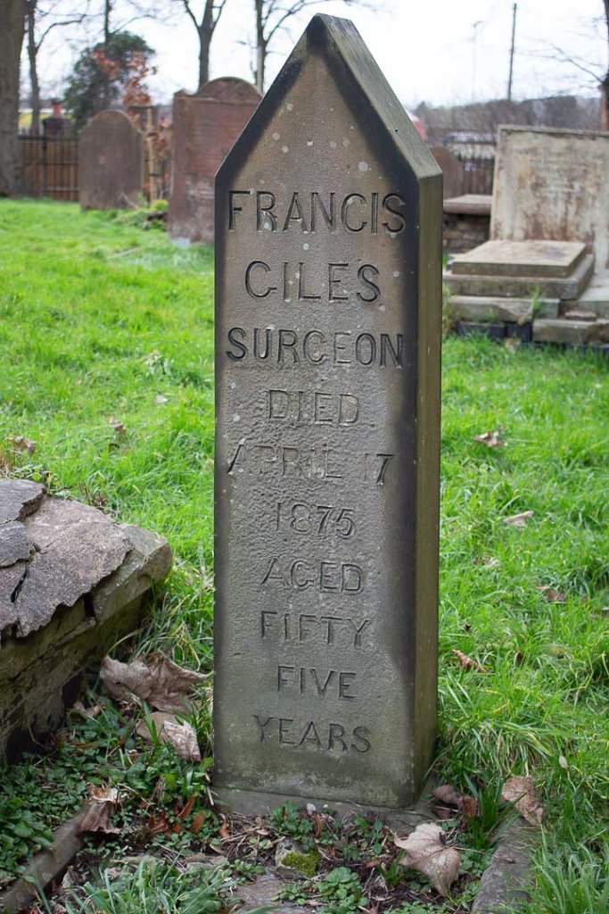
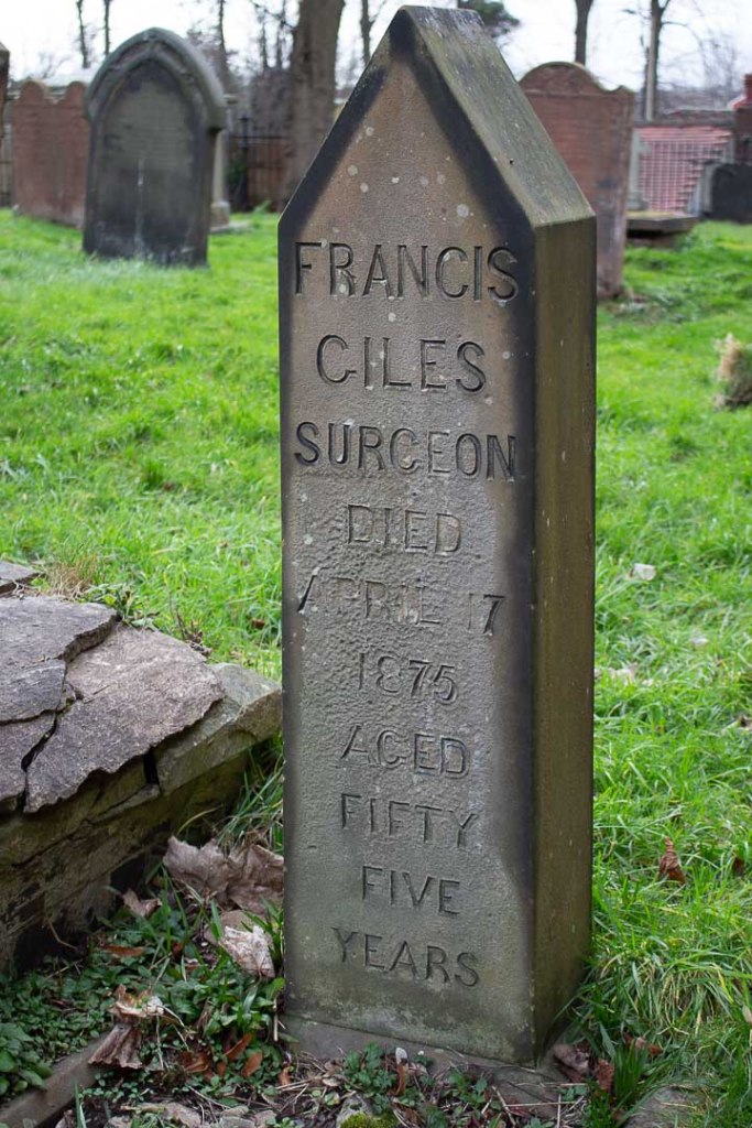
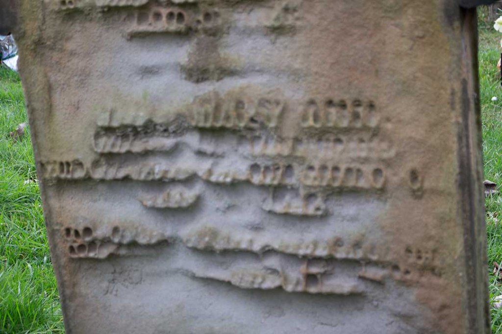
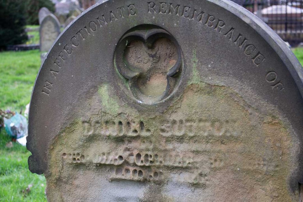
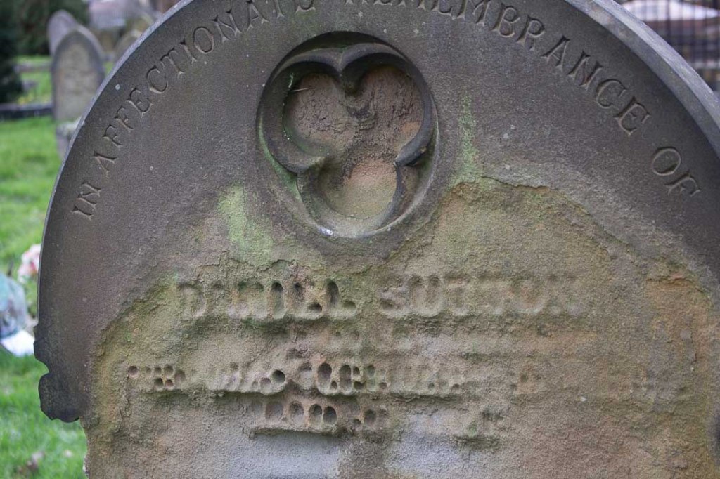
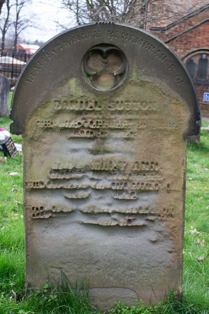
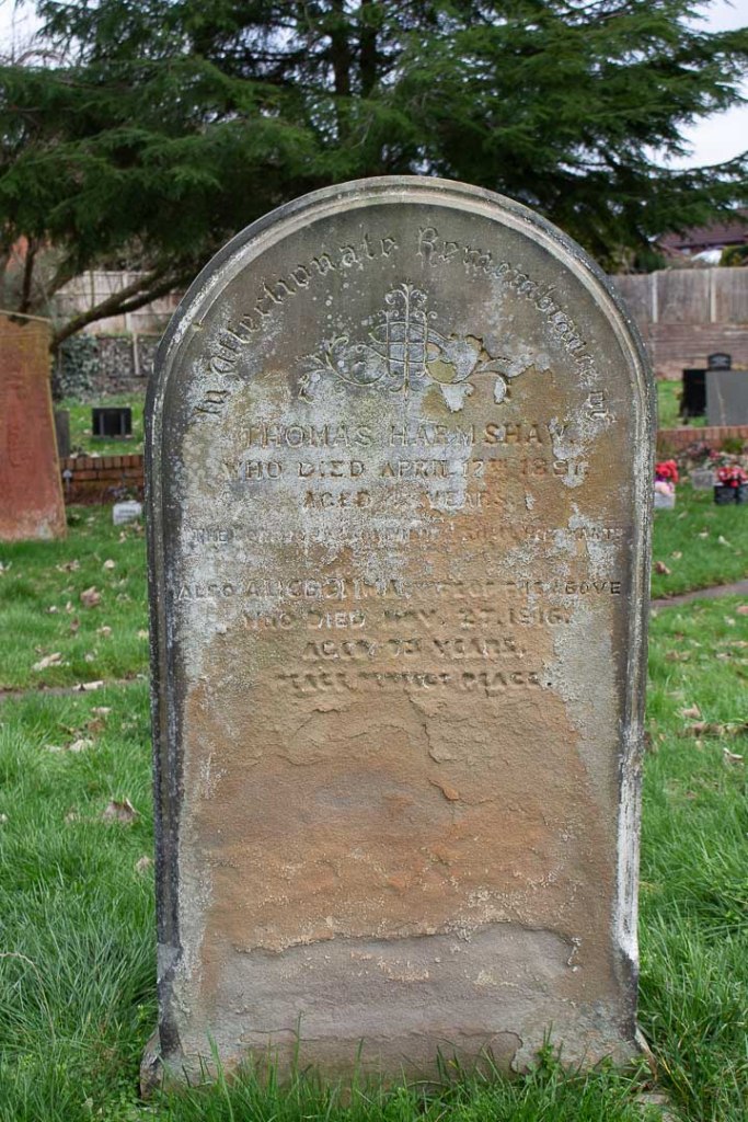
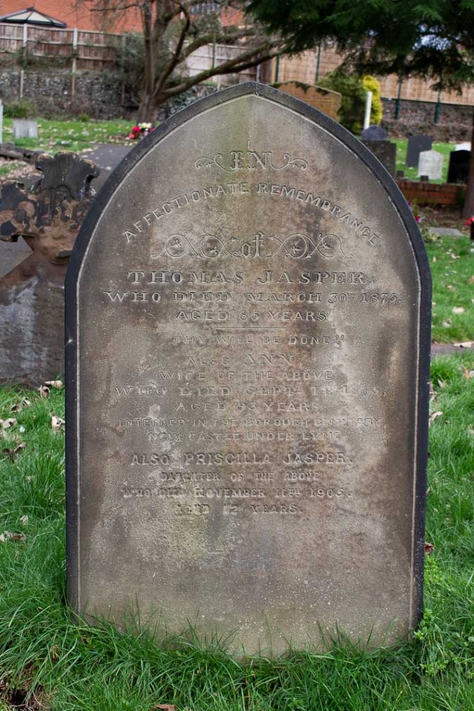
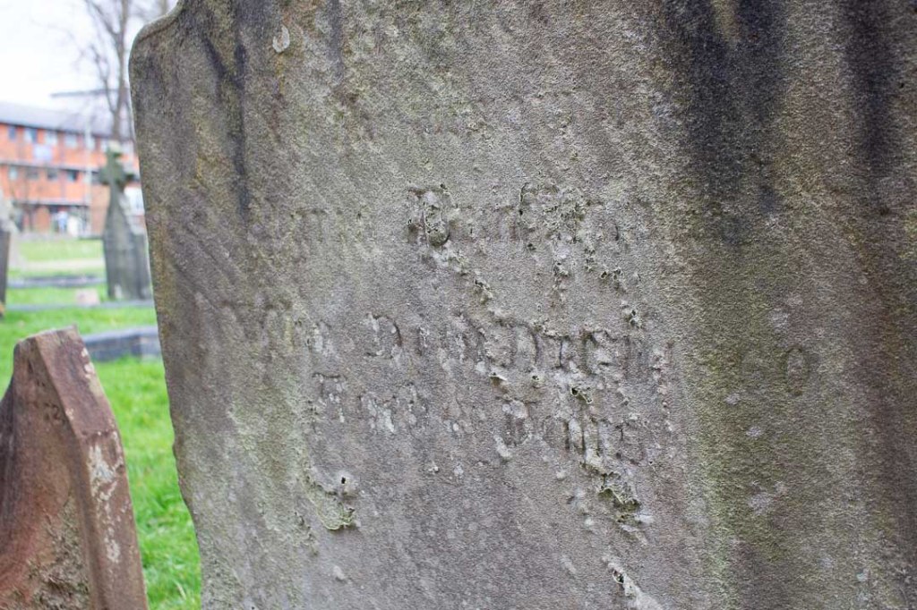
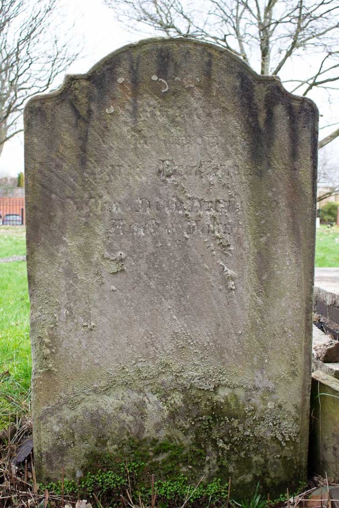
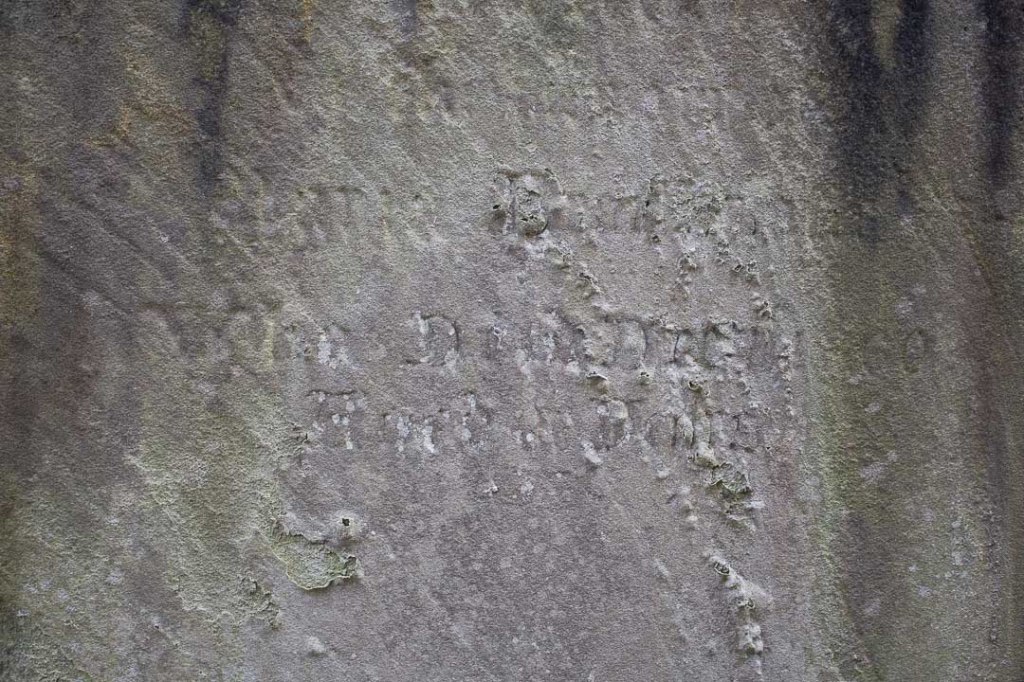
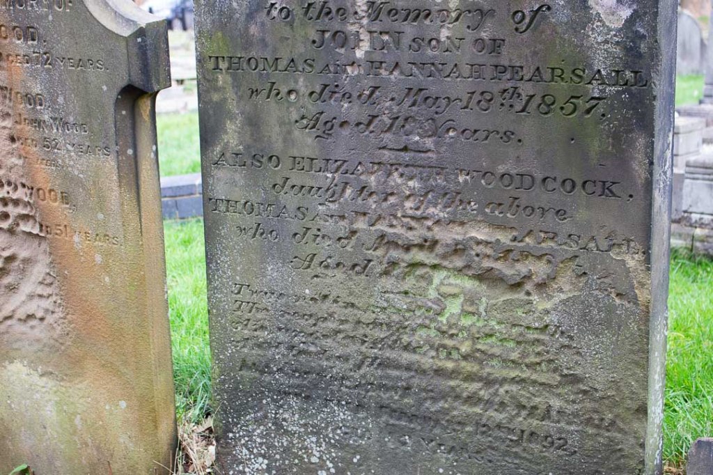
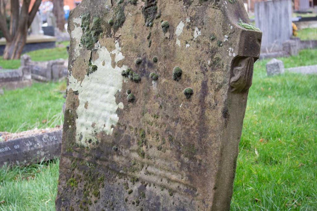
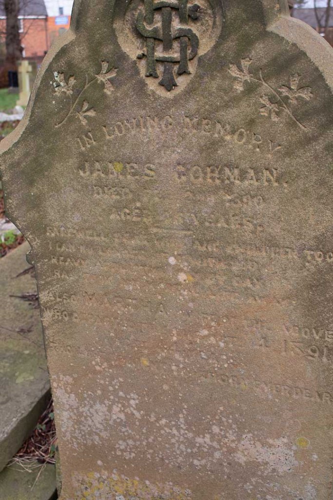
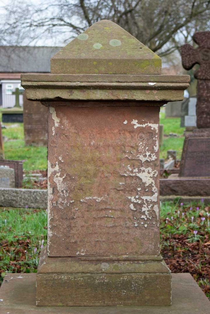
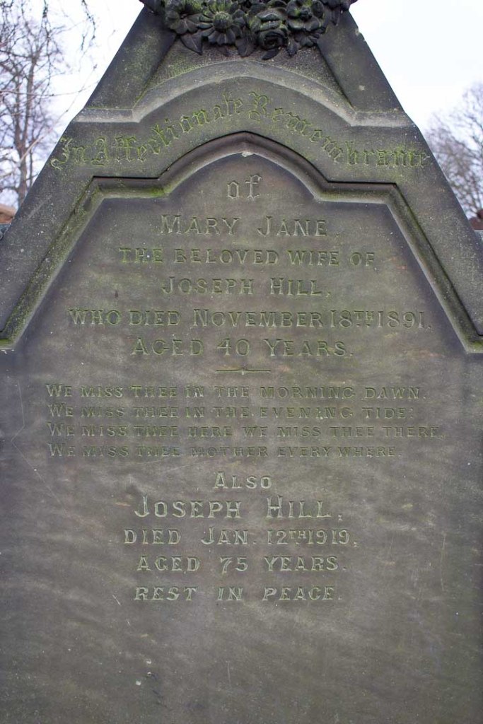
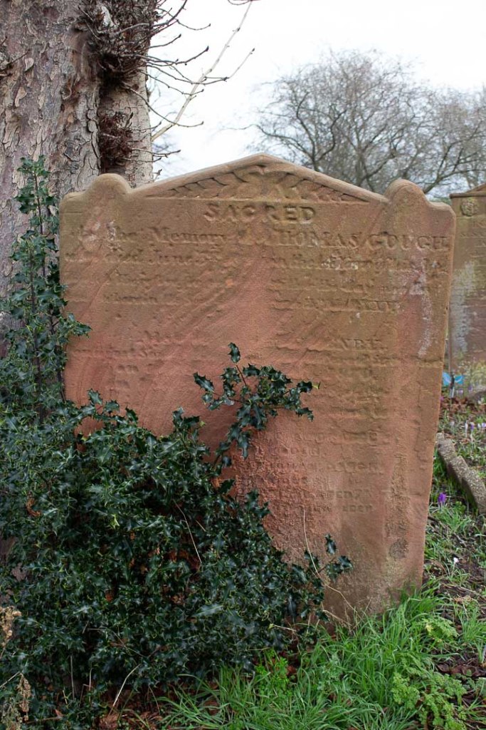
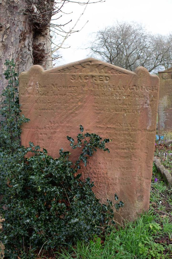
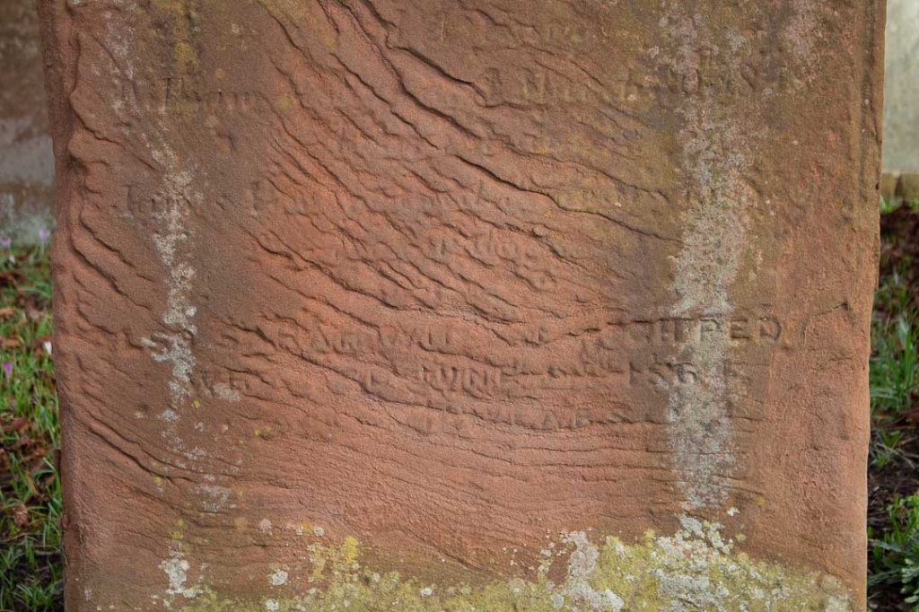
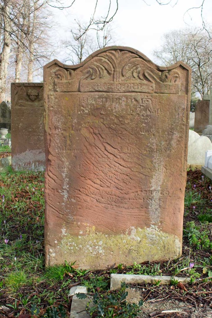
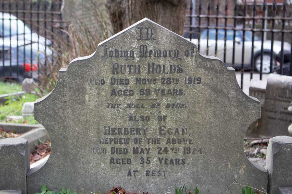
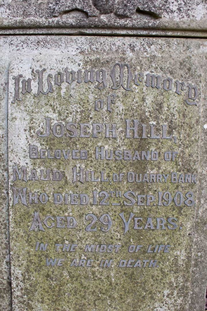
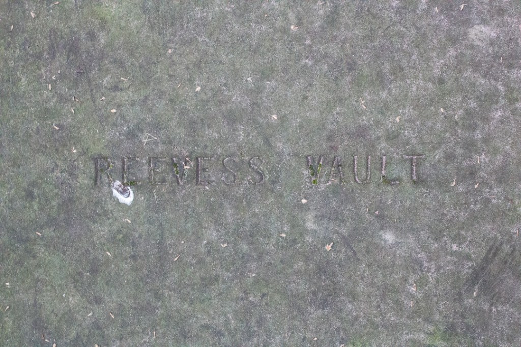
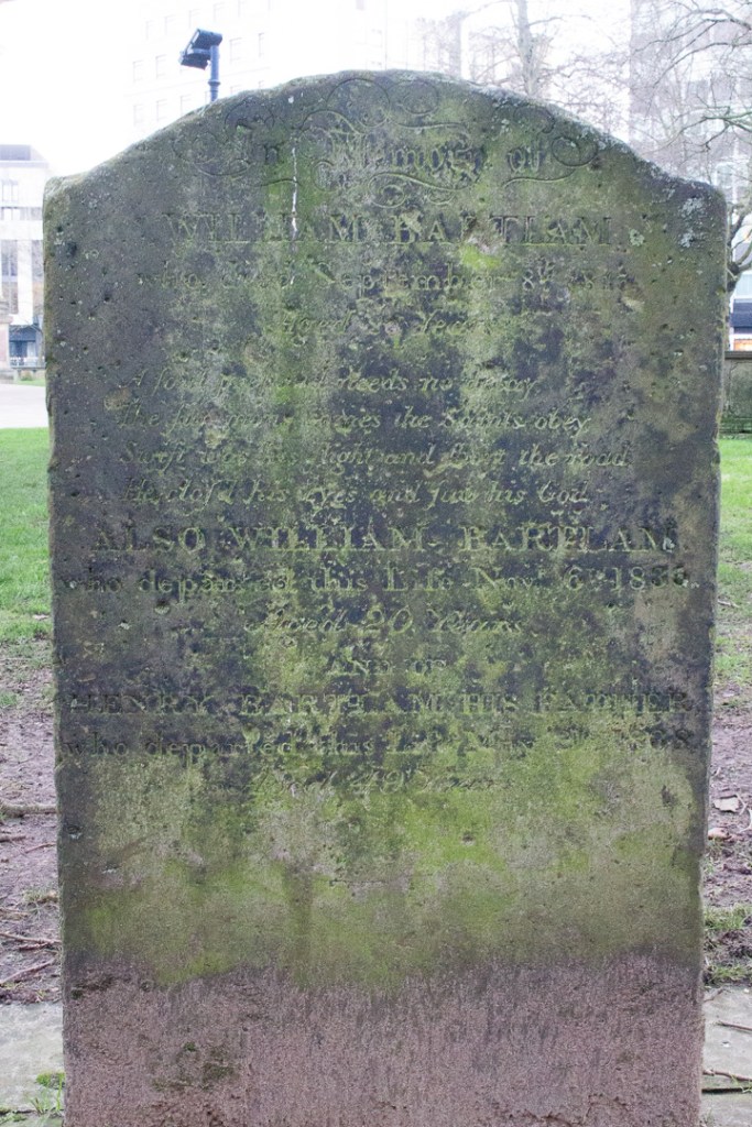
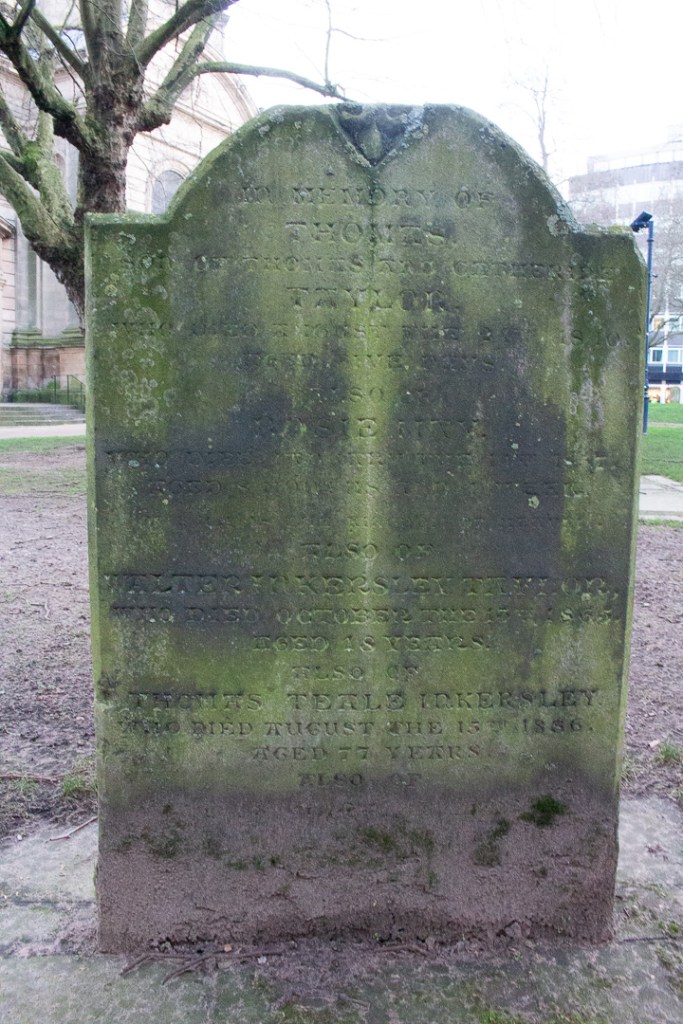
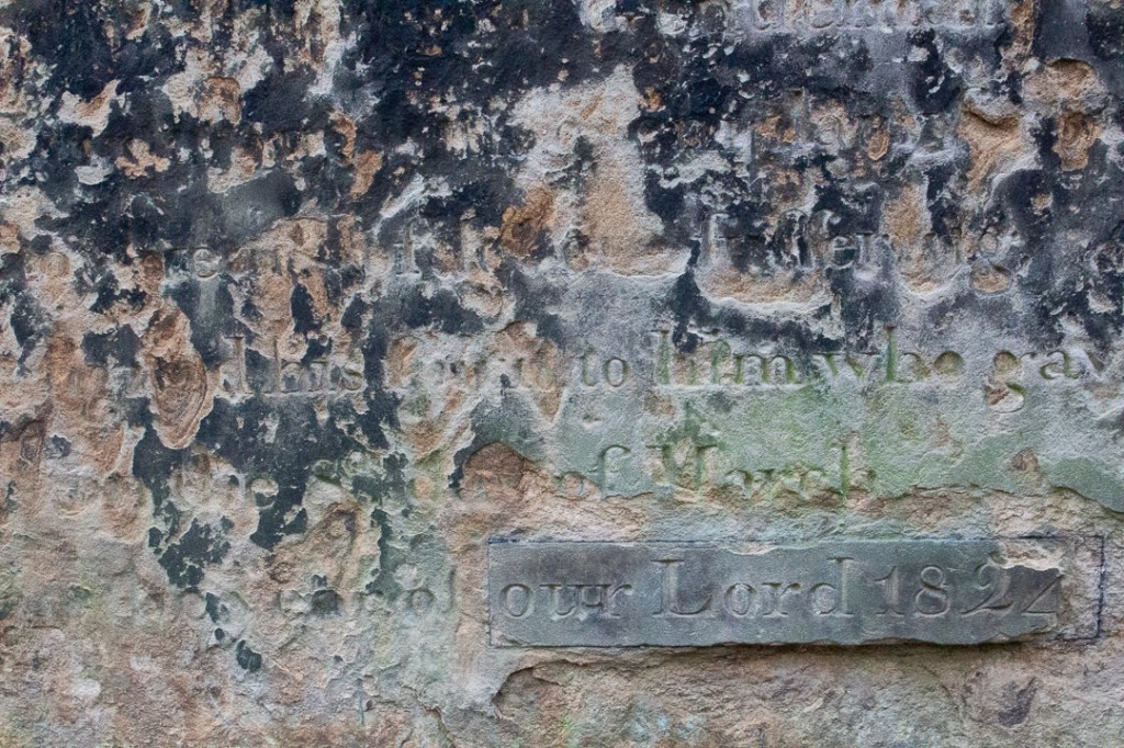
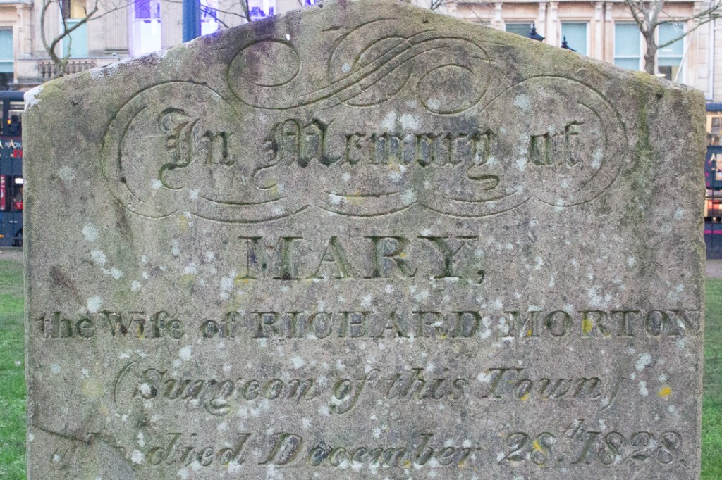
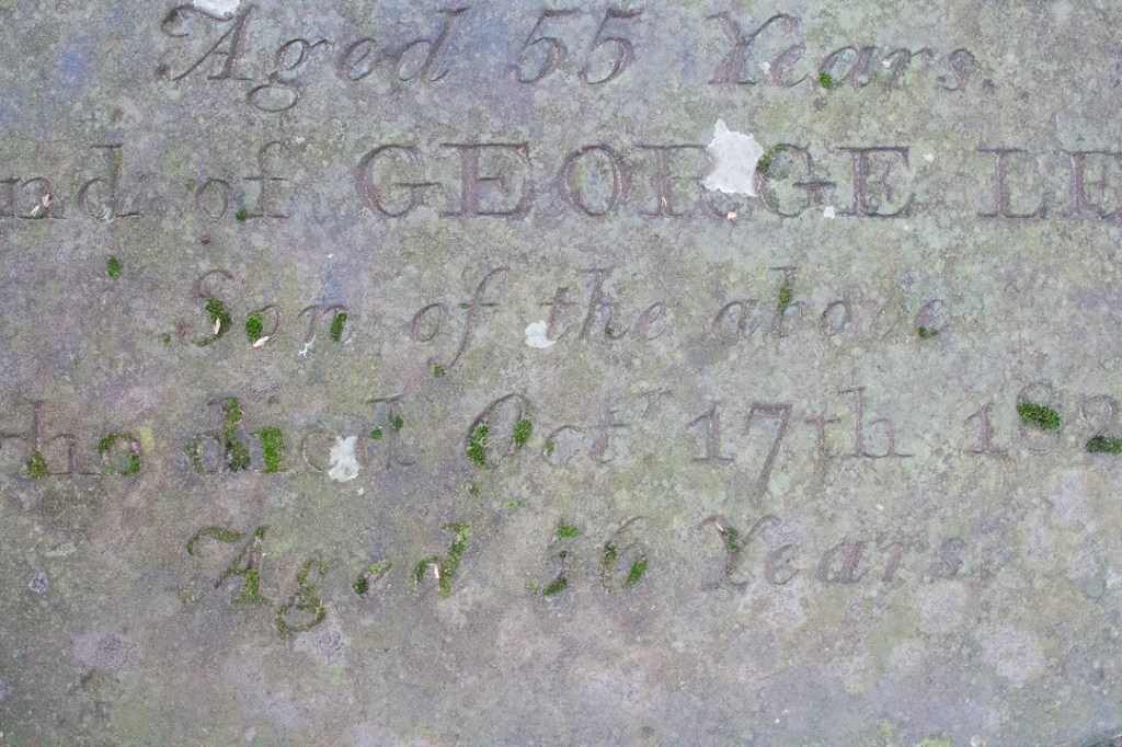
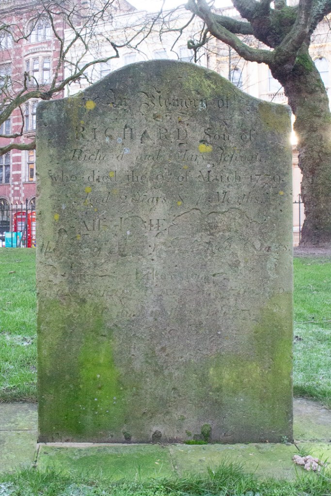
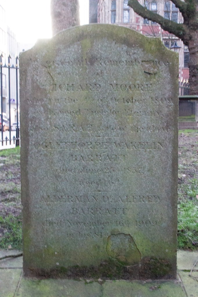
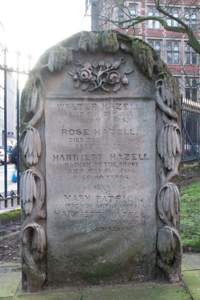
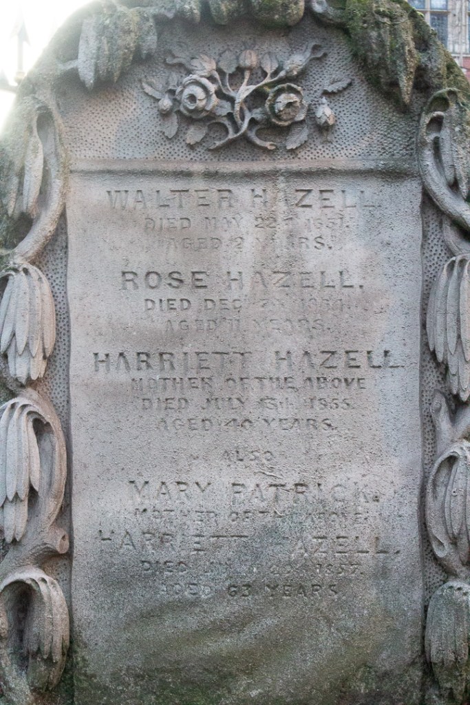
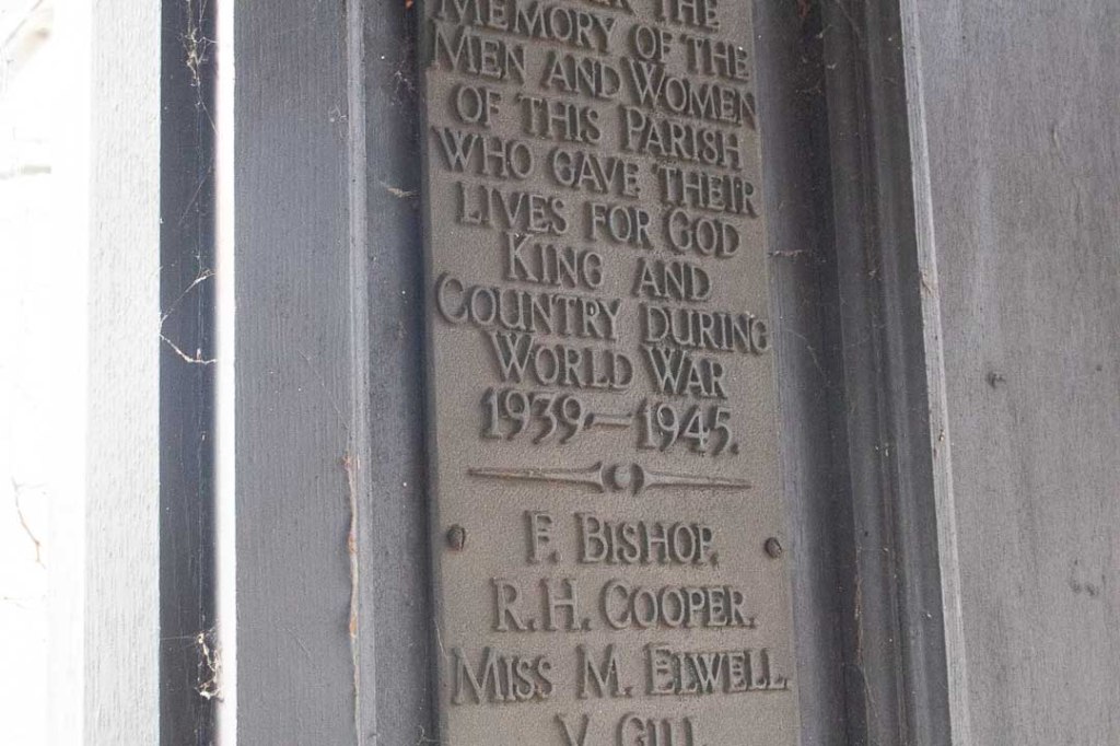
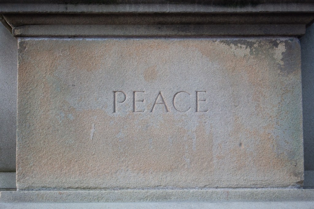
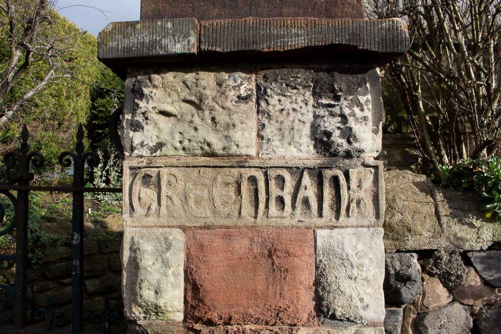
Grave Stones
Black Country


Birmingham


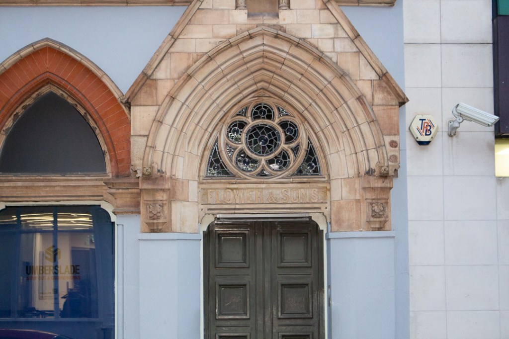
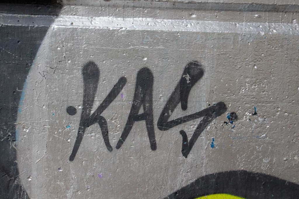
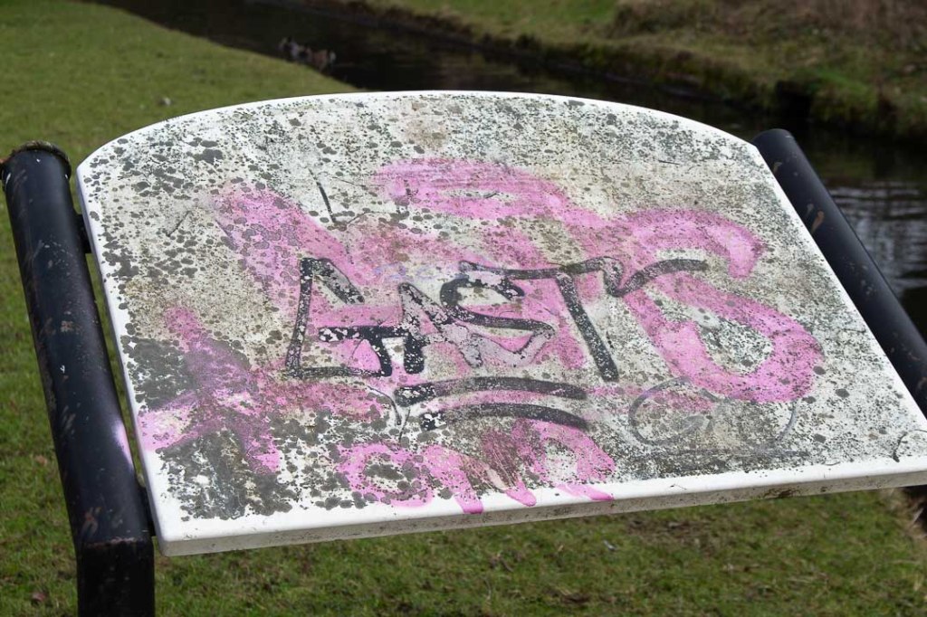
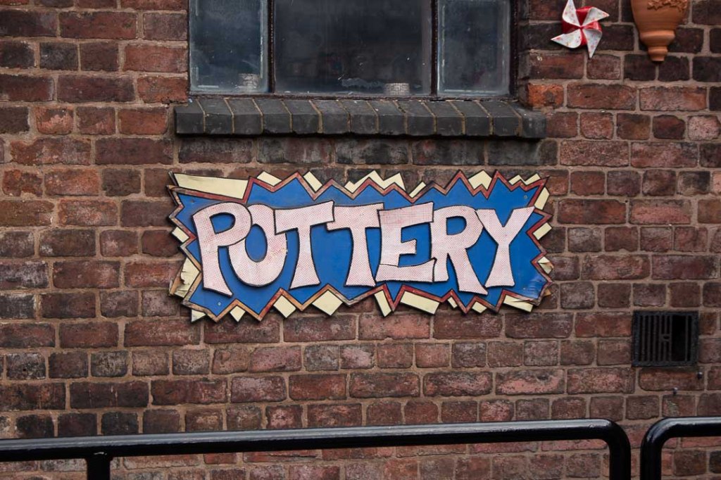
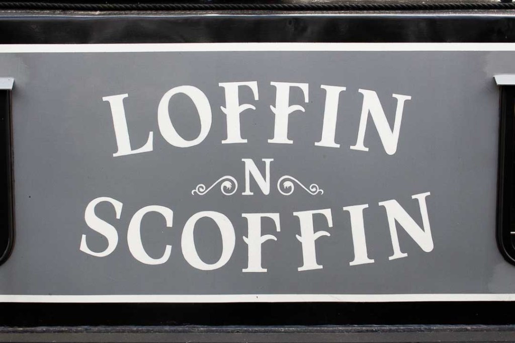
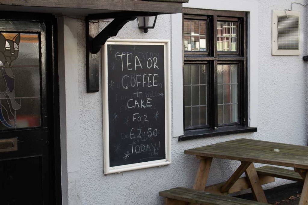
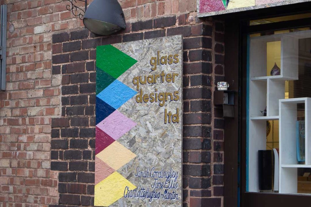
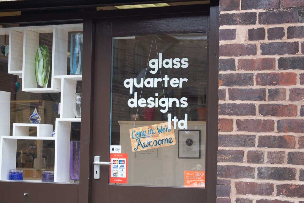
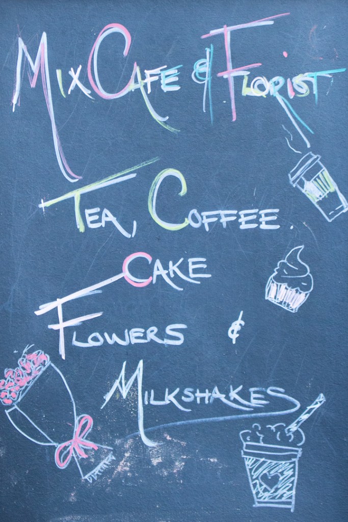
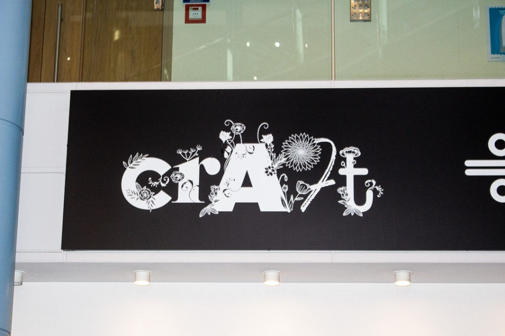
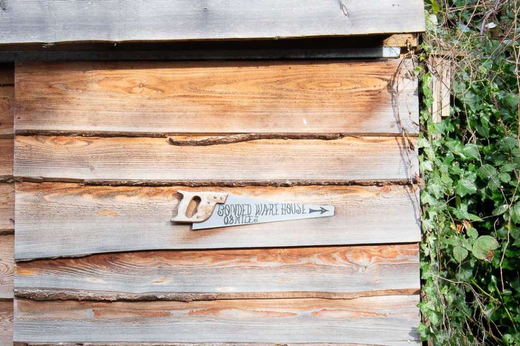
Hand Written, Painted and Rendered
Black Country


Birmingham


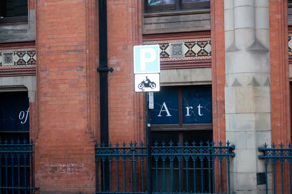
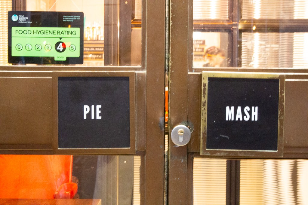
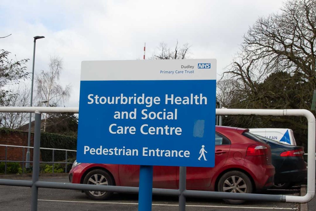
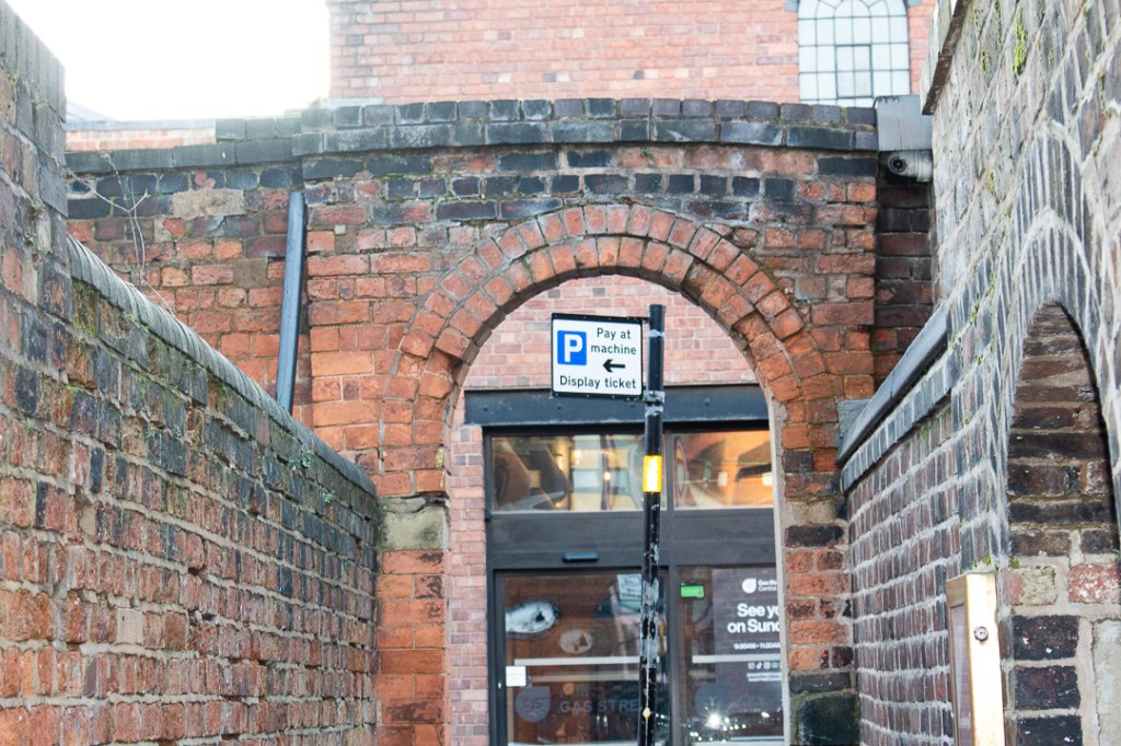
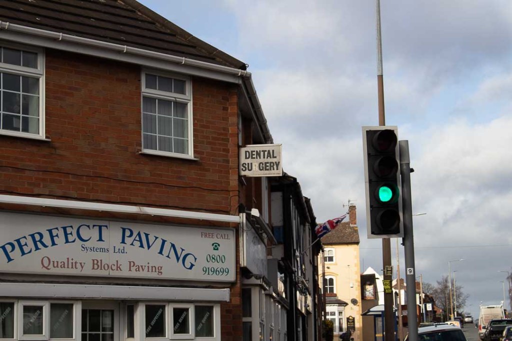
Informatory:
Black Country


Birmingham

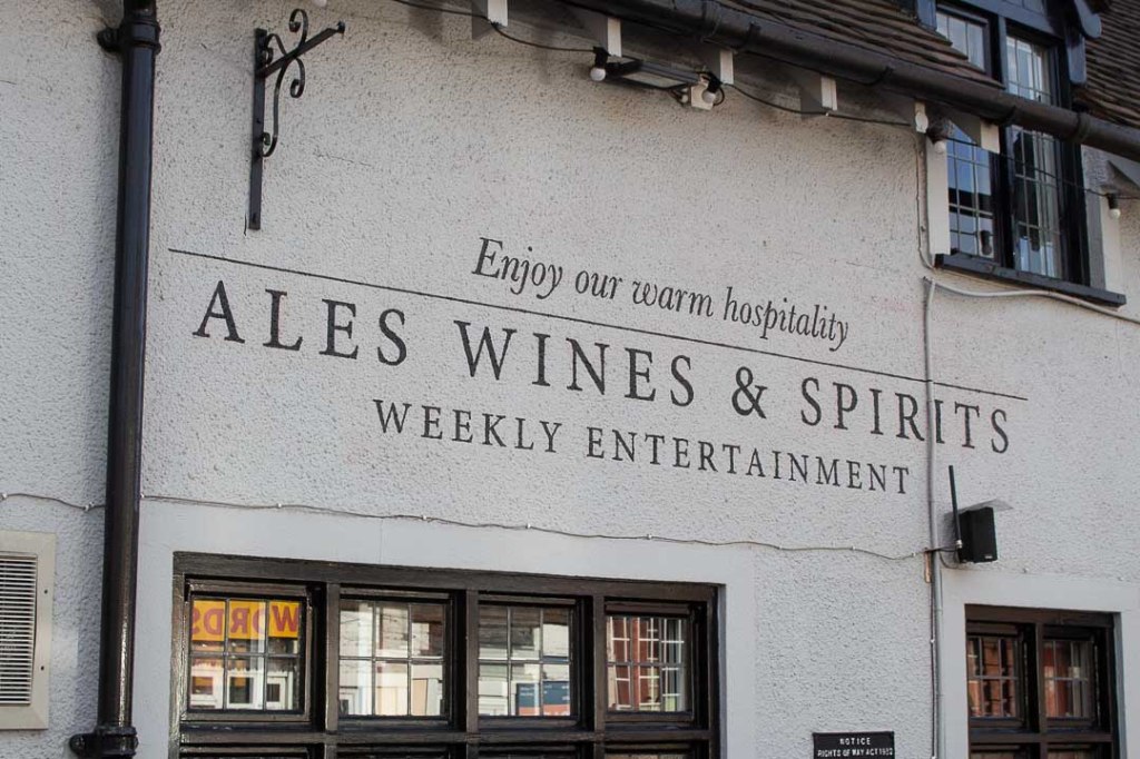
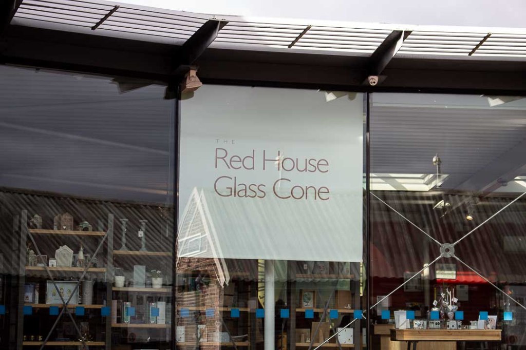
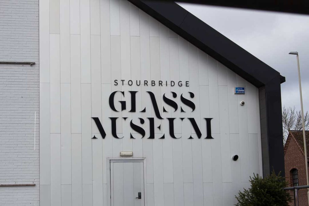
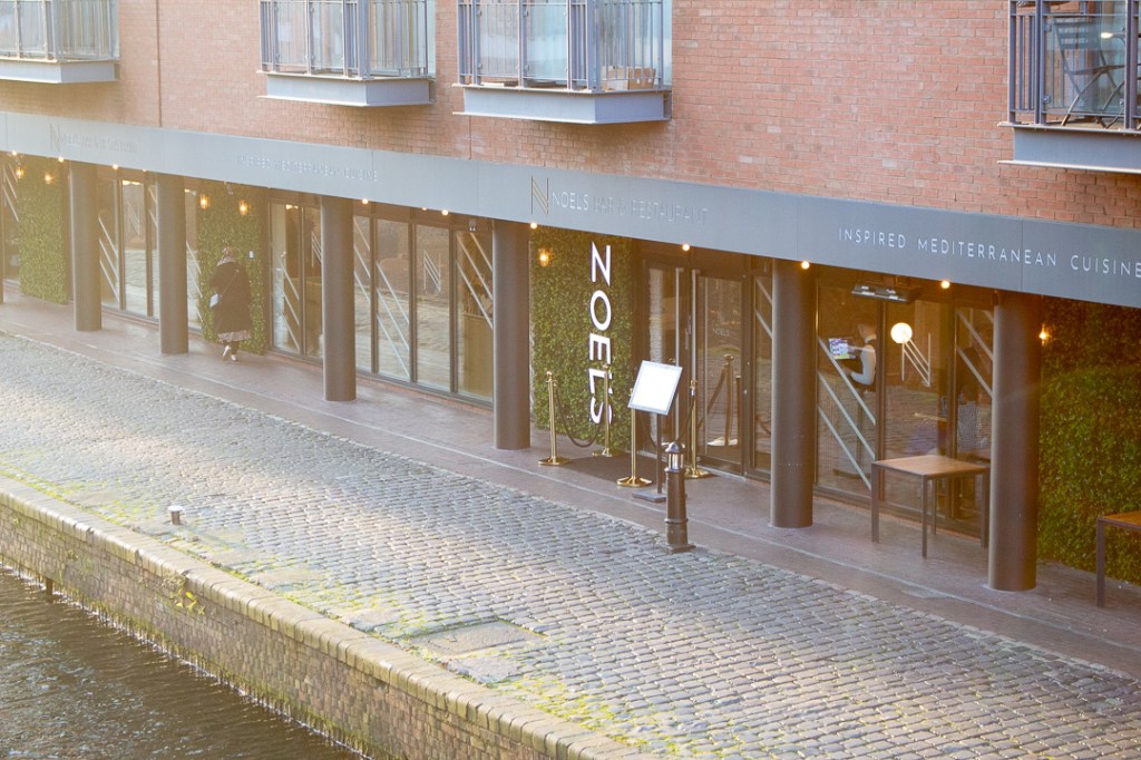
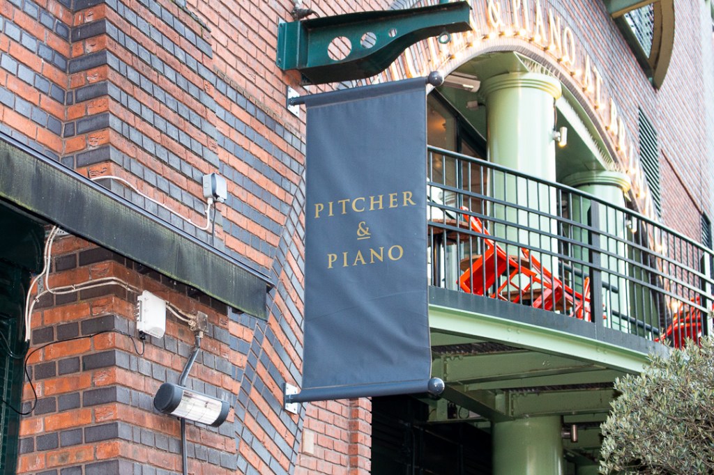
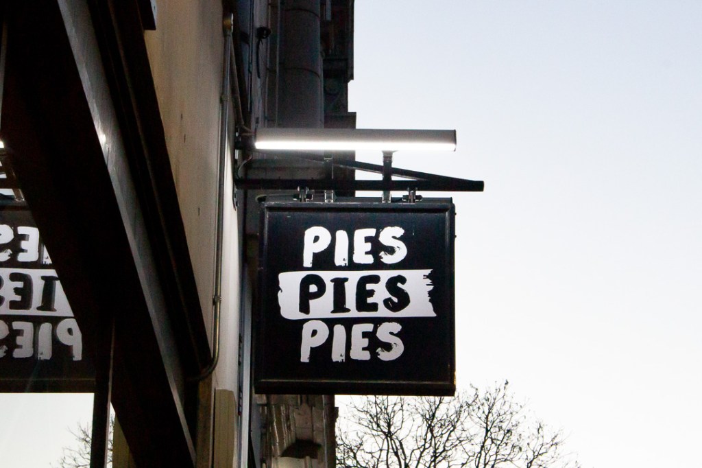
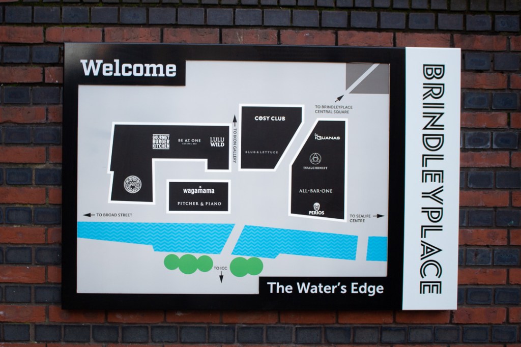
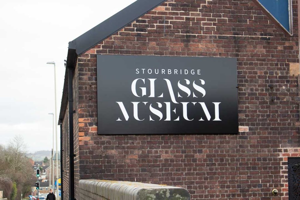
Pristine, Contemporary
Black Country


Birmingham


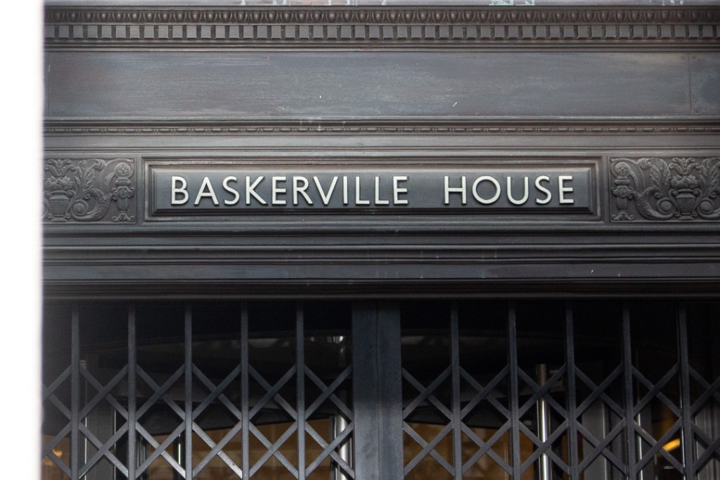


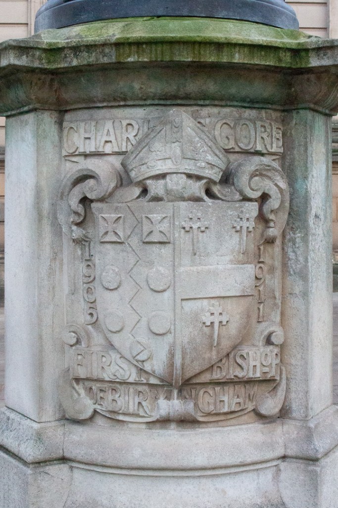
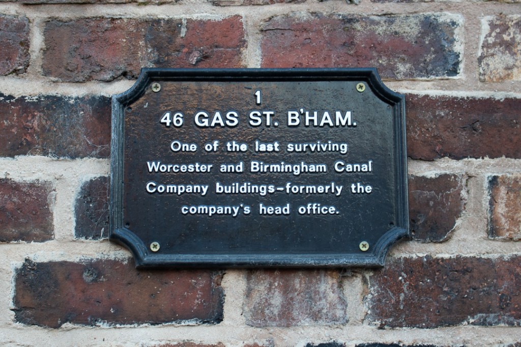
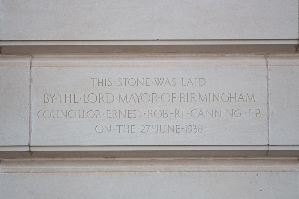
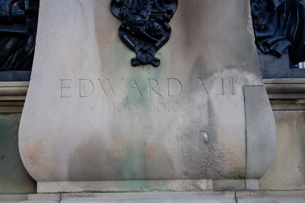
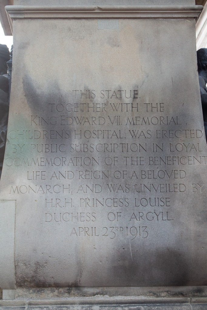
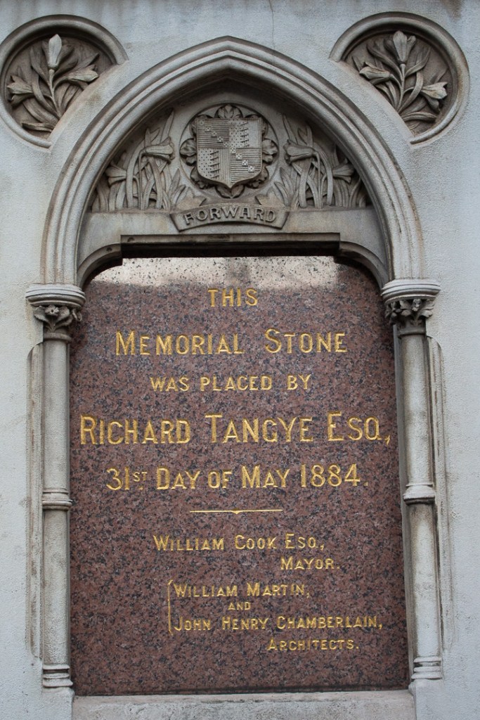
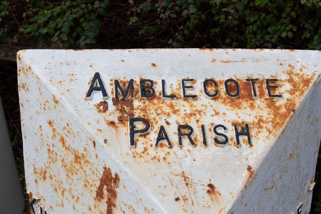
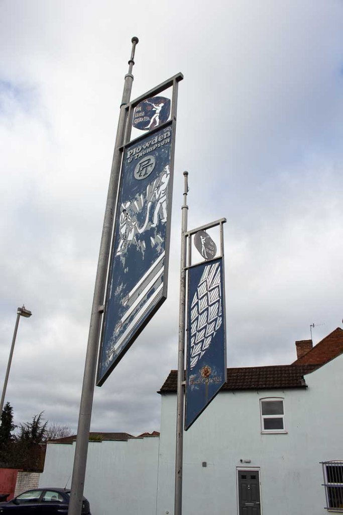
Recording/ Commemorative
Black Country
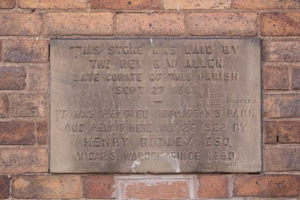

Birmingham


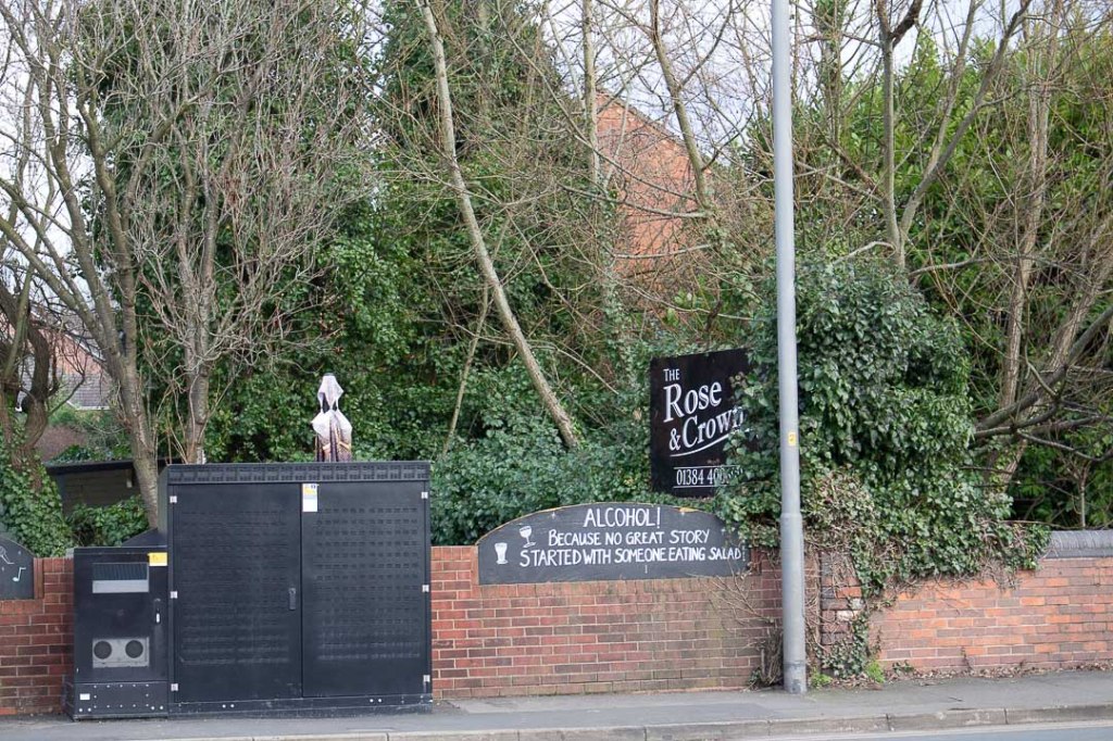
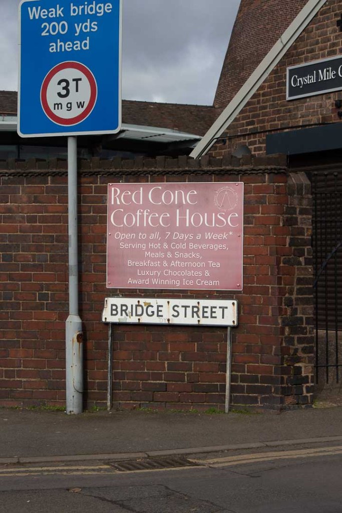
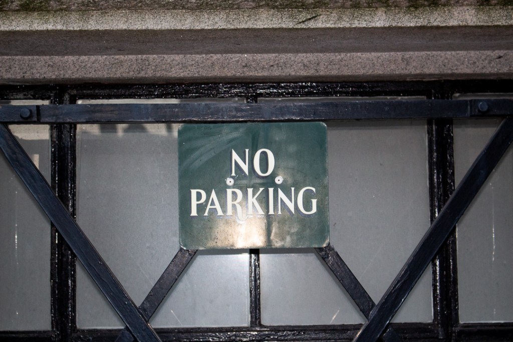
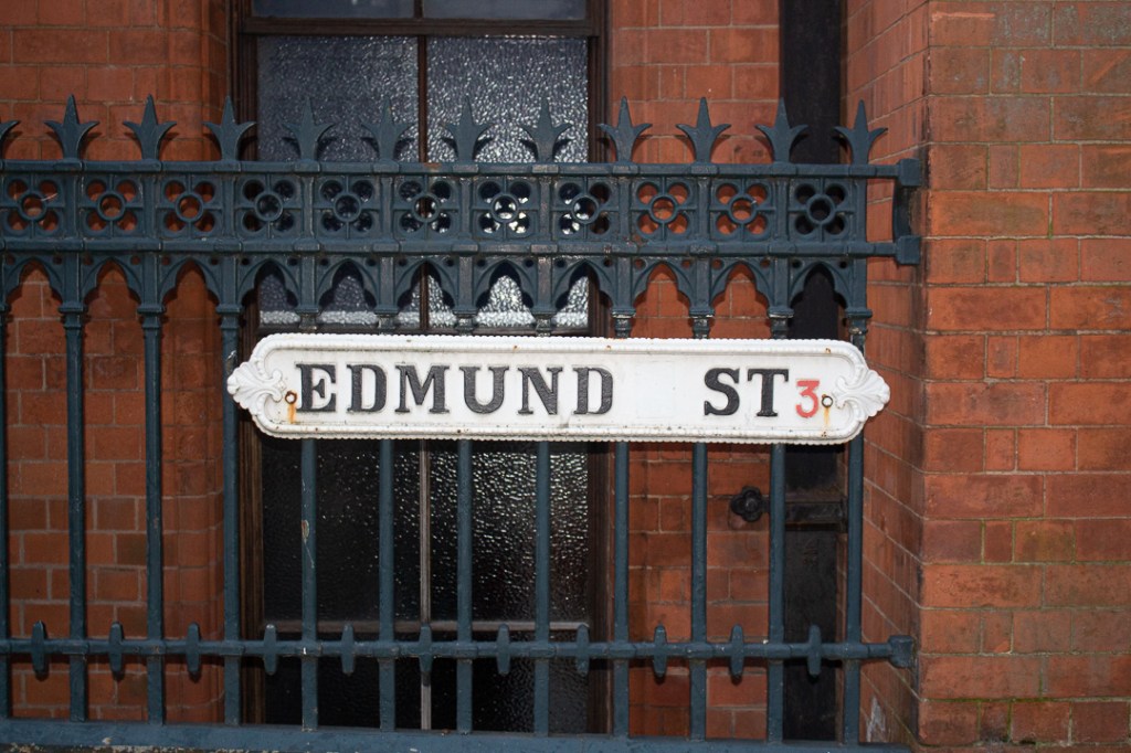
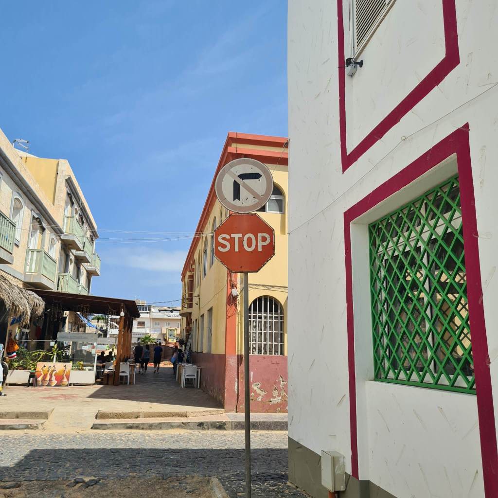
Regulatory
Black Country
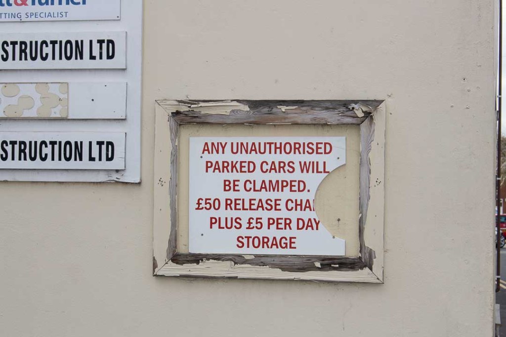
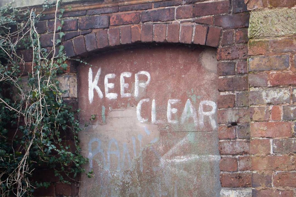

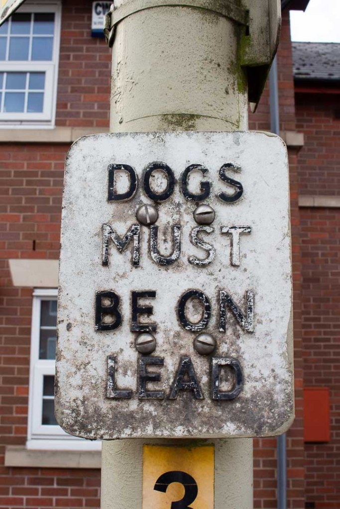


Birmingham
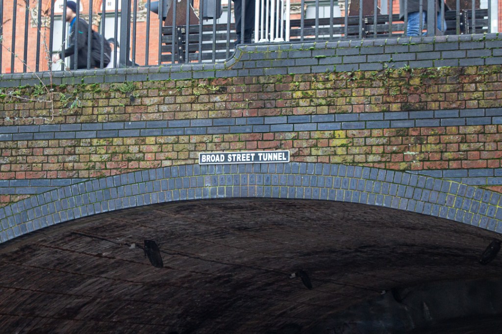
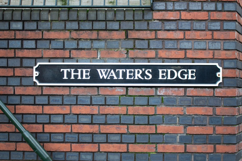
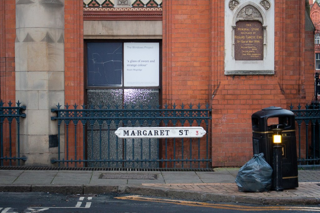
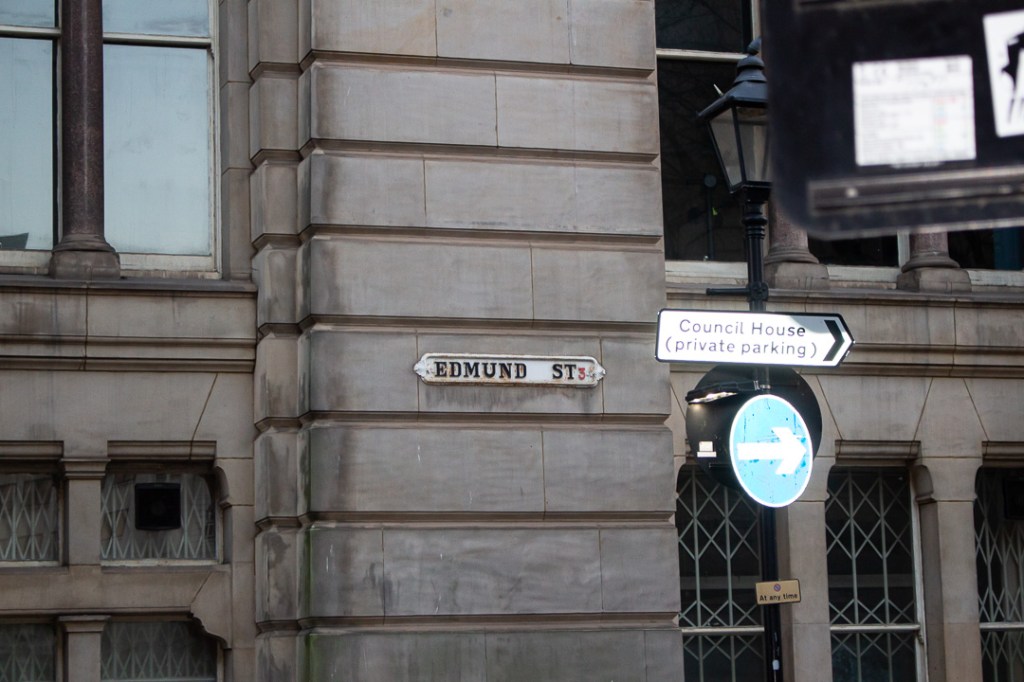
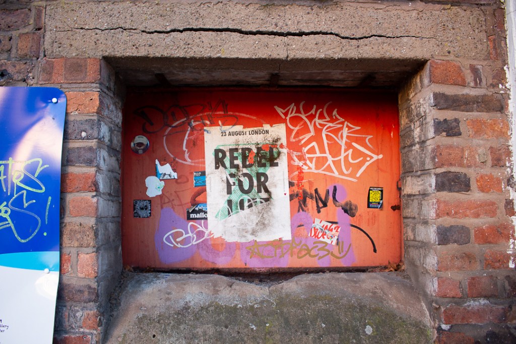
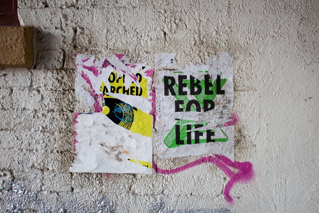
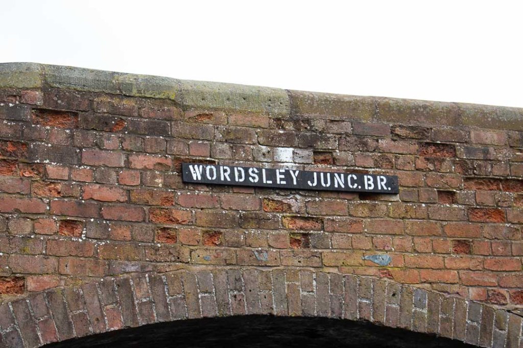
Street Signage
Black Country
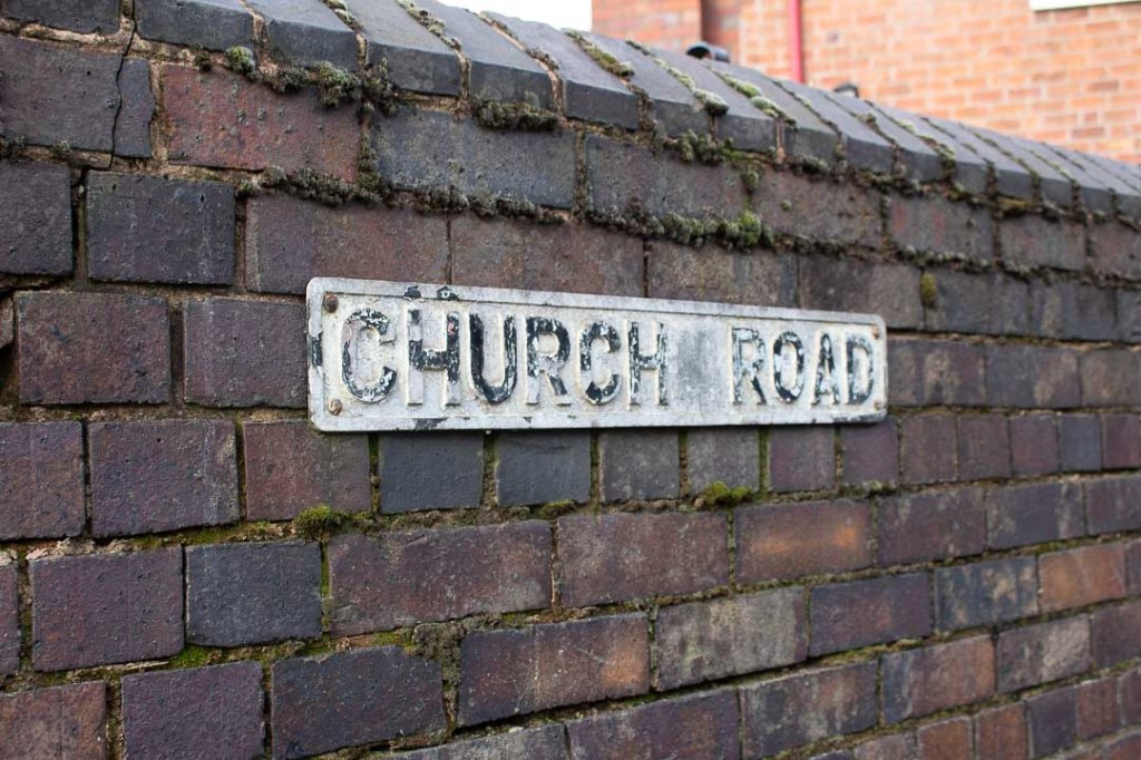

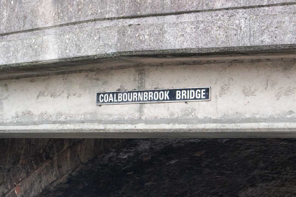

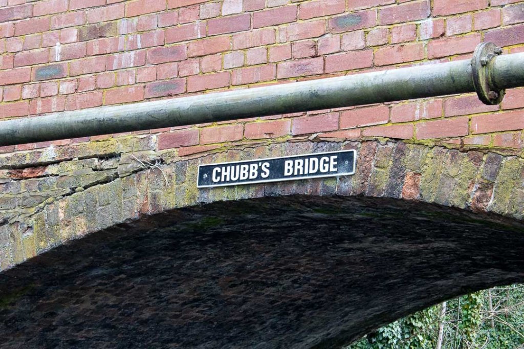

Birmingham

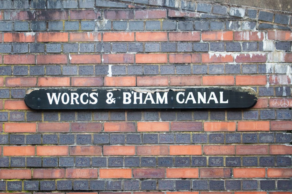

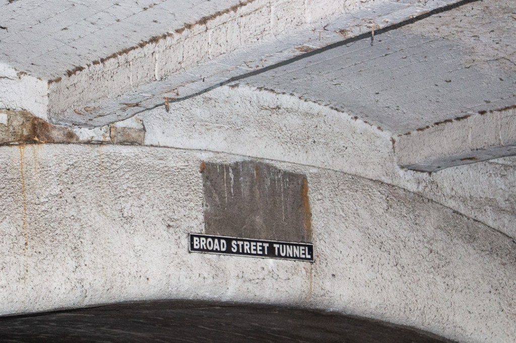


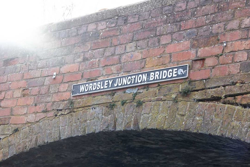
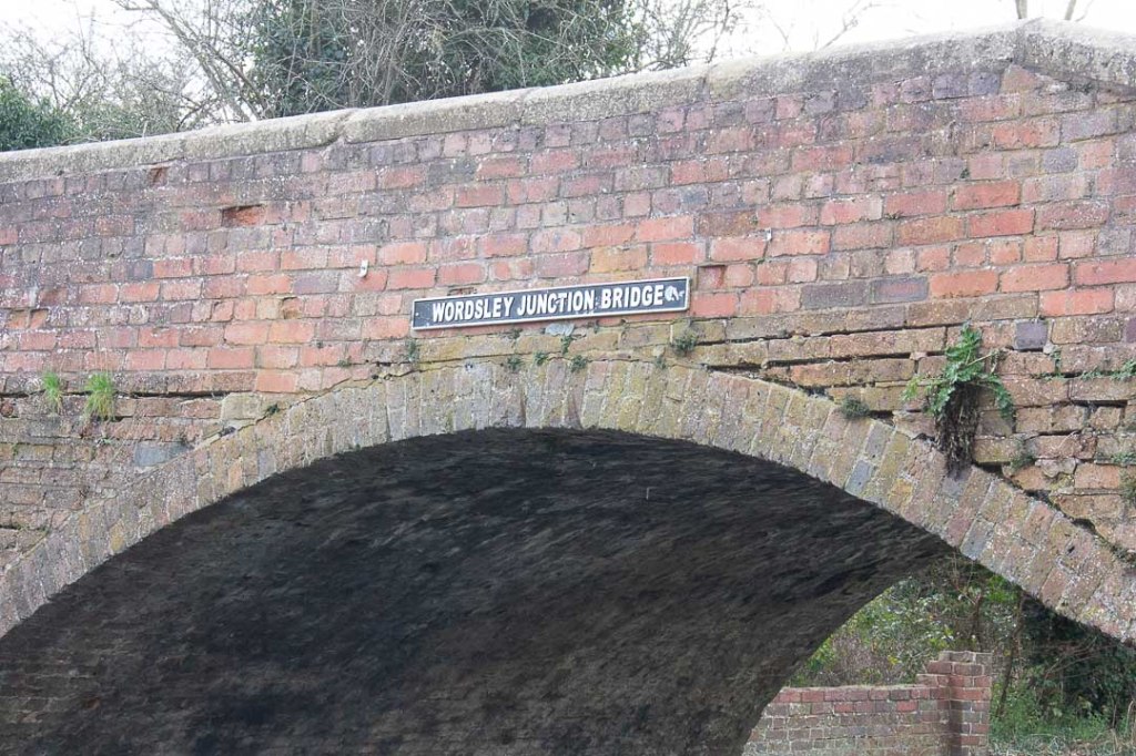
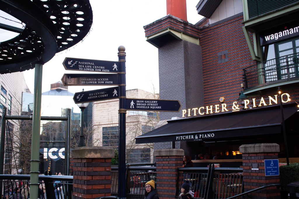
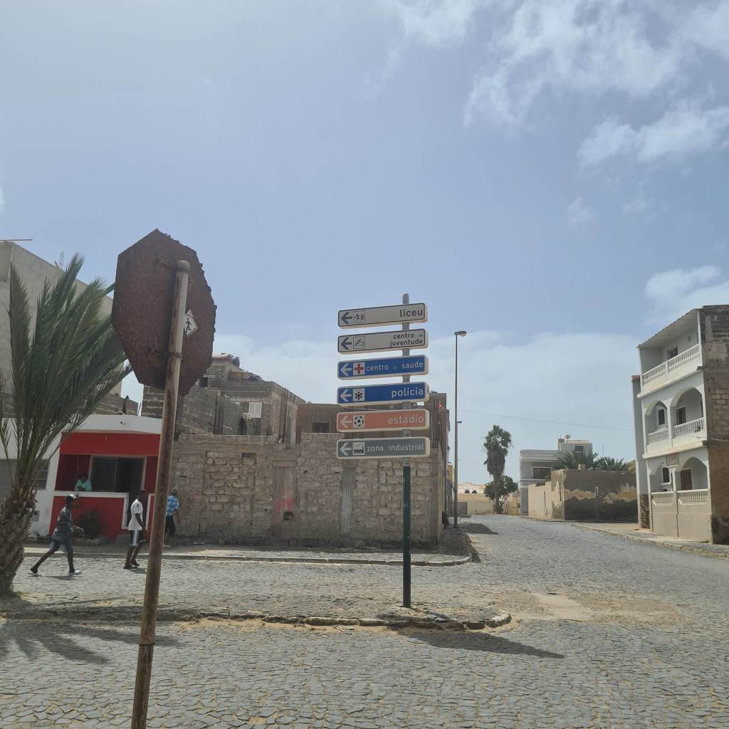
Way Finding/ Geographic Navigation
Black Country

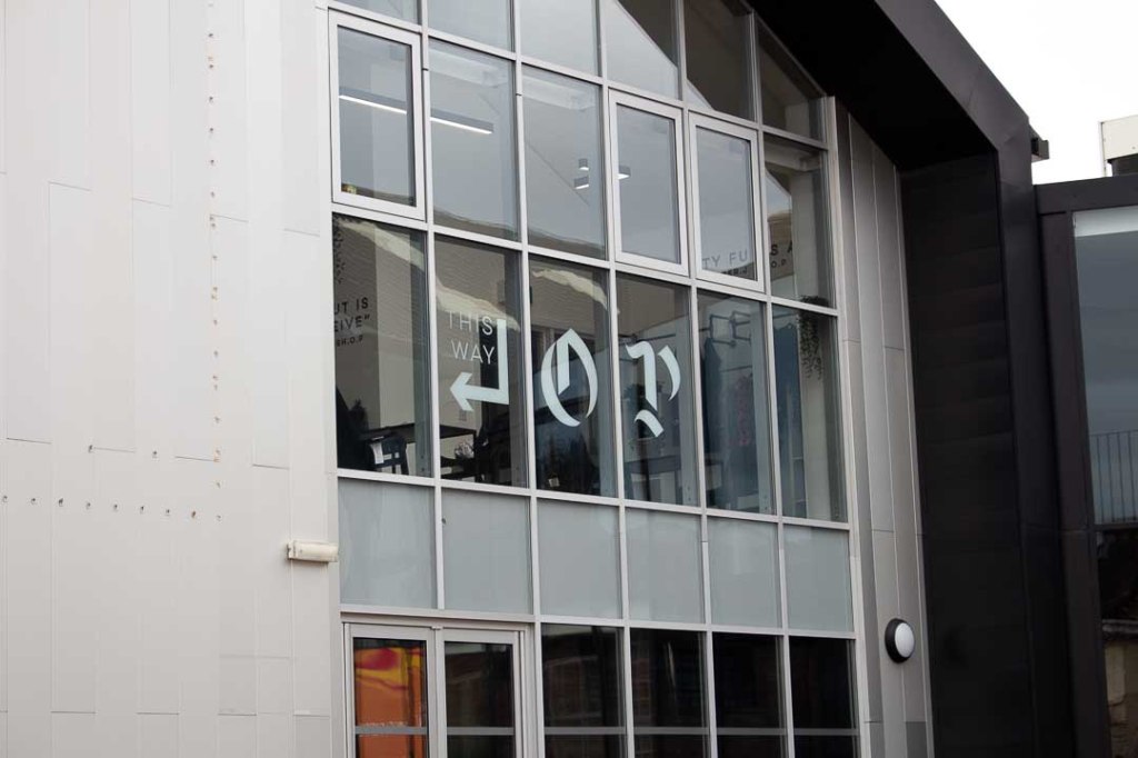
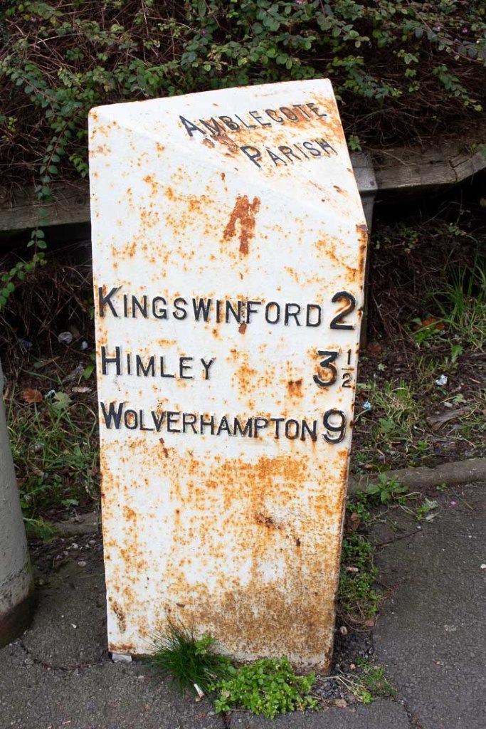
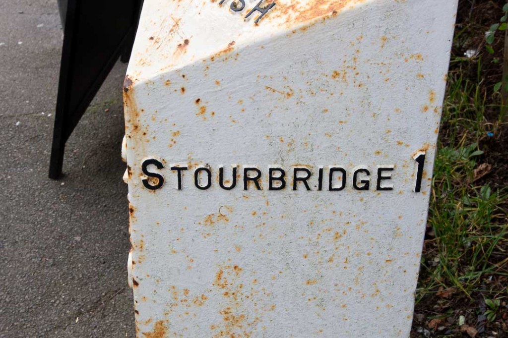
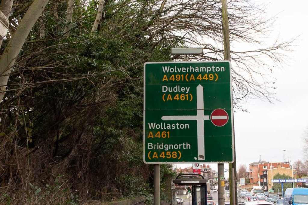
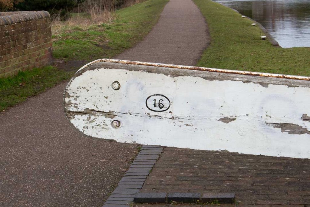

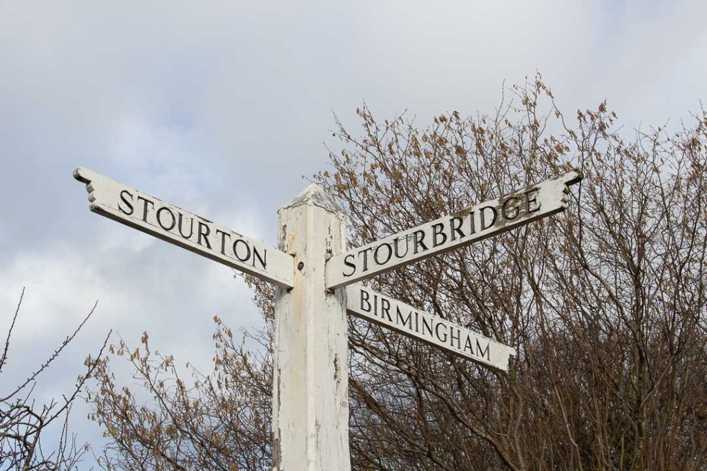
Birmingham

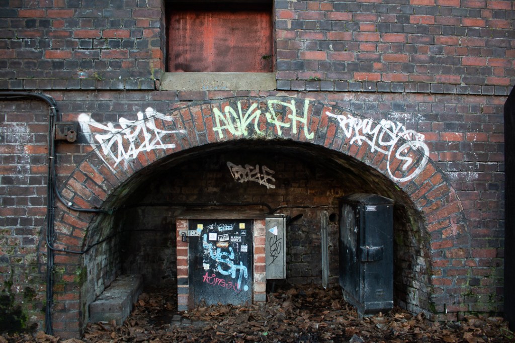
Weathered and Worn
Black Country


Birmingham
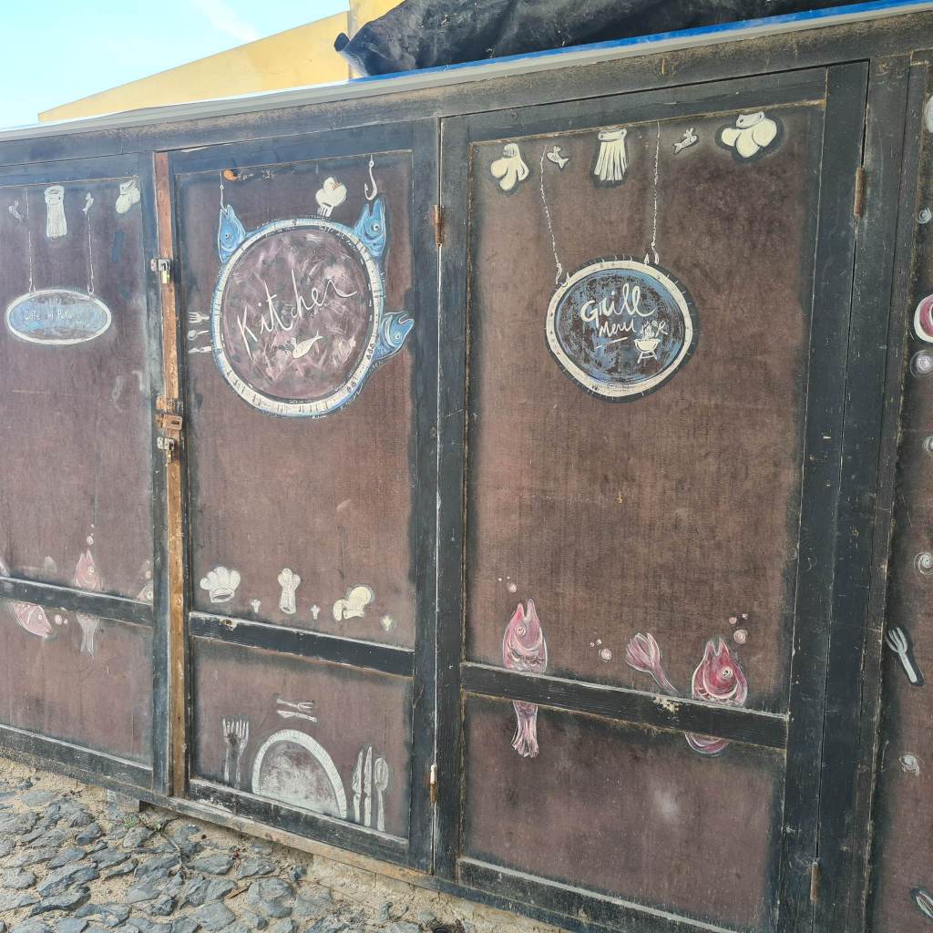
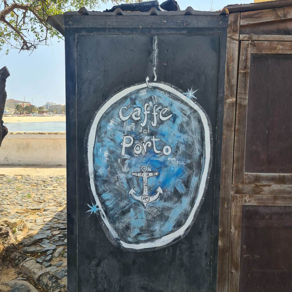
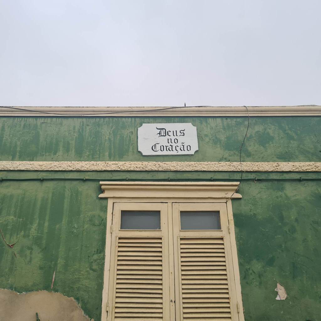
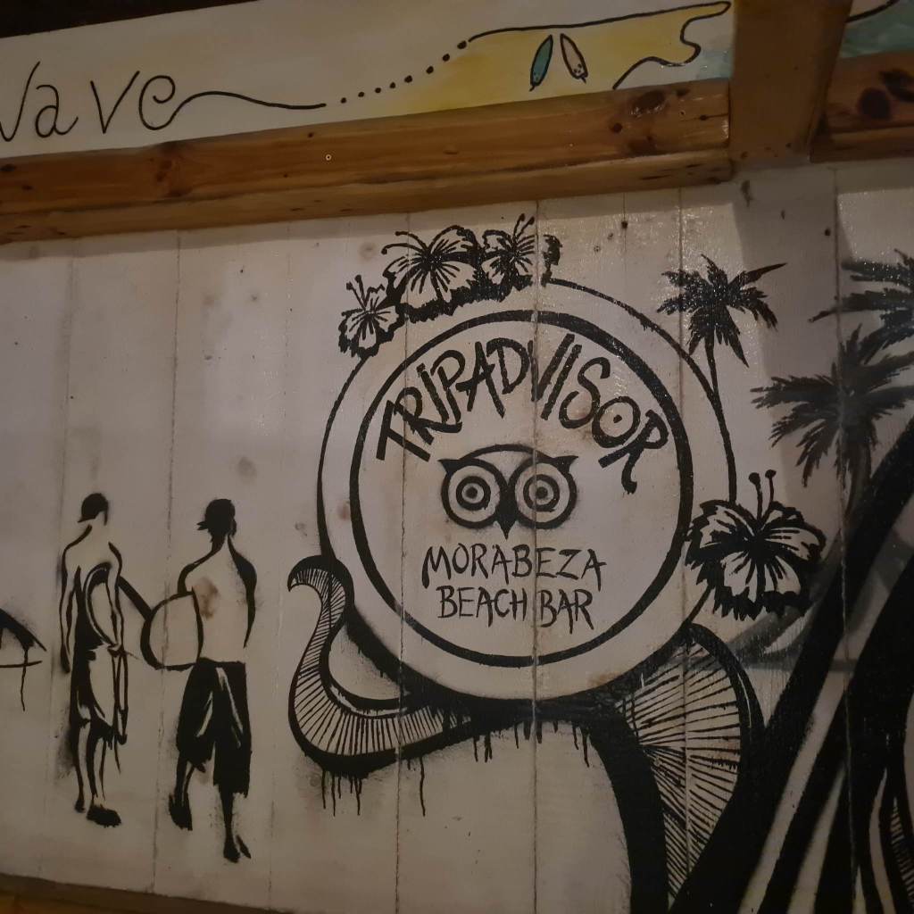
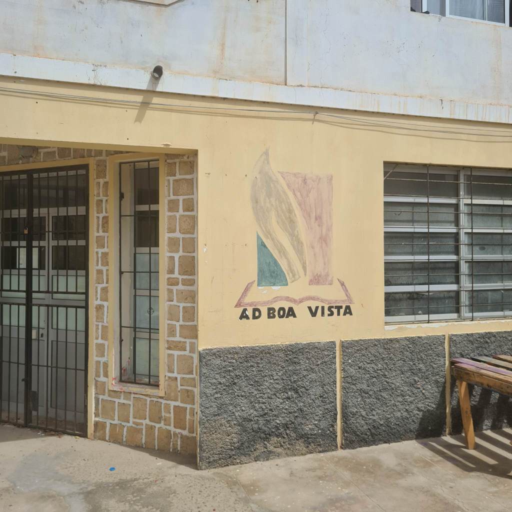
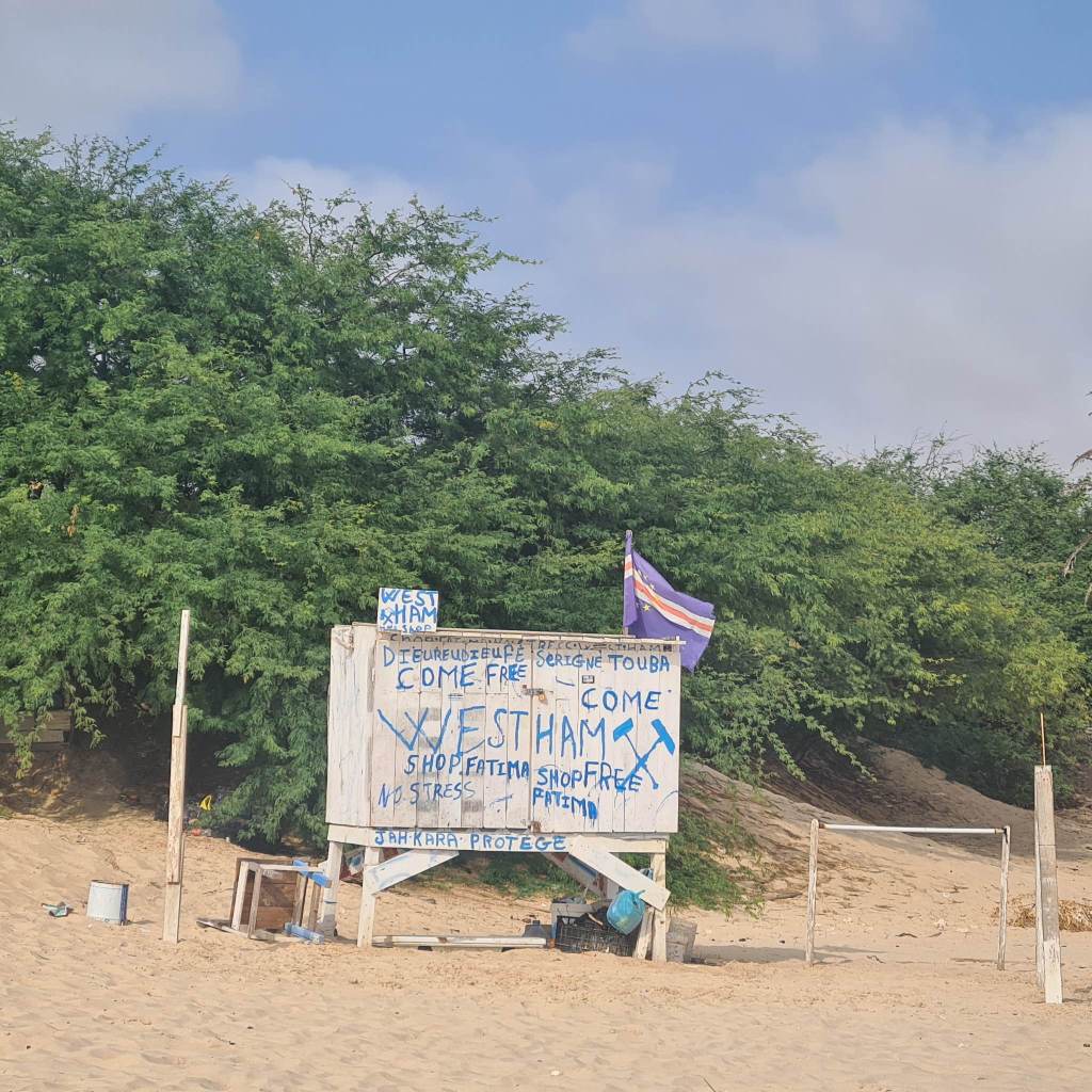
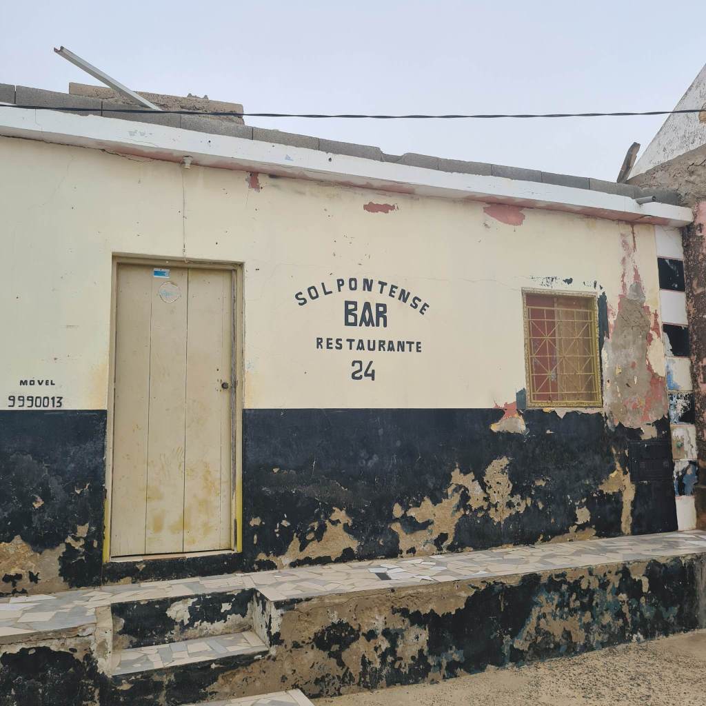
Further Research: Cape Verde, Boa Vista
Wayfinding


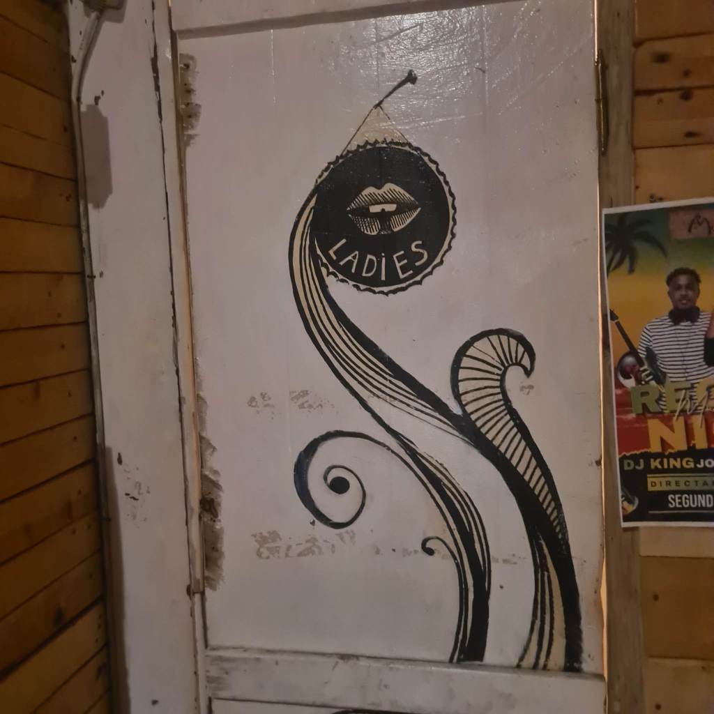
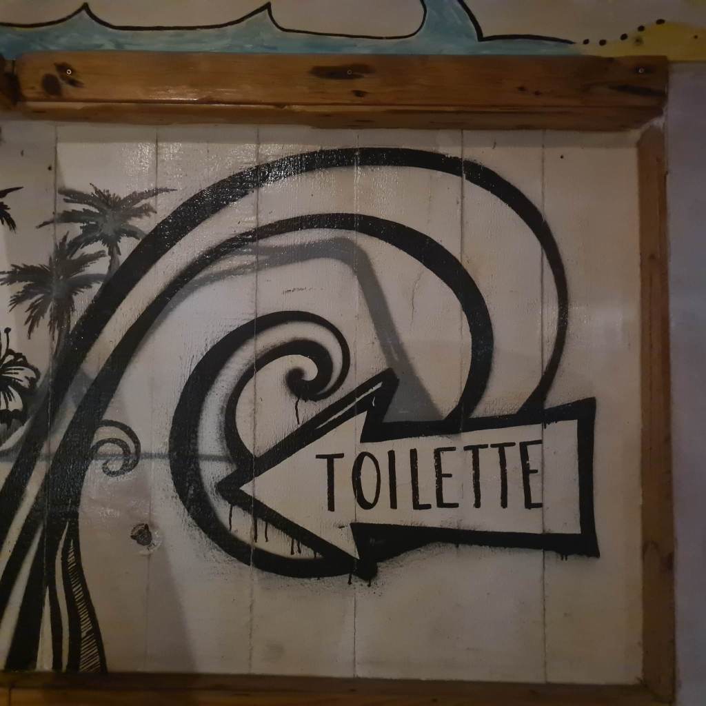
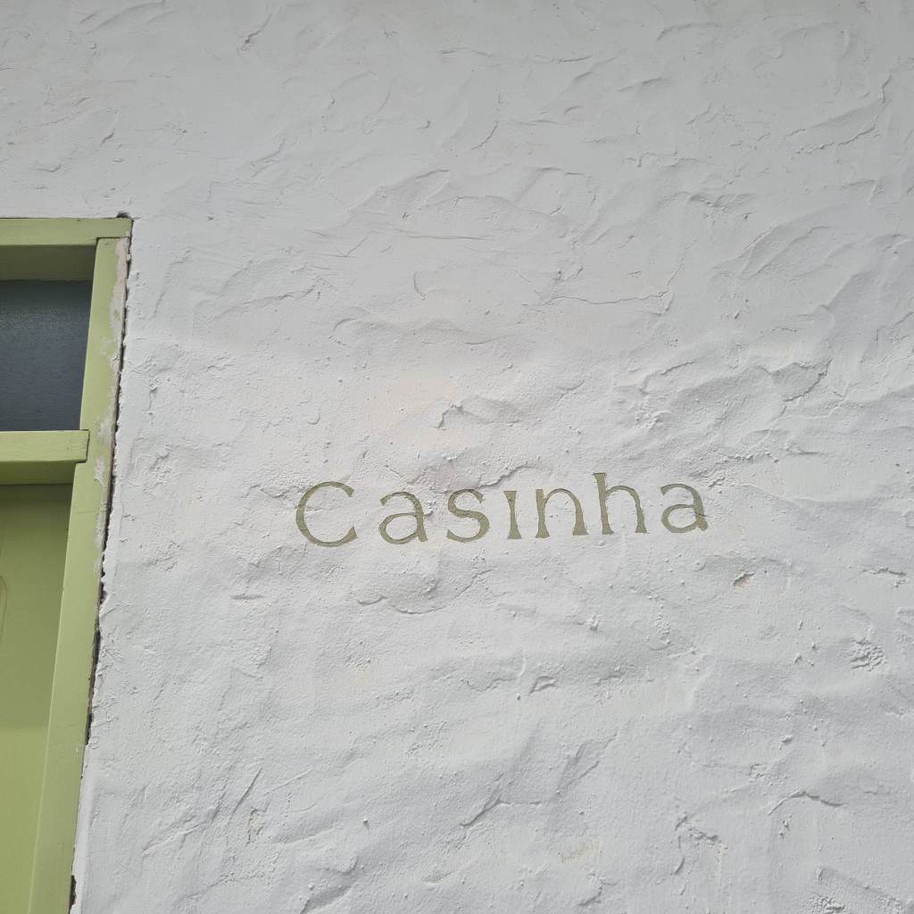
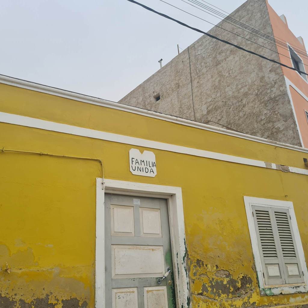
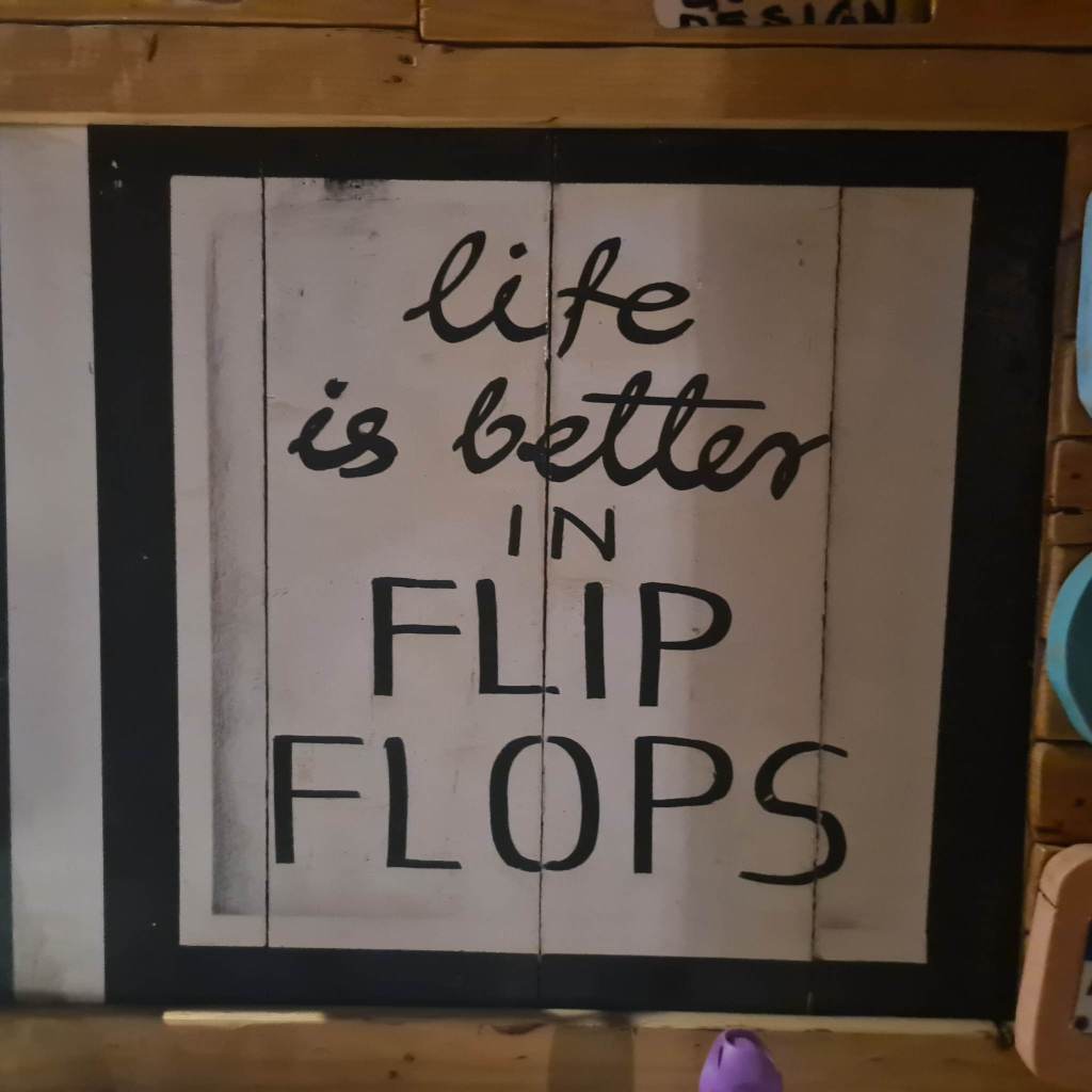
Hand Written/ Painted
Despite the economic and social issues facing indigenous communities, a rich array of hand written, illustrative signage communicates a cultural philosophy of optimism love and kindness. The local moto ‘No Stress’ is reinforced through various formats (see fig 3 and 4). Due to the island’s financial dependence on tourism, warm, welcoming and hospital messages in bold joyful colours seem to fulfil a role to satisfy vacationers’ needs to relax and detach from the pressures of consumer driven contemporary western society.


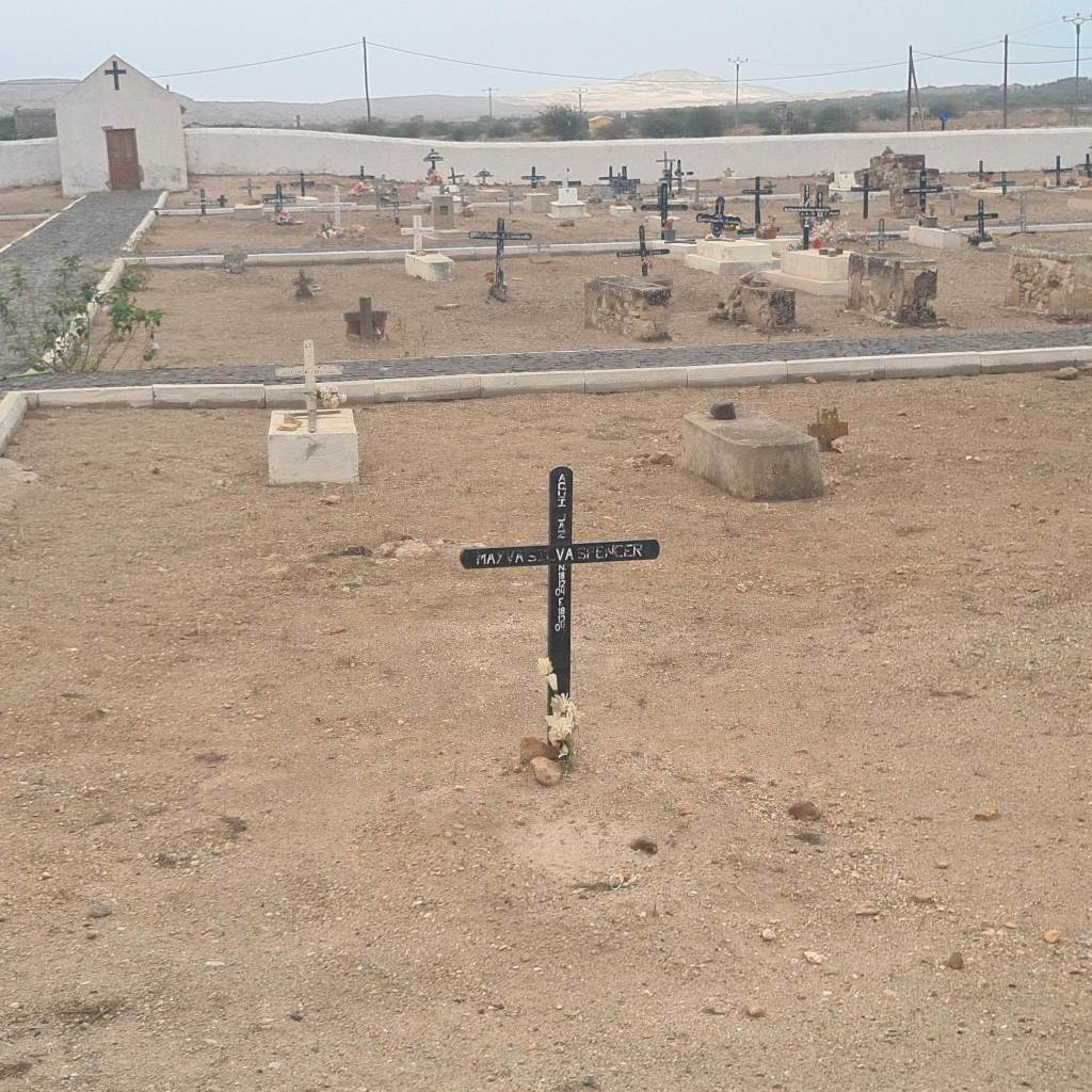
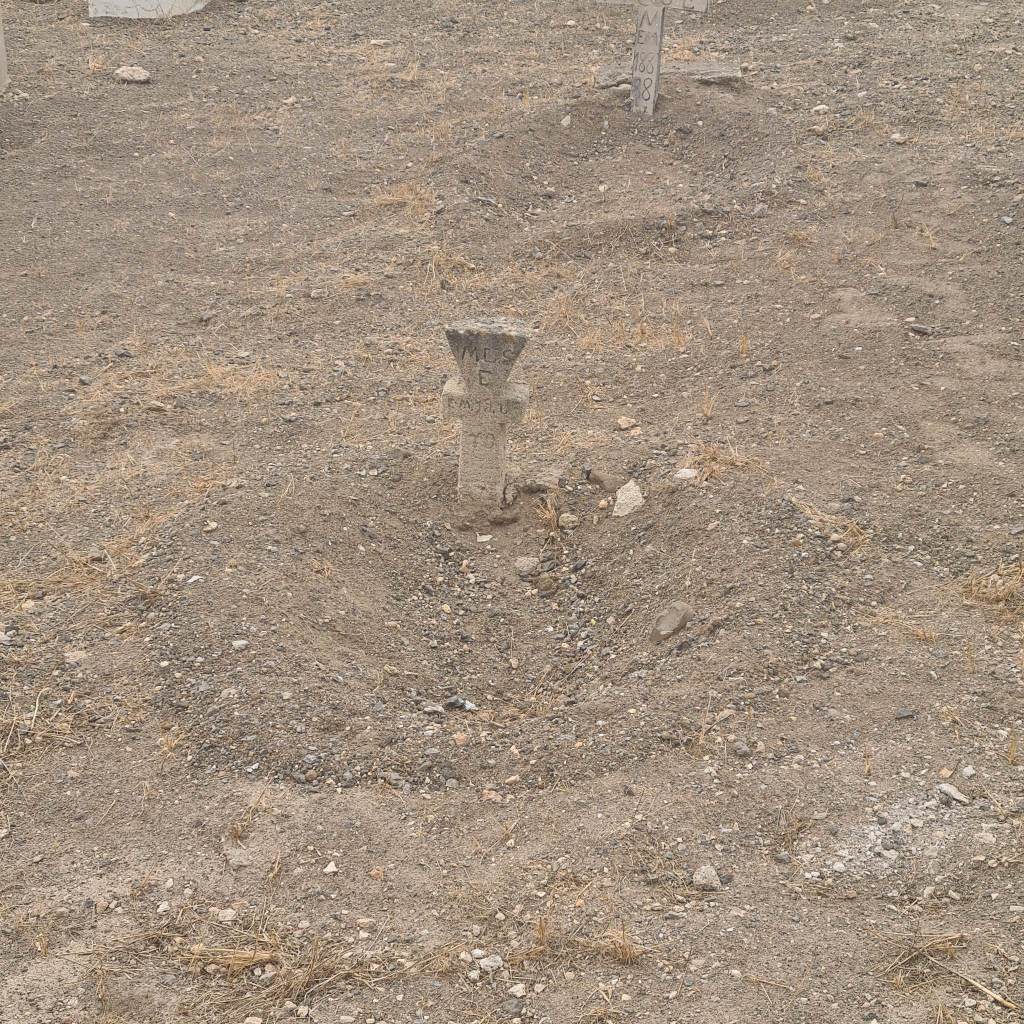
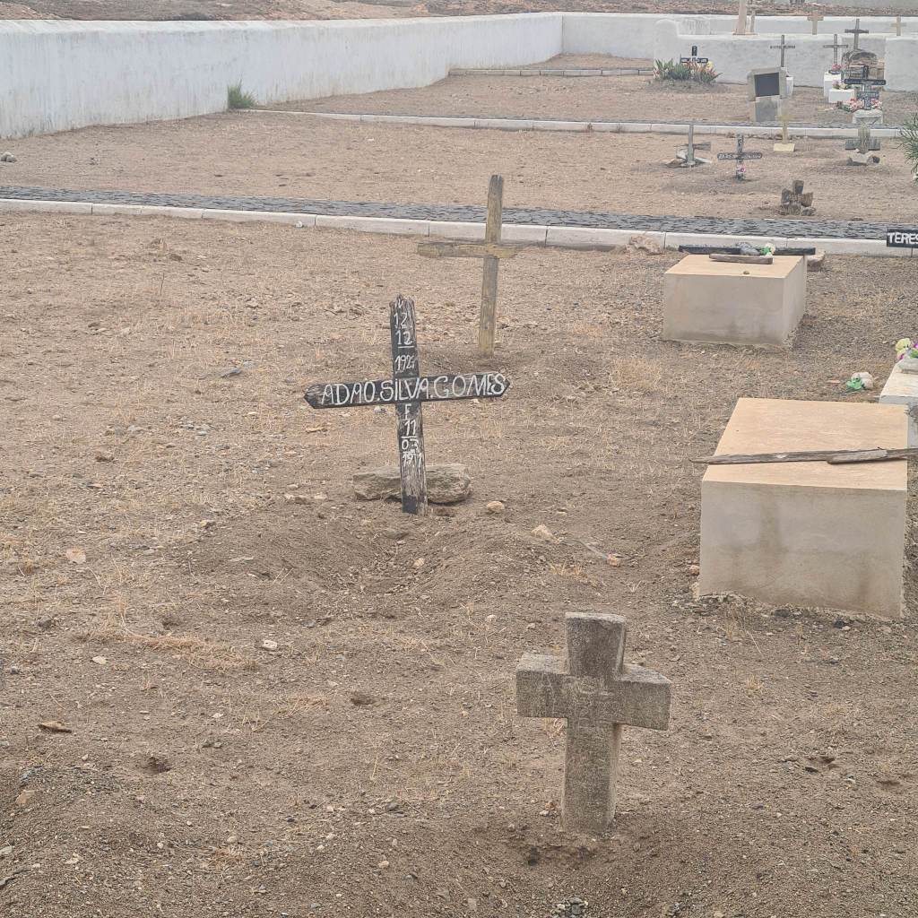
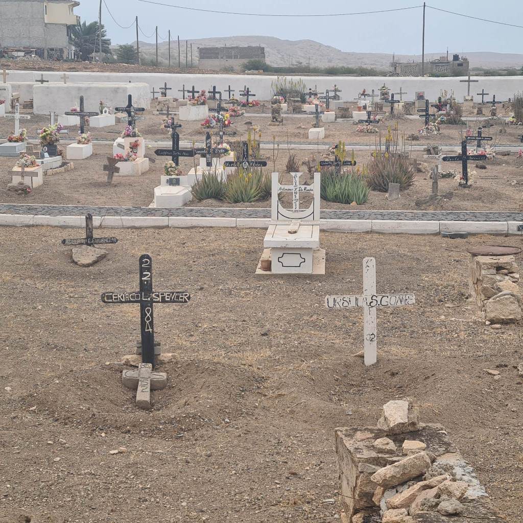
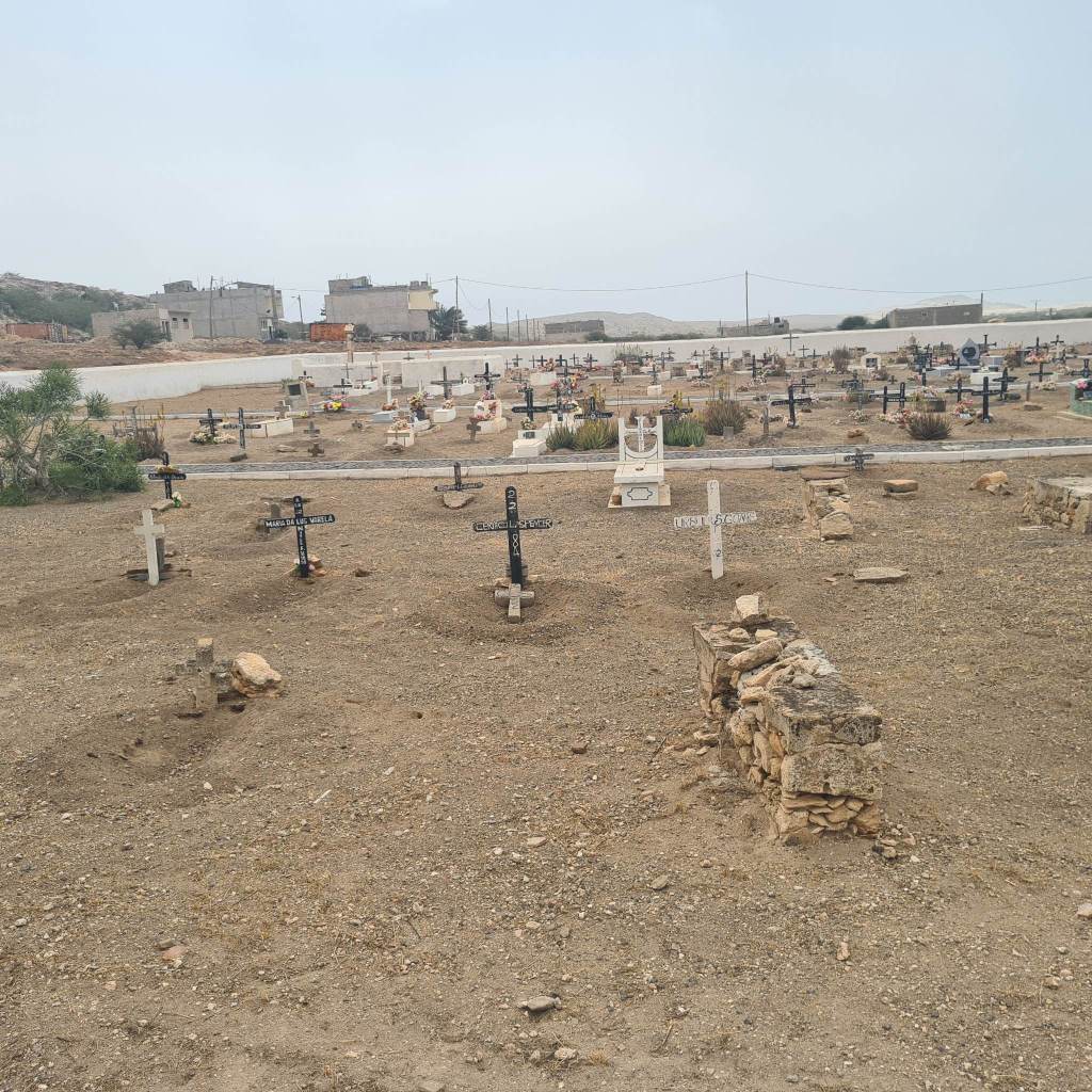
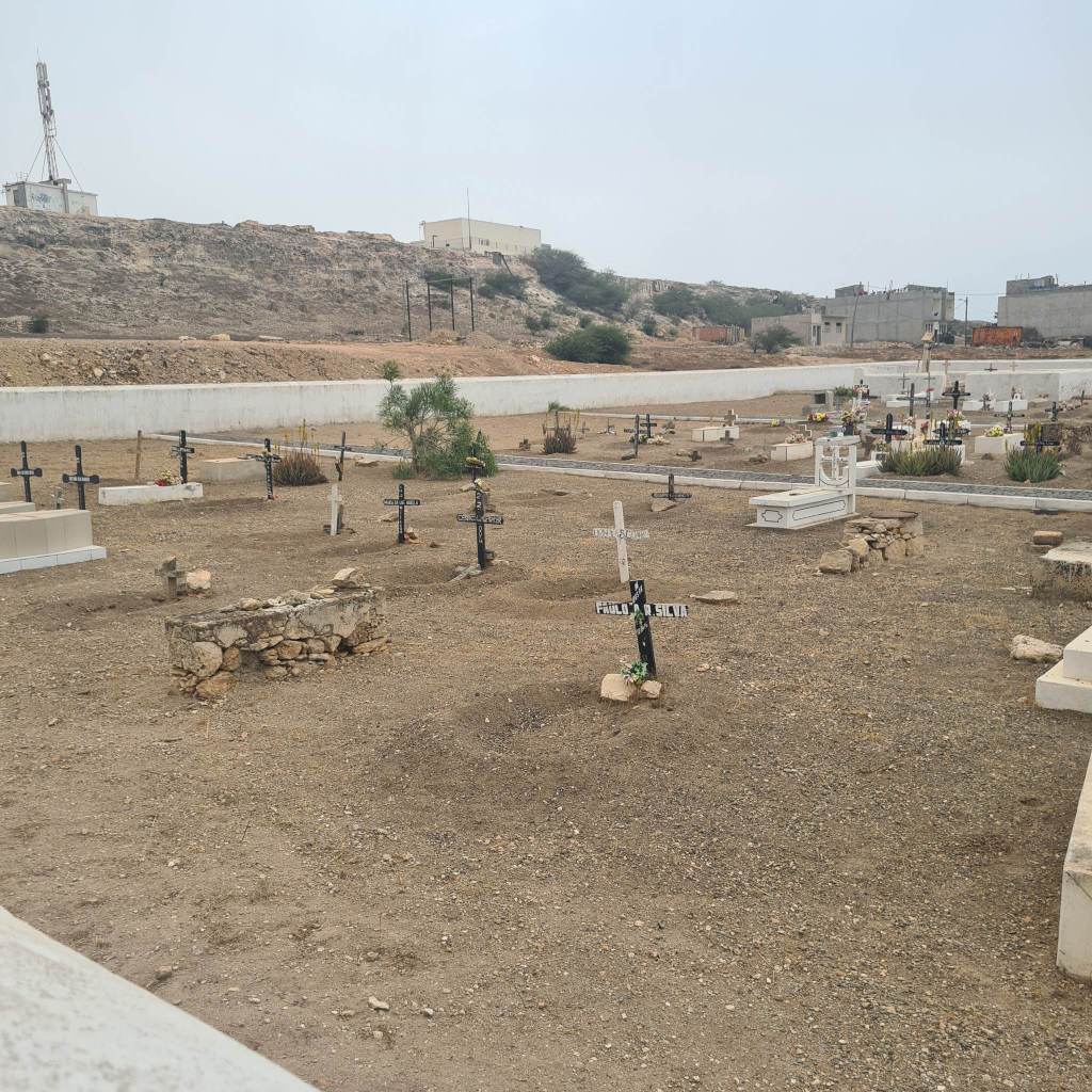
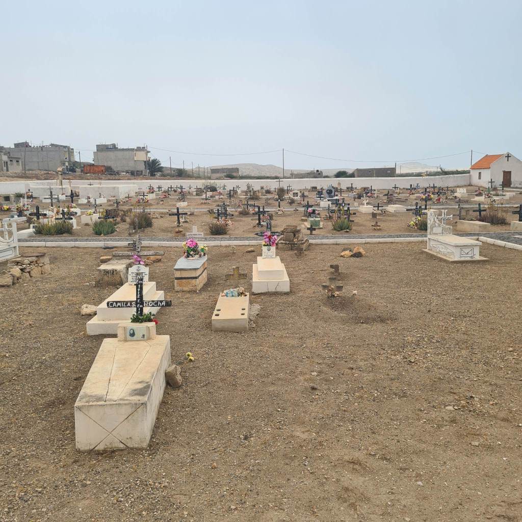
Grave Stones
During this module I had the opportunity to explore the typographical vernacular of Boa Vista, Cape Verde, a North Atlantic Island situated between Portugal, Brazil and West Africa. The country’s identity exemplifies its Portuguese and Brazilian cultural influences (mainly language and Catholicism) however there is also a strong drive to preserve its original West African heritage through the preservation of languages, traditional arts and historical artefact which educate tourists about the island’s mythology and the horrors of slavery.
In contrast to the longevity, resilience and grandeur of grave stones in The Black Country, the humble nature of these hand etched/ carved graves reflects the local inventiveness, resourcefulness and creativity in the midst of a lack of infrastructure, unemployment and a limitation of local manufacturing. They also to me represented the areas resilience and constant fight against environmental conditions of harsh dangerous seas, winds and draught which has socio economic consequences including a lack of resources and reliance on importation and tourism.


Step 2: Analyse

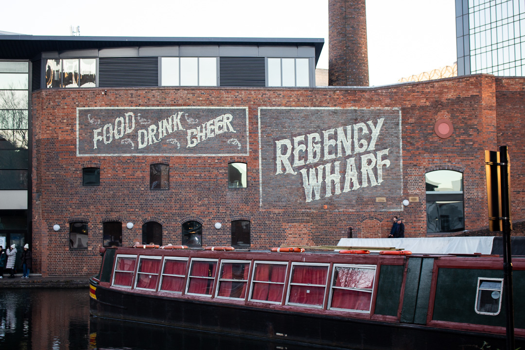
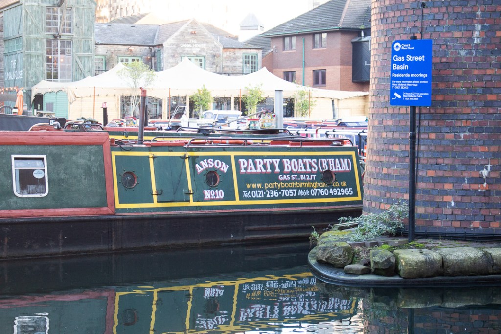
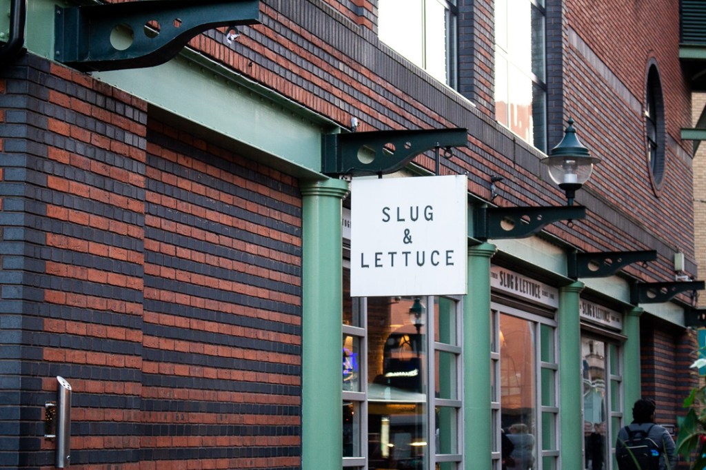
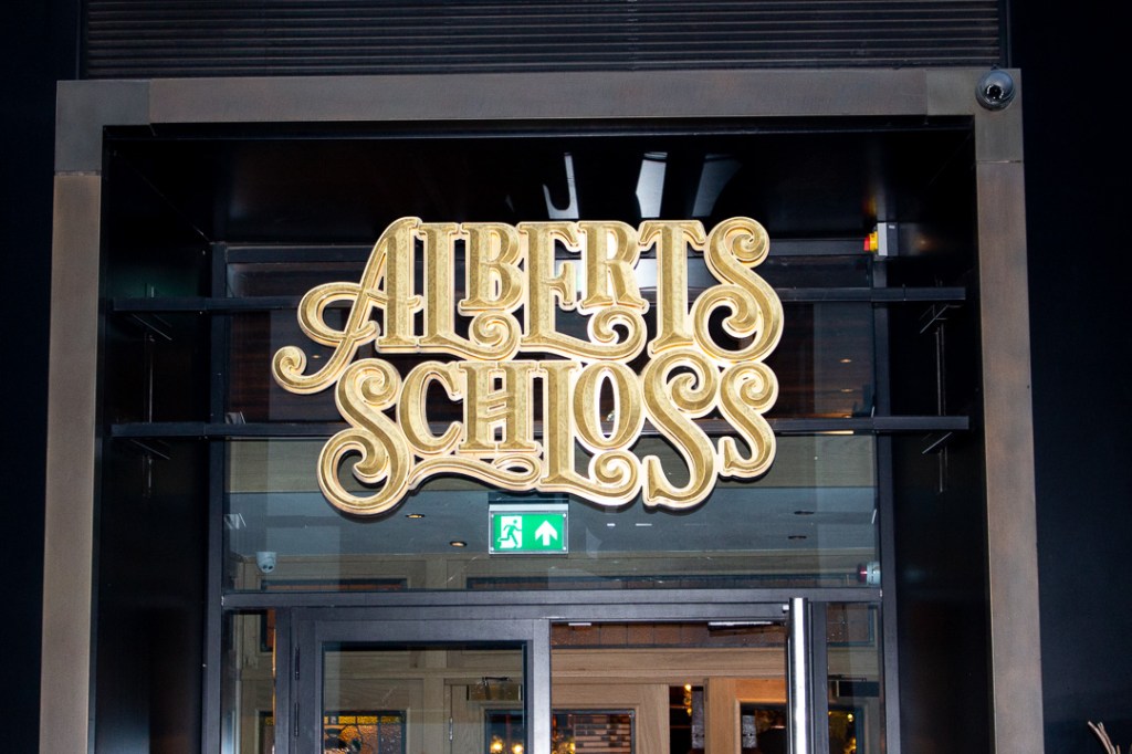
This typographic illusion to 19th-20th century hand painted ghost signage visually references the rich industrial heritage of Regency Wharf, now a prime leisure and office district. Ruggedly textured against course architecture, traditional hand rendered organic type forms juxtapose surrounding contemporary buildings and pristine signage, suggesting gentrification of an industrial urban space. Curvaceous serifs and slanted 3D type treatment reflects 19th century typographic styles and production methods, reinforcing historic urban identity. The types context overlooking the tranquil canal, with industrial roots as a busy trading system, creates a deeper atmosphere of cultural nostalgia and appreciation for the area’s history and functional evolution. Overall, this performs a role to promote the locations iconic cultural value to younger, professional, affluent audiences.

Analyse how effective the examples of type design communicate place and the of that area, and write a short (one hundred word) description for each letterform. Please consider its material make up, role, use and application, with regard to its location eg a weathered sign over a disused shop, which would suggest the changing fortunes of the high street, or the industrial letterforms in a new bar, which suggest gentrification.
Step 3: Upload
Upload your examples, description and exact location to the GeoType page on the MA Graphic Design website https://falmouth-design.online/geotype-submission/ (Links to an external site.)
The GeoType page is a space for you to post your collection of typography and lettering that you believe defines the identity of your hometown, nearest city or surrounding area.
- Log into: https://falmouth-design.online/geotype-submission/ (Links to an external site.)
- Enter the following password and click submit: magd
- Enter the exact location of your letterform. Please only select a verified Google address from the dropdown options available.
- Upload a photo of your selected letterform.
- Enter the 100 word analysis of your letterform into the space provided, to demonstrate how it effectively communicates a sense of place.
- Tick the ‘data’ check box.
- Click ‘submit’
- Repeat the above process for each of your 5 letterforms.
