Design Development | Interviews
Q: Please identify and explain a development process / activity where you had to evolve a
more revolutionary approach to solve a project.
Torsten Posselt, FELD
“Is the machine knowing all the information really the thing you trust? Is this more based on communication and the way you communicate?“
Torsten exemplified a revolutionary approach to Volkswagen’s open brief, reflecting beyond the product itself and focusing on how but how the product’s technological characteristics can emotionally resonate with humans through AI communication. In order to tackle challenges marketing autonomous driving, this human centred approach targets primitive needs for trust and safety, challenging the machines limitations to make the customer feel comfortable and safe through effective communication.
There was no given outcome so the process itself was the outcome…Not going for the straight line in the beginning but really going a little bit left and right and seeing what else is there, it is usually a good thing.“
Matthew Jones, Accept and Proceed:
Campaign to associate Canary Wharf as somewhere to live as opposed to just somewhere to work.
“We were finding it hard to land on the campaign line…the one thing we’re saying… we took all the articles written about Canary Wharf in the last 30 years and we fed all those into a computer and we made an algorithm that took all the verbs and the nouns out of these pieces and we made these commands, these statements. Every poster that was printed had a different headline on; all the moving graphics had this algorithm feeding in a different headline each time”.
Mathew Jones applies the principle of embracing risk and happy accidents in the revolutionary approach of allowing an algorithm to write headlines based on digital research archives (articles) and a design framework to compose verbs and nouns. The computer’s role in generating random combinations enables unique surprising compositions which go beyond the intellectual decisions of the individual designers.
Wouter Dirks, Studio Dumbar
Capturing music in visual design: Visual identity of Amsterdam Sinfonietta, a string orchestra:
“We developed a programme using processing where typography and form interacts with sound. We created this programme where depending on what the input was – it could be type, it could be form, it could be colour – it interacts with the music and it creates these really natural shapes and motion. Online and on video we used that motion but for the print material we captured a few of these screenshots in the middle of the motion.“
I really liked the sensorial dimensions of this project and the revolutionary way of using motion graphics to communicate the characteristics of sound into visual typographic forms. As my project is constructed around a core theme of nature and its physiological and psychological wellbeing benefits, Wouter Dirks projects has inspired me to consider visual outputs which communicate sensorial experiences of sounds, touch, smell, taste etc.
Design Indaba, (2014) Experimental Jetset on scavenging the ruins of Modernism
- Contrarian: Idea that you need to get something negative to get something positive
- A graphic language is first of all an actual environment and cultural landscape
- Guy Dabord – the derive: the society of the spectacle – urban drift
- Design in the country side – woodland? – ethics of design in natural spaces.
- What interests me is not the representation of reality – but the reality of representation
- Revealing methods of reproduction in printing – deconstructive art work to reveal the nature of the painting.
- Stanley Kubrich – stylised existential terror – relentless merciless aesthetic – space odyssey
- Modernism: impure – multitude of conflicting movement – reaction to modernity
- Provo – anarchist Amsterdam based movement – conceptual activism and speculative political proposals: empty banner –
- Tropicalia – constructivist art and concrete poetry – make fresh new forms of expression
- xxx – crosses ontop of each other Amsterdam – absorbing different meanings
- why? people trying
- “The world is basically on fire and billions of people are struggling to survive and we realise that design indaba is a conference of design thinkers, innovators, great communicators and people trying to find solutions to help humanity. And here we are a tiny studio maintaining a practice that at first sight consists mostly of extract word play, pop cultural references, conceptual gestures and aesthetic matters. How can we justify this, should we be justifying it at all?… Intuitively we do believe that somewhere in this whole heap of pop cultural reference and concept word play we might be able to come across something of a solution… something that might shift the way that people think, however subtle.
Critical Reflection
Experimental Jetset’s ‘w – why’ category of the alphabets of influenced resonated with my inspirations to focus on nature related wellbeing the associated cross disciplinary aspects of ecology and education. Experiental Jetset’s objective to “come across something of a solution… something that might shift the way that people think, however subtle.” reconnected me with my own practices motivations of social consciousness and ethical issues such as climate change and ethical consumerism. Considering the cultural context of climate awareness and increasing activism within younger audience, this gave me more conviction in my chosen design direction which aspires to connect a younger generation with nature, both physically, emotionally and spiritually through historical, cultural references which personify elements, plants and animals and create a meaningful narrative around nature for children to positively engage with.
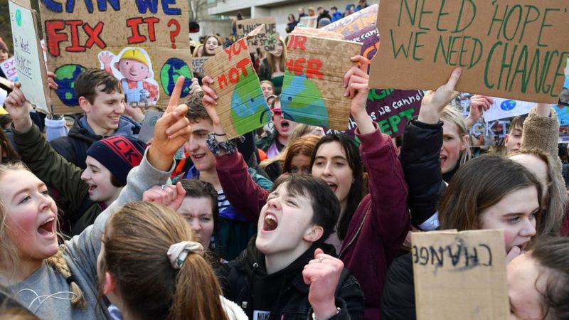
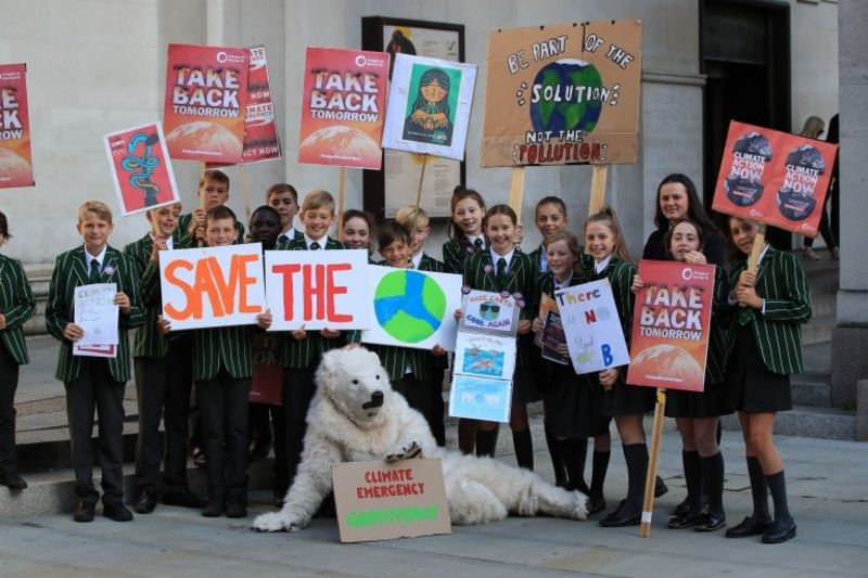
https://www.bbc.co.uk/newsround/49766020
Nicer Tuesdays, (2019) Nicer Tuesdays: DIA Studio
Critical Reflection:
Mitch Paone’s analysis on kinetic identity inspired me to further explore the conceptual principles of motion graphics, particularly after reflecting on my projects requirement to emphasise the sensorial dimension of the natural world inspired by Wouter Dirks’ visual identity for Amsterdam Sinfonietta, a string orchestra, in which he used motion graphics to communicate the sense of sound through visual design.
Paone’s notion of interconnectivity and conditions emphasised that identity is holistically informed by a vast range of cultural, historical, social and conceptual contexts. The zebra was given as an analogy for evolving identities with multifaceted, nuanced influence. This idea can be applied to the dynamic energy of moving objects, and the application of cross disciplinary principles of physics, sound, music and choreography within the context of graphic design to inform identifiable languages of movement.
For instance, in examples of the caterpillar and the snake, the physical limitations of certain species inform their unique style of movement which can be communicated when applied to other forms such as typography. Although I have some basic experience in motion graphics this inspired me to go beyond my comfort zone and explore in more depth technical tools and animation principles in order to create original graphic expressions which commicate the natural world.
Ideas for further exploration:
- Wind
- Water
- Animals
- Insects
- Seasons: snow, falling leaves.
“we have to evolve the tools we use … to deal with the current state of communications “

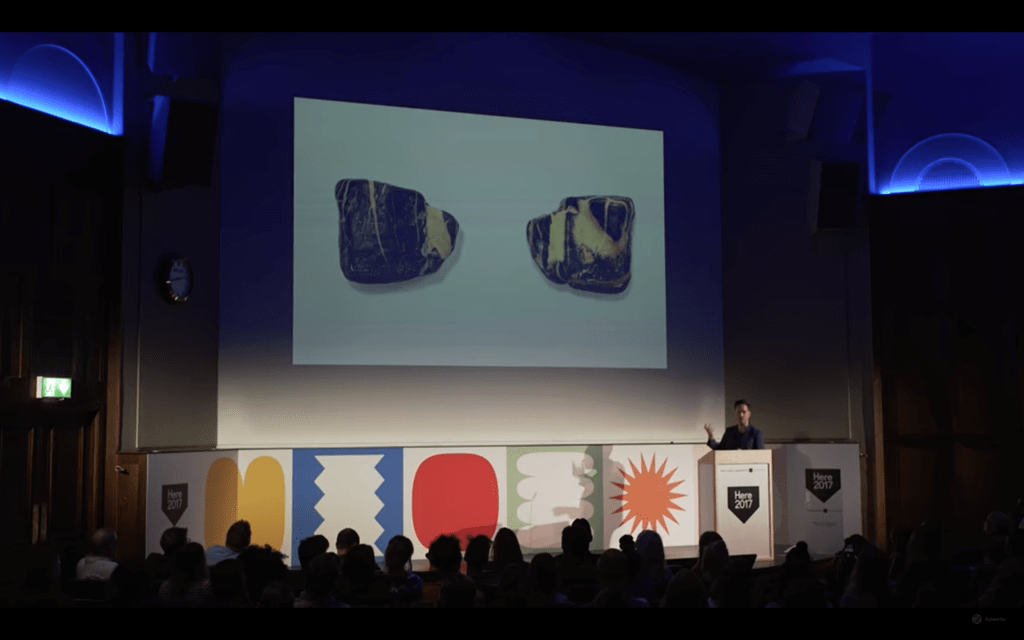
Here, (2017) Here 2017: Triboro. Available at
David Heasty’s focus on the relationship between communication and ambiguity appealed to my experience of studying fine art (BA Hons) and my interest in the boundaries between fine arts ambiguity and designs function to traditionally communicate information. Concepts such as soul and ‘invisible design’ inspired me to interrogate and re-evaluate the aesthetic and conceptual approach of my social consciousness project and its core emphasis on natural engagement. Although my mission statement has a functional emphasis on exposing young people to the physical wellbeing benefits of nature based experiences, I’ve also developed an interest in creating a deeper emotional connection with the natural world in order to foster ecological responsibility and appreciation within the younger generation for social good.
With regard to the creation of ‘meaning’ and ‘soul’ within design, Heasty’s study of primal influences such as cave paintings and early human symbols/ glyphs encourages me to consider how personality can be infused into forms with no explicit interpretable information and emotion can be generated in design through contexts such as music packaging.
Furthermore, the notion of “invisible design” provides a unique process, exploring intuitive human responses to formations created in nature which can not be intellectualised into being by the designer. Heasty’s rock, which at one sider resembled a bear and on the other, a dog, reminded me of research images exemplifying the ‘law of farmiliarality’ in M1, Wk 5 which examines the human inclination find familiar images such as faces in natural ambiguous forms.
Considering the creative imaginative aspect of play within nature as the core aspect of my design strategy (informed by the trend ‘Edu-play-tion’), the idea of personifying natural beings and forces occurred to me as a means to create a deeper spiritual connection with nature. This also inspired me to challenge preconceived notions of the desired design output and explore alternative processes than traditional illustration in order to create a unique innovative response.


Nicer Tuesdays, (2018) Nicer Tuesdays: Mahaneela.
- Dichotomy of Identity: “I’m not supposed to be here”
- “Jack of all trades and a master of none”:
- In the global marketplace, is it necessary to wear many hats and be a Jack of all trades?
- Smashing the box – embracing multifaceted creative outputs
- The main concept of Mahaneela’s talk gave me more conviction to embrace my fine art background and explore the ambiguity within design in order to initiate diverse, intuitive, emotional responses to visual design.
Further Reflection
Harriet’s Lecture: Brand story and hero’s: an identity which personifies natural elements, plants and animals in order to engage younger people with nature. Nature is the hero, climate change and pollution is the obstacle. Humans are the hero and the obstacle as human activity is detrimental to the environmental health which causes lack of opportunities to experience wilderness which causes wellbeing in humans. The focus of this project could in turn reframe a younger generations relationship with nature, and establish a positive sense of ownership and empowerment regarding our role within nature.
Lecture:
- Taking a break
- Celebrating Imperfection: Wabi Sabi
- Embracing accidents: Stanley Donwood: ‘We almost removed human agency from the painting process. It was like setting up an experiment and seeing what happened’.
- Stephen Gill: exposes prints to the natural environment:
- Michael Cina: Buring processes
- David Nash: Wooden boulder: studio in wales: manipulating nature: transitory processes
- The Crazy Eights: fold paper into 8 sections – set timer for 8 minutes – sketch new idea every 8 minutes.
- scampeR. a series of provocations which help innovation by looking through different lenses: 7 types of questions – substitute, combine, adapt, modify, put to another use, eliminate, rearrange.


Critical Reflection
On reflection of feedback regarding the practicalities of implementing the design in the context of formal education, I found it difficult to manage the political and financial restrictions in way that would enable me to produce something innovative and meaningful. I also found that the specialist criteria for certain key stages made it difficult to design for such a narrow target audience with specialist requirements. For instance, I had to balance simplicity and accessibility with necessary challenge to aid curriculum-based learning outcomes. Having researched content resource providers such as Twinkl (n.d) as suggested by Ian Prior (PGCE student and Freelance Outdoor Educator) I realised that the specialist education aspect of this direction might require further extensive research and expertise which due to the time constraints of the project, I might not be able to conduct and do the project justice. Also having discussed current teaching material with Ian Prior, I found that many of my ideas regarding narrative-based learning and personification of animals and natural elements were already in practice and hard to compete with (For instance Ian Prior was currently leading reading and comprehension lessons based around animal-based books such as Roald Dahl’s Fantastic Mr Fox).
Reflecting on my original project brief which specified a target audience of ‘children and parents’ in response to the Future Laboratories ‘Edu-play-tion’ trend (which emphasised both children and parents feeling they no longer had time to ‘play’) I decided to revise my design direction in a way that was more inclusive of the relationship between children and parents, independent from the restrictions of mainstream education. This resulted in an idea for a community run activity based mental health initiative which would enable me to explore more original and experiential ways of implementing natural wellbeing practices through a more democratic context.
References
TWINKL. n.d. ‘Awe and Wonder Science Activities’. Available at:https://www.twinkl.co.uk/ [accessed Dec 2021].
Dahl, Roald. 2016. Fantastic Mr Fox. London, England: Puffin.
Concept Development