Lecture: Typography, Type and Press
Critical Reflection
This lecture got me really interested in the historical influences of type and press. Having previously studied English Language and standardisation through innovative printing processes, I was particularly interested in the early stages of medieval scribe rooms where manual typographic processes were used to communicate religious ideas. Being interested in medieval, renaissance and gothic art, this inspired me to conduct more research into typographic examples from these periods in an effort to understand how they might inform contemporary aesthetics and my own visual language.
Further research: Thinking with type, A Critical Guide for Designers, Writers, Editors and Students, Ellen Lupton 2004.
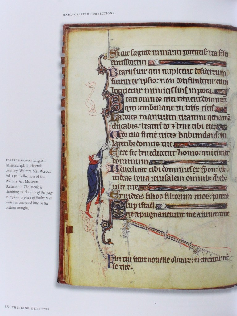
An interesting example of inventive methods of editing, fixing errors as well as type classifications, illustrative lettering and enlarged capitals.


Baines, P. and Haslam, A., (2005) Type & Typography . London: Laurence King.
Critical Reflection
The 4 main approaches to design outlined in Type and Typography empowered me to explore the conceptual and expressive approaches. As my developing visual language is informed by my experience of fine art, the conceptual approach’s emphasis on ‘the big idea that encapsulates the message’ appeals to the interrogative instinct to reveal overarching messages and meanings. However, as this approach is reliant on ‘designer and audience sharing the subtlety of wordplay’ the expressive approach seems to have more relevance in it’s exploration of the subconscious, through mark making and symbolism to ‘emotionally reposition the viewer’.
Absolute clarity is not always the intension here: the design approach is impressionistic, poetic, and lyric, inviting the view to reflect on the content.
Kubel, H. and Williams, S., (2015) Type: New Perspectives in Typography London: Laurence King.
Critical Reflection
A practice of possibility: ‘hybrid hyphenated practice’ eg type image, type sculpture inspires me to explore a multidisciplinary approach to the workshop challenge. This also raises questions regarding the technical limitations and appropriacy of certain environments.
I was really interested in the topic of production informing style raised in this material (for example, book typefaces being thicker in order to accommodate rough papers of the time) as this gave me a wider cultural appreciation of evolving typographic aesthetics. The emphasis on using type to create ‘cultural resonance’ rather than simply a ‘fashionable visual statement’ similarly encouraged me to apply critical understanding of cultural and historical contexts to new projects. During this week’s workshop challenge, I’d like to explore the root/ essence of the extracts original style in a way that communicates the poems enduring relevance within a contemporary aesthetic environment.
Workshop Challenge
Research and Planning
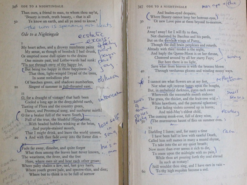
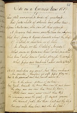
Following on from last weeks challenge, I wanted to continue working with romantic inspired themes of nature and the sublime. During the research stage I was torn between 2 poems which explored relevant ideas, Ode on a Grecian Urn by John Keats (1820) and Tyger Tyger (1794) by William Blake.
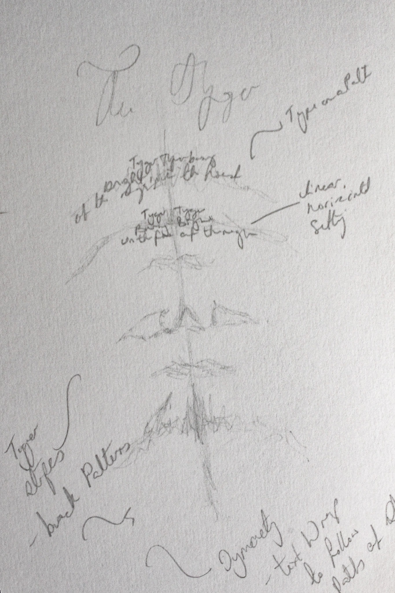
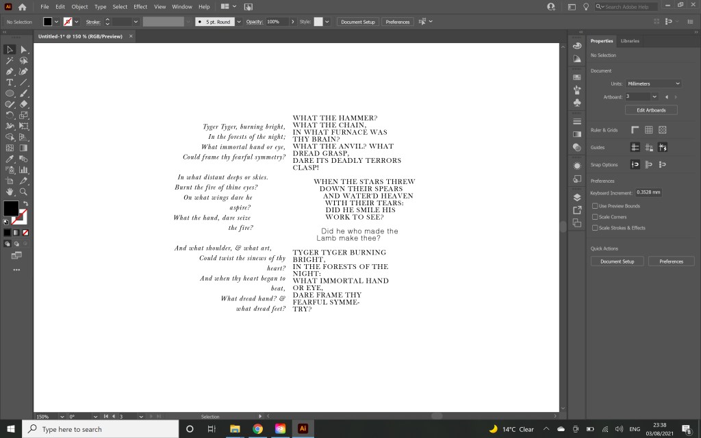
Tyger Tyger (1794) interrogates the creation of universal dualities, symbolically contrasting the Tyger’s awe inspiring power and capacity for destruction with the innocence and vulnerability of the lamb. Considering ideas explored last week in A Philosophical Enquiry into the Origin of Our Ideas of the Sublime and Beautiful by Edmund Burke, this juxtaposition represents the conflicting emotions of terror and astonishment which characterise the sublime. It can also be interpreted to represent other dualities inevitable to the human condition such as joy and suffering and life and death. Considering last weeks technical execution, this poem seemed like a good opportunity to develop a line of work exploring duality.
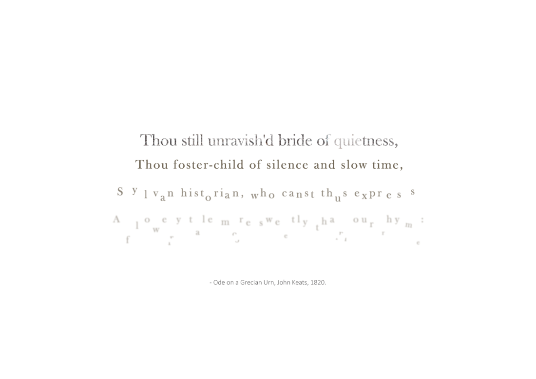
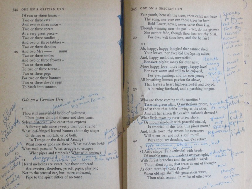
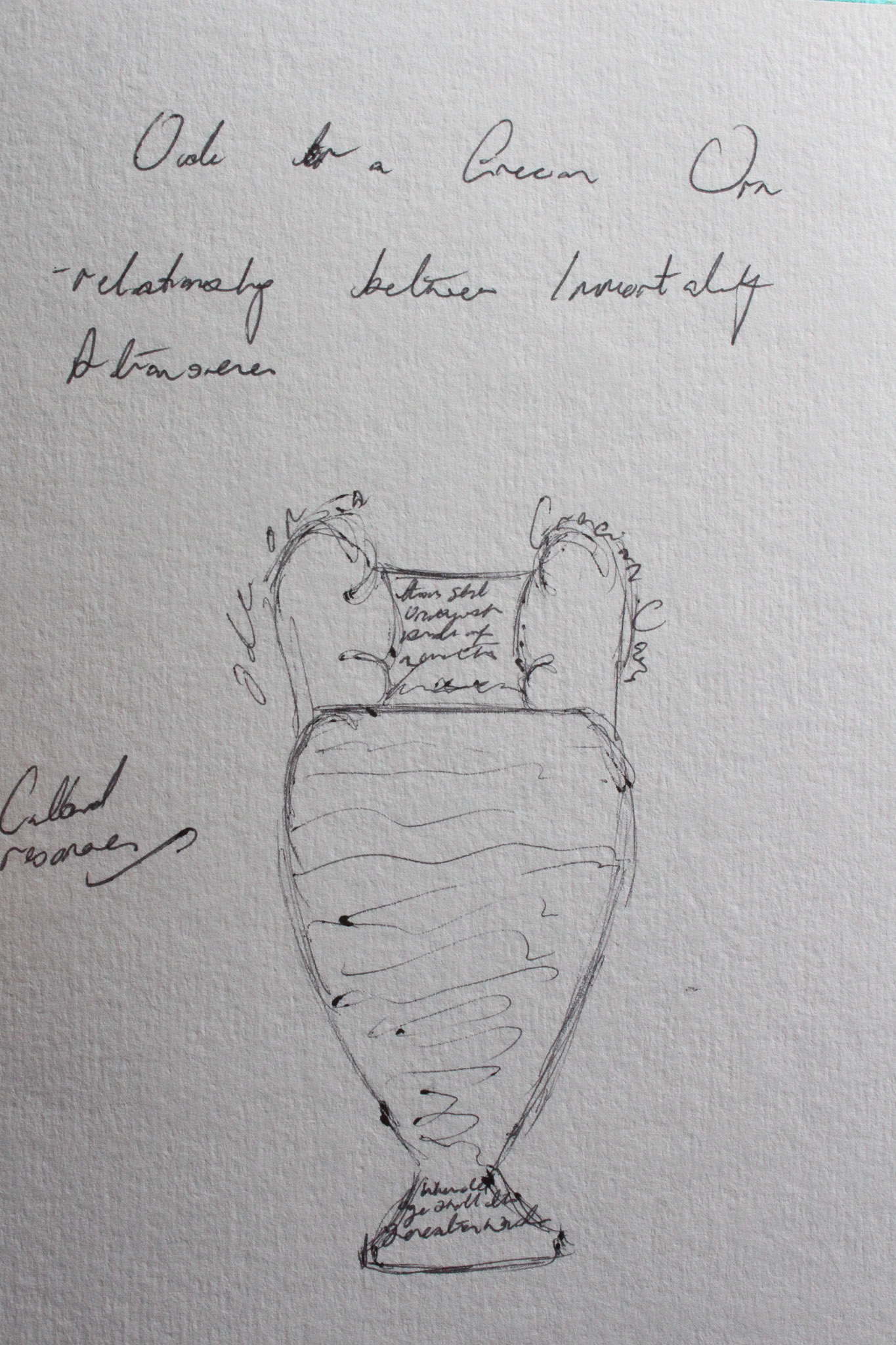
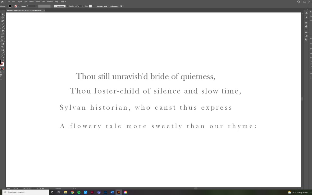
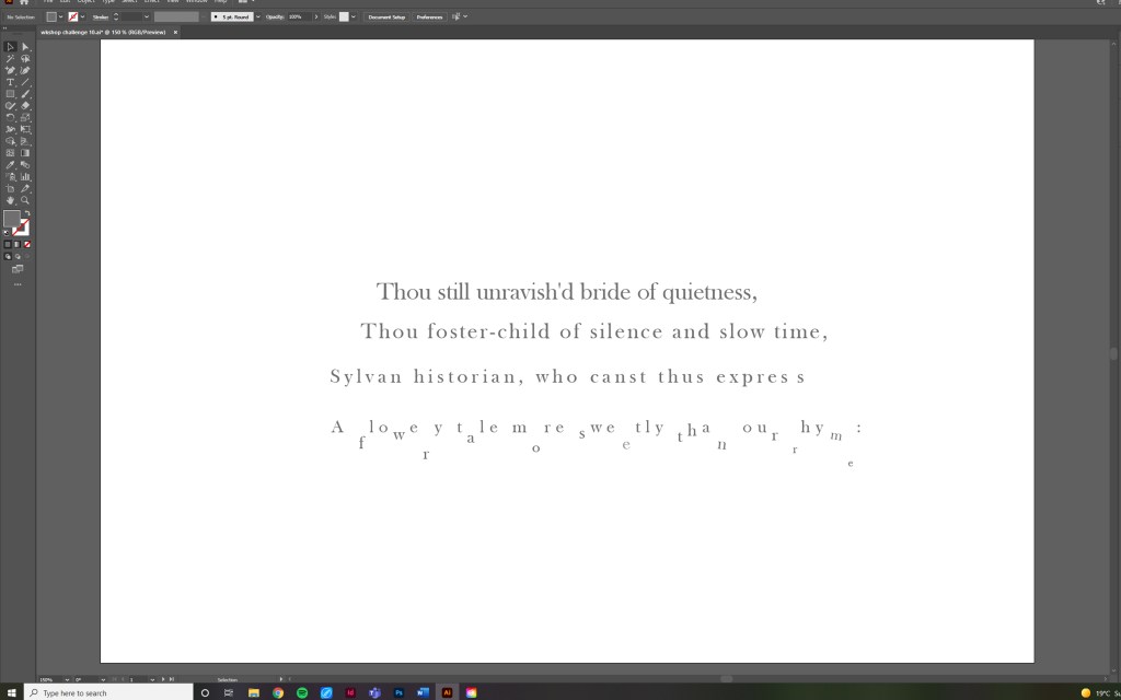
Ode on a Grecian Urn (1820) explores similar themes of the self preservative instinct as the urn represents Keats’ aspiration to achieve literary immortality through the endurance of his poetry. The urn and its painted figures is a physical symbol of permanence that suspends a represented human experience in eternity through a static artefact. Considering last weeks primary research and analysis of natural textures and processes in the Moorlands, I though that this would be a good opportunity to explore the contrast between the transient and the permeant through expressive type.


Development
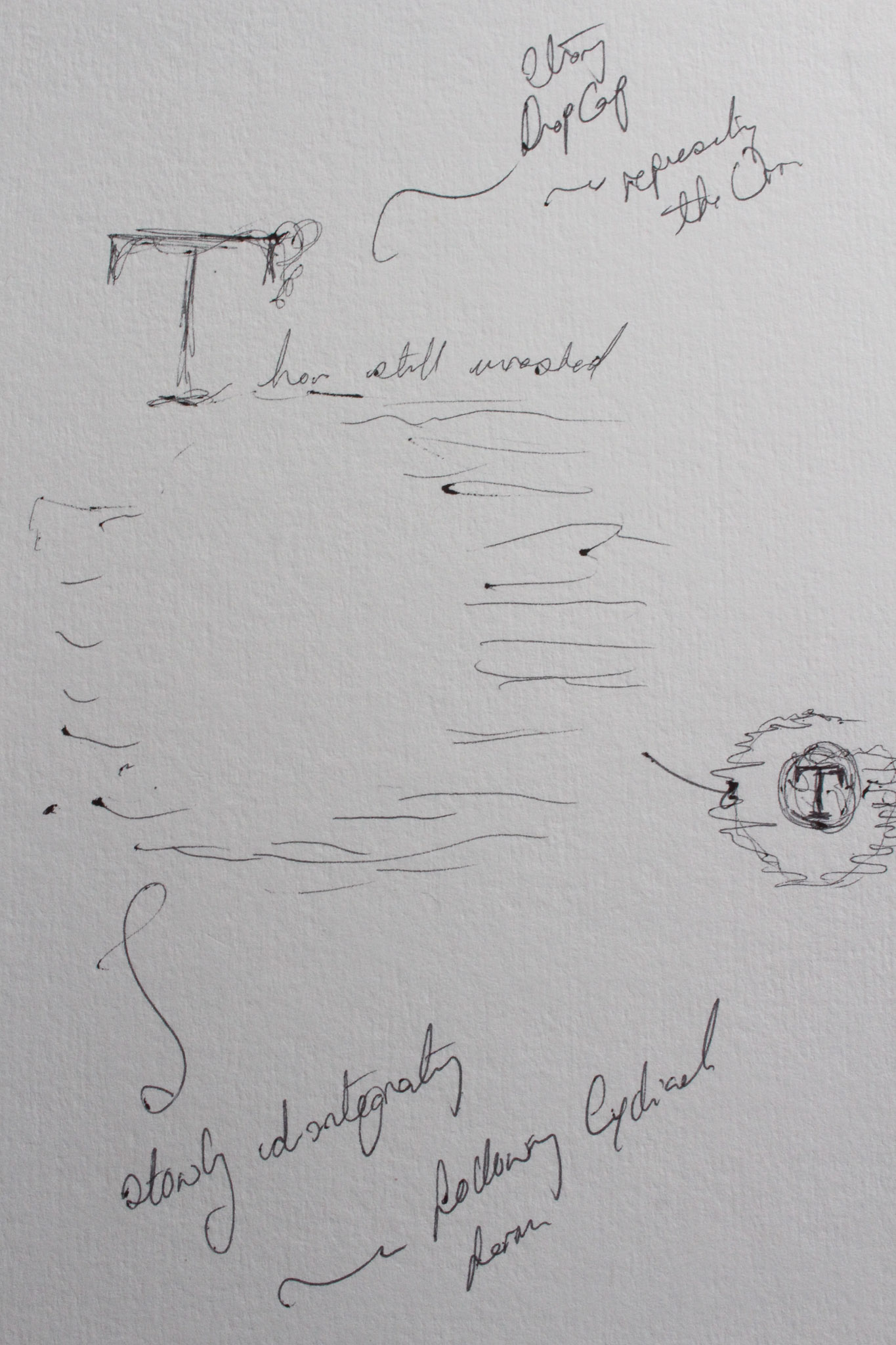
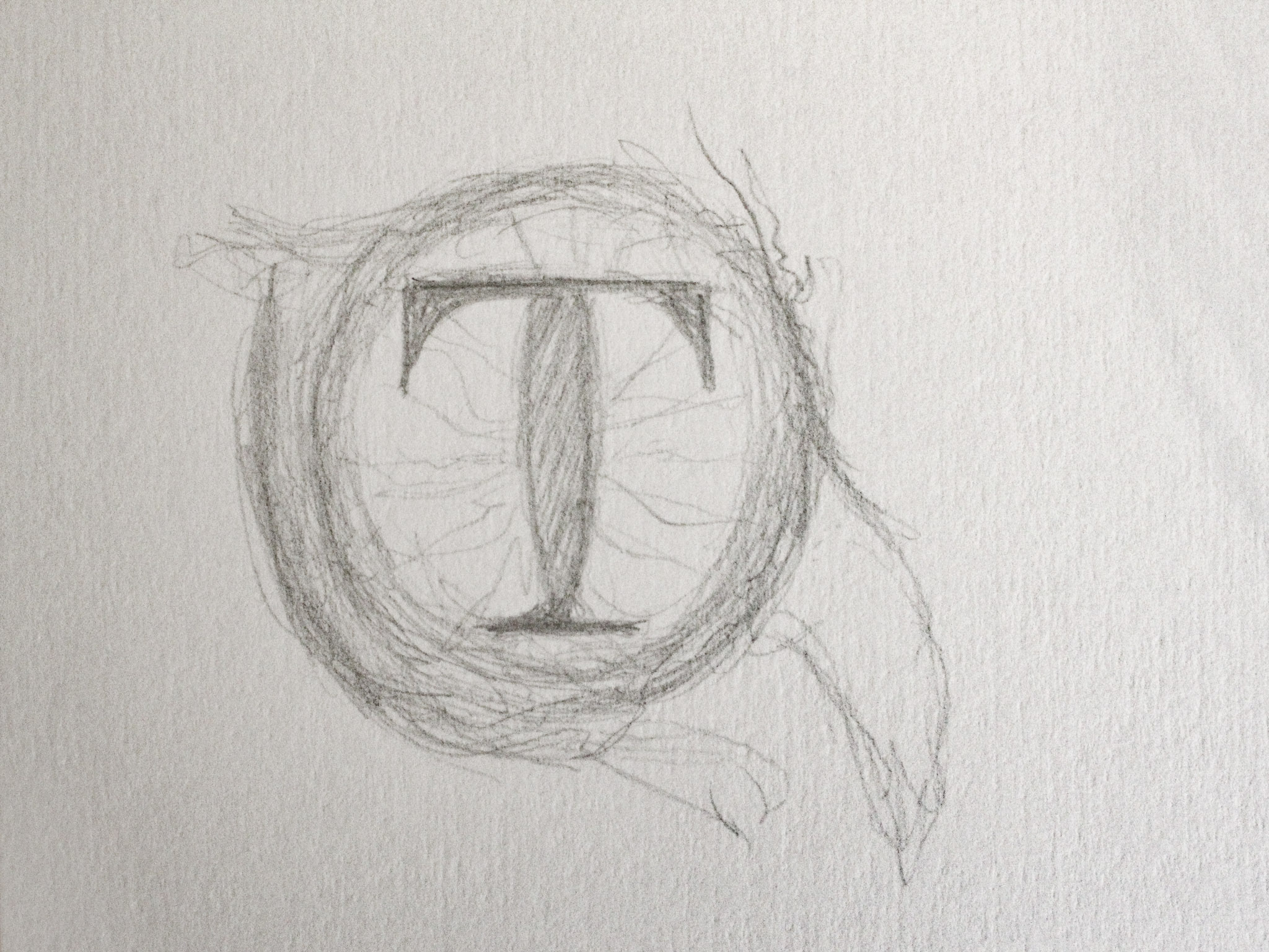
Inspired by concrete poetry such as The Mouse’s Tale by Lewis Carroll, I wanted to explore a figurative approach to type setting, beginning with the tigers eye which is an important motif in Blakes poem. I was interesting to explore the eye as a geometric shape with potential to divide to stanzas into asymmetrical columns. I explored the poems overarching theme of duality by contrasting typographic styles which created alternating tones; soft quiet italics with loud, robust confrontational capitals.


Initial Outcomes:
Evaluation:
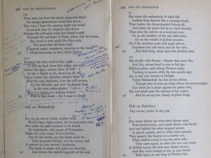
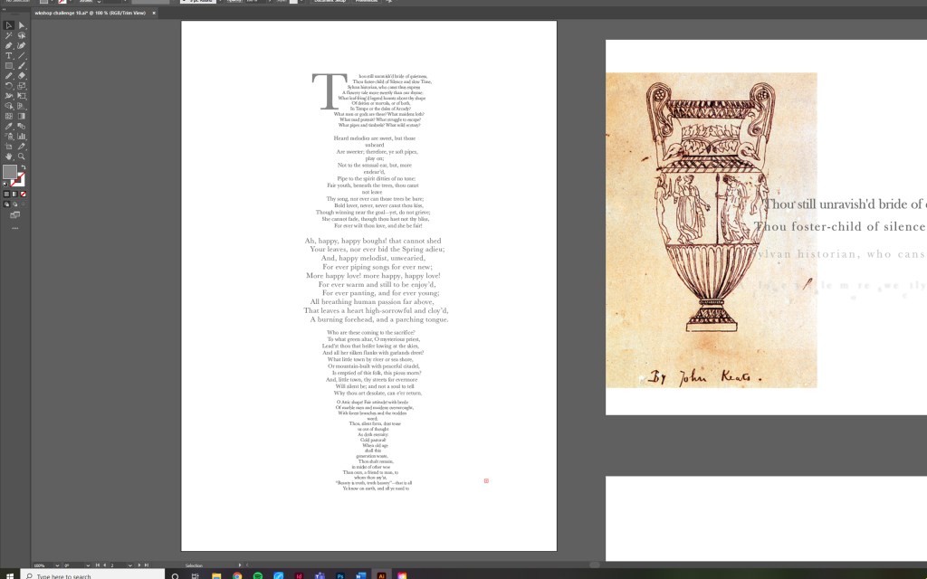
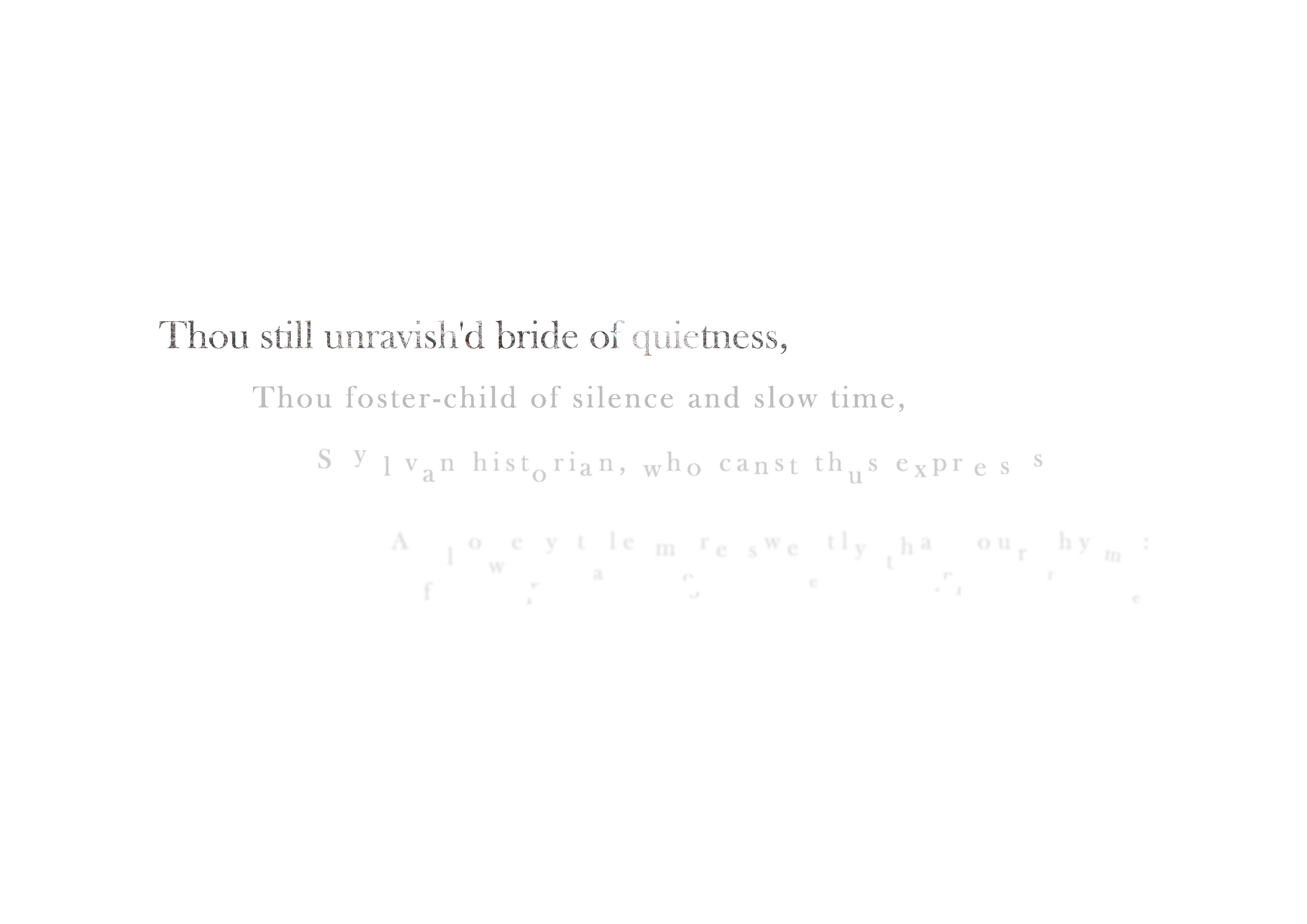
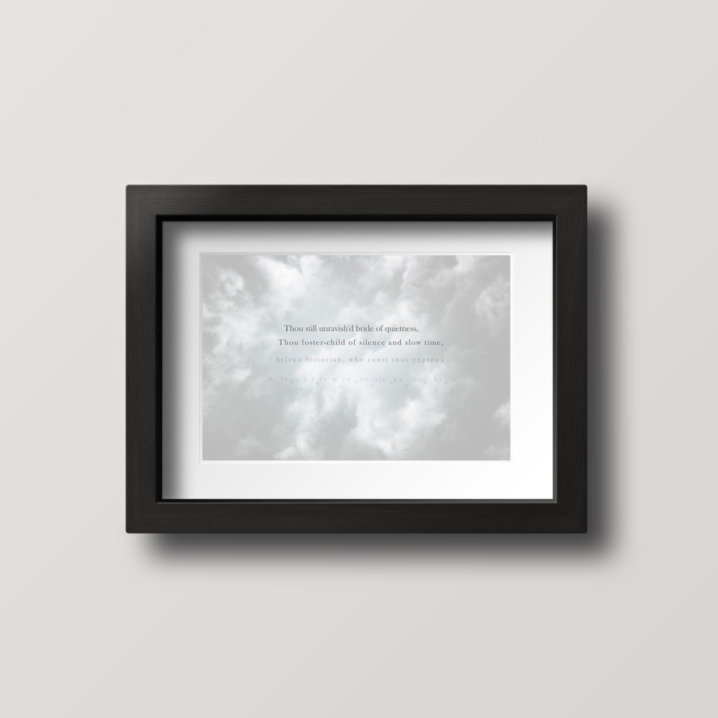
Conscious of ideas in Type & Typography regarding the importance of the design process being informed by the experience of reading the copy and undergoing cognitive stages, I was unsure as to whether I was perhaps interfering with the poetic meaning by forcing this sense of asymmetry. Therefore I attempted an alternative approach on Ode to a Grecian Urn which enabled me to play around with slightly different themes not reliant on duality. In the first section of the challenge, exploring the first line, I liked how themes of decay could be suggested through the treatment of type such as fracturing, blurring and transparency, whilst the first line represented permanence using a strong culturally resonant transitional type face (Baskerville), masked with a gritstone texture to reflect the ceramic origins of the urn. The thematic contrast was delicate as the poems emphasis is on the immortality of the words (art), however perhaps the disintegration could represent the inevitability of transience despite human endeavours to preserve the self?
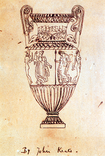
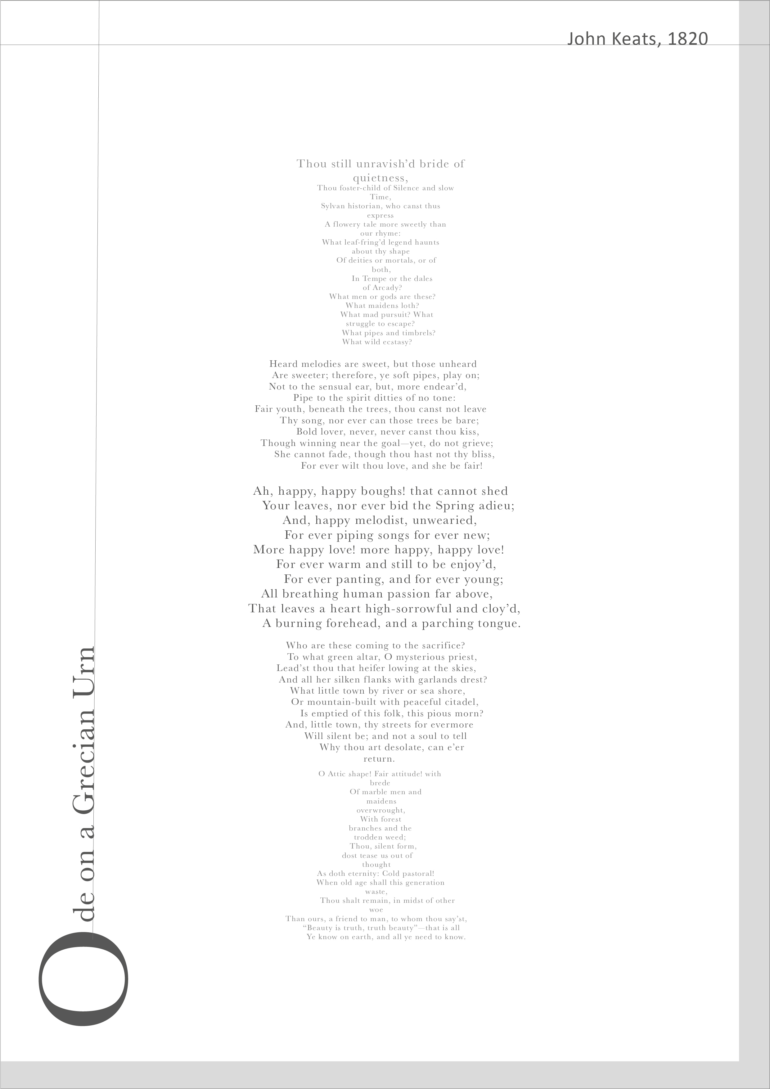
Informed by Keats’ drawing of the Grecian Urn, the poem adopts a figurative approach. Due to the complexity of the original poetic structure, this was quite challenging to achieve and therefore applied limitations upon the customisation of specific sections. The typography fluctuates in size and tracking which someone follows the mood of the poem, however was also necessary in achieving the figurative layout. This piece does in some ways covey material permanence by forcing the viewer to trace a structural form, however if I were to develop this challenge I think I would persevere with the first idea of the tigers eye as this offered more control over the treatment of specific words.
Feedback: Annie Dornan Smith, BA Graphic Design and Illustration
- Relationship to page: physical objects, animation, reflect on the context and purpose of the design, a gift poetry book could be a lot more illustrative than a typical poetry book or anthology.
- The whole poem doesn’t necessarily have to sit on one page, consider contexts such as a set of prints or an exhibition, street art, books with multiple page spreads.
- Explore colours, textures, mark making that references the poem in interesting ways
Further Development

Final Outcome 1: First Line of Poem
Although I liked the idea of engraved type to convey themes of artistic endurance, the delicate nature of this outcome would be best understood in the context of a fine art print, therefore I took this as an opportunity to explore the types relation to image. Considering the poems core theme of human endeavour to transcend mortal limitation through the endurance of art, the sky and clouds compliment concepts of intangibility and ephemerality. I found this challenge particularly hard due to the complexity of poetical themes in Ode to a Grecian urn, however I feel that I had experimented with typographic distortions more in an effort to create something more abstract and expressive. On reflection I could have taken this further by experimenting with ways in which images can obstruct and interact more actively with lettering. In the same way if I had more time, considering the notion of ‘hybrid hyphenated practice’ discussed in Type: New Perspectives in Typography (2015). H. and Williams, S., I could explore processes of transience through motion graphics.

Final Outcome 2: Body of Text

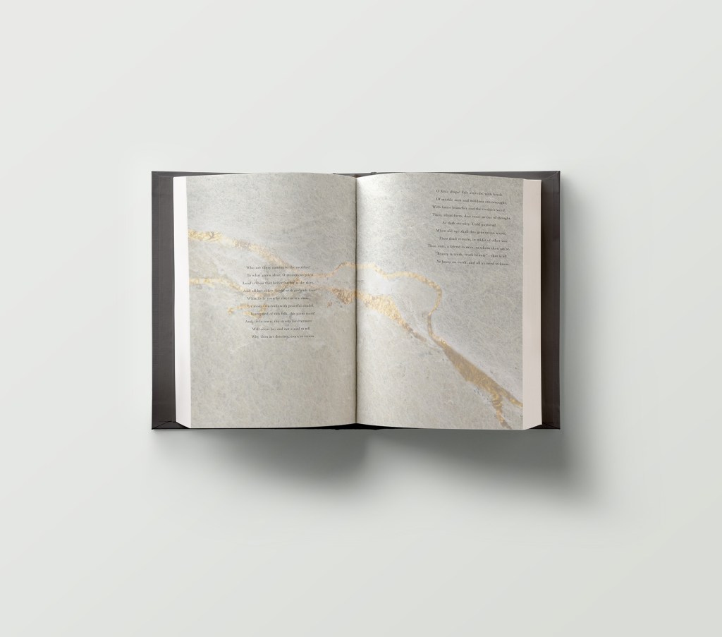
As with the previous outcome (first line task), this final piece explores the types relationship to image image, using stone texture to connote themes of endurance. Considering good typesetting practices mentioned in …. including reading the type to critically review how type setting influencing the experience of reading, I tried to disrupt the traditional layout of the poem by separating verses and displacing them in a way that creates a sense of the poets fears of instability. Although I wanted to use a culturally resonant type face to reference traditional moving type and their sense of rigidity and endurance, I felt that I should have made more effort to challenge typographic conventions and pursue a more expressive outcome. In the future I want to push myself to embrace the experiential play process and explore analogue methods of crafting type.
