Abi Durham Gardens: Volunteer Project
Final Output


Development Phase:





Client References

Brivet: Volunteer Project
Brivet
Volunteer Project
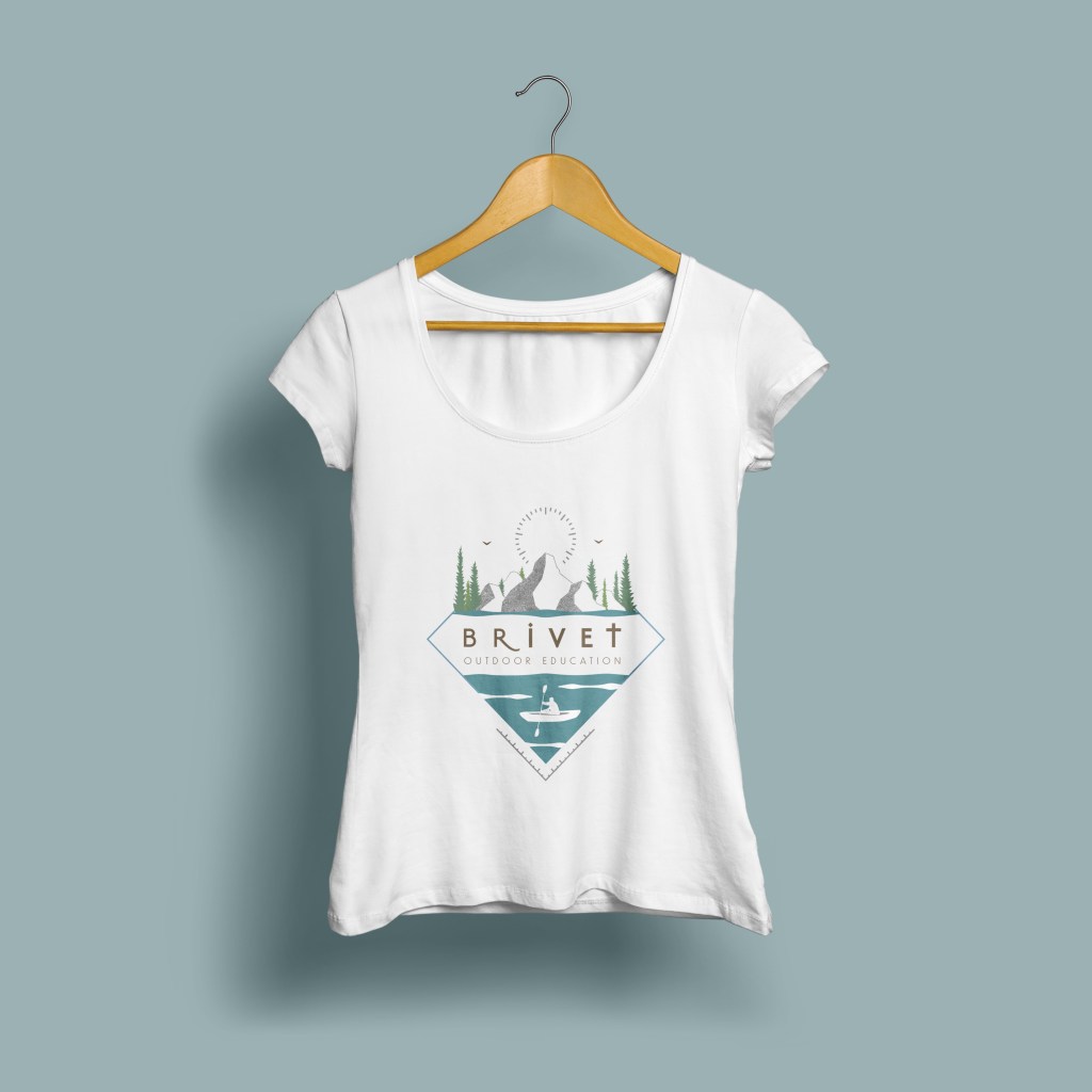
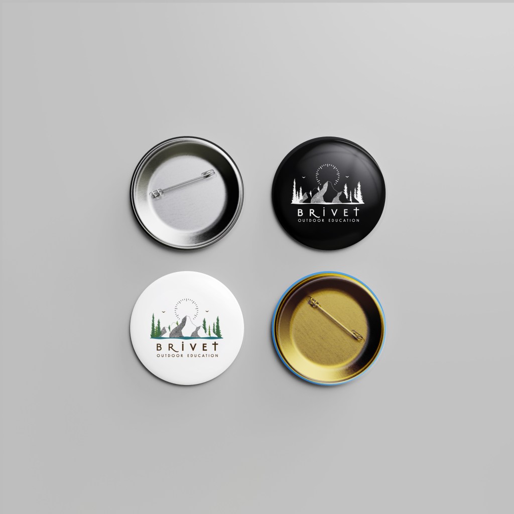
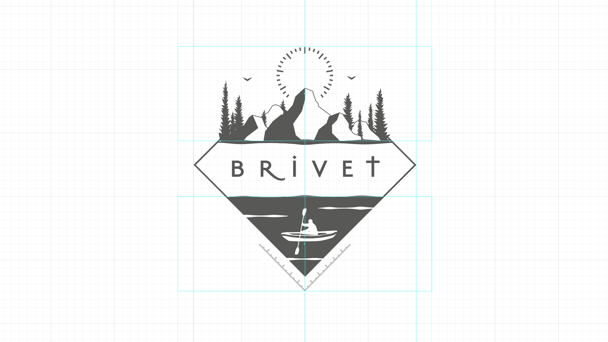
As the outdoor education industry is characterised by its creative and experiential learning philosophy, encouraging sensory exploration of nature to promote self-confidence and wellbeing, the brand identity seeks to accentuate underlying values of freedom and child directed learning. This is reflected in the linguistic choice of company name, Brivet, a verb with appropriate etymological origins in the regional dialects of the West Midlands and Welsh border, describing the action of namely children or animals who ‘wander an area without specific purpose or to satisfy idle curiosity’.
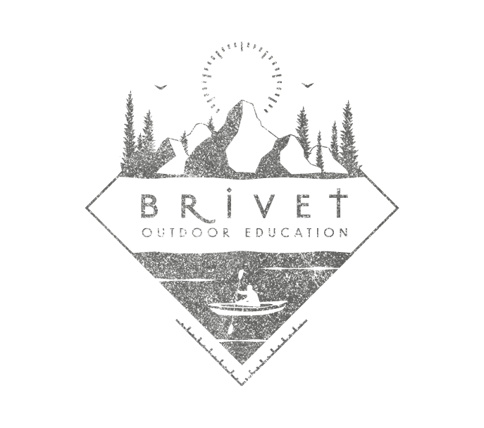
Brivet’s unique selling point is its conservation-based ethos to foster meaningful connections between future generations and the natural world through outdoor experiences and environmental education. Therefore, traditional badge and seal composition styles were pursued in order to create a unique and contemporary educational trademark with elemental references to the landscape and associate activities. The hierarchical composition contrasts the small figure at the bottom against the unbound expanse of mountains, forest and sky, referencing Brivet’s ethos to inspire respect and awe of the landscape.
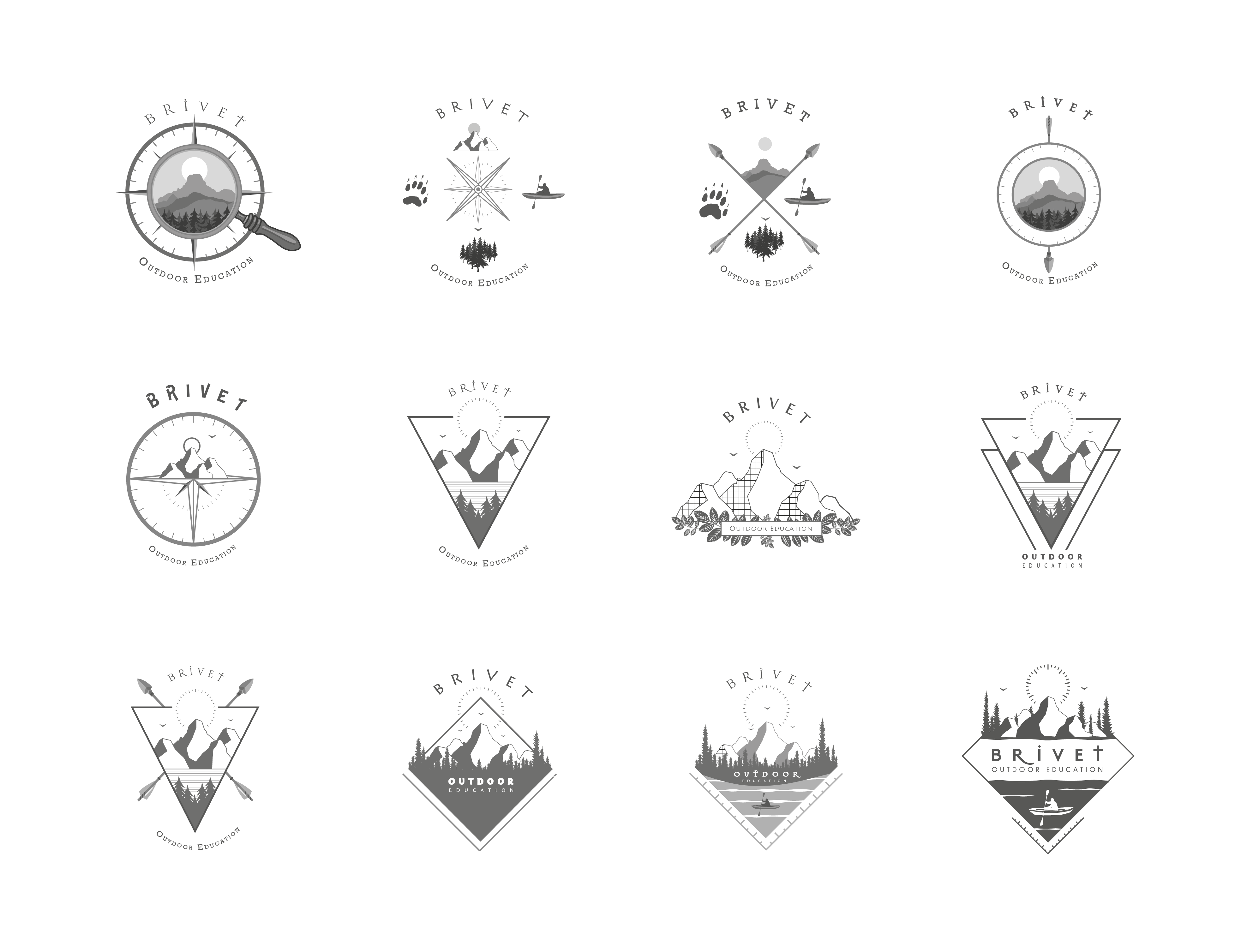
Being required to target an age group ranging from primary aged children to adults from 25-60 years, I presented concept designs which offered child friendly illustrative styles, in addition to wider-reaching simplistic logo marks which incorporated geometric shapes, influenced by specialist outdoor navigational equipment. These concepts suggest a sense of movement, resourcefulness and adventure, whilst their simplicity target a broader market of image conscious young adults as they would be more successfully and diversely applied to promotional merchandise ranges such as clothing. Geometric seals successfully promoted a sense of clarity and balance which the brand wishes to inspire through its services. I also pursued archaic decorative typefaces which connote the primitive nature of the outdoors and explored an analogous colour pallet of vibrant earthly hues of blue and cyan. The mood evoked by this harmonious pallet exaggerates the brands associations with nature and its and ability to facilitate self-expression, stability, peacefulness, creativity and freedom.

The Titling Kettle: Volunteer Project
The Tilting Kettle
Volunteer Project
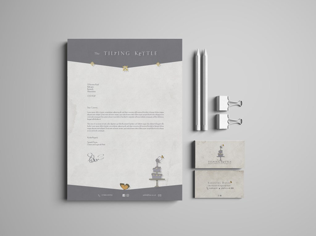
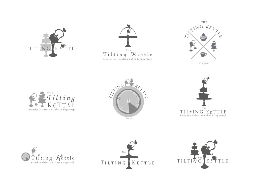
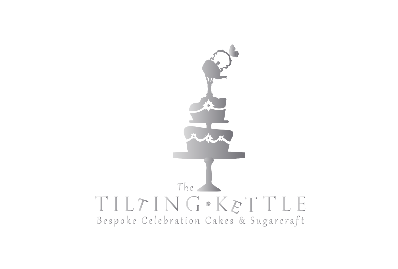
The Tilting Kettle is small local brand specialising in bespoke celebration cake design and creation. Previously the business offered a tea party service for small events and functions, thus the brand identity has been constructed around the conceptual relationship between the kettle (tea) and cake. As the business now has a predominant focus on bespoke cake design, the re-branding required a logo mark which emphasised the cake as a product with some visual reference to the iconic ‘Tilting Kettle’ which its existent customers recognise.
The brand name is inspired by antique tilting kettles and silverware reminiscent of 19th and early 20th century hospitality. Connotative of class and luxury, a simplistic silhouette was used to present a modernised interpretation of the ornate subject, which resonates with a target market of mainly women aged 25-70 seeking a personalised yet indulgent product for their loved ones’ rites of passage. This emblematic combination of the two core visual elements was the result of various iterations of logo marks which sought to appropriate the weighting between the cake and kettle elements in interesting contexts. The client eventually chose the silhouette version from a concept presentation, which represented the cake almost as a cake topper, highly appropriate to the brands artistic ethos and specialism in sugar craft model making.
Connoting to irregularity, uniqueness and innovation, the active verbal process of ‘tilting’ has also been accentuated by manipulated lettering and an uneven illustrative style. This strikes as necessary balance between the brands higher end, classic tone and the quirky celebrative nature of the product and service. The butterfly, a personal request from the client, has been incorporated into the composition, accenting the handle of the kettle. This alludes to a sense of mysticism associated with the art of creation, as well as a poignant life affirming symbol of blessing which resonates with prospective customers anticipating important rites of passage.
