Polly Morgan
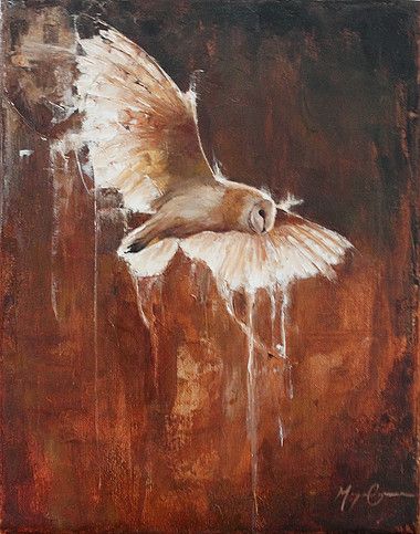
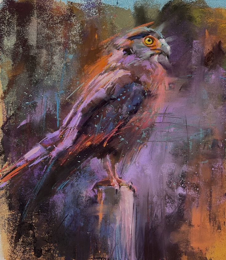
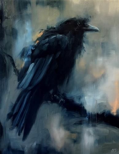
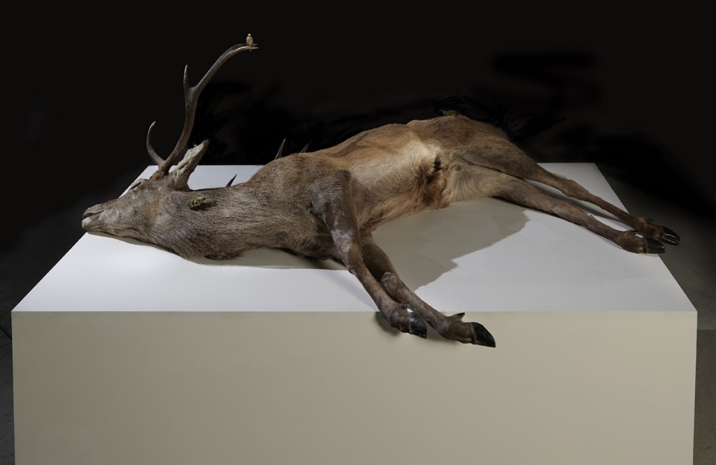
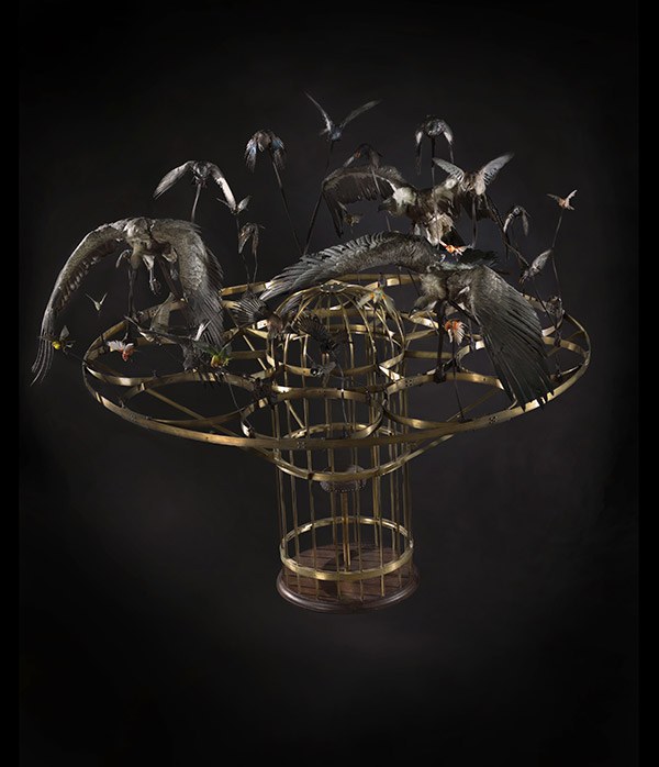
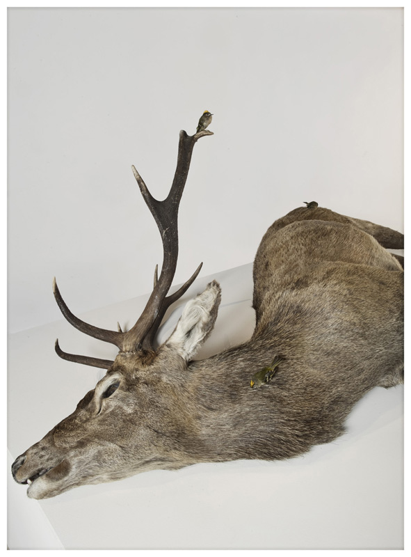
Polly Morgan is a fine artist whose sculptural practice explores the medium of taxidermy to create challenging narratives by combining conceptualism and craft. Using only ethically sourced specimens, her work incorporates contemporary images and objects to explore a dynamic range of socially relevant topics, transcending ‘Victoriana’ associations of with taxidermy and its ornamental focus, which imitates the habitats of animals. Morgan uses the animal as a captivating, tangible symbol to convey ideas and create atmospheres or feelings such as humor, catharsis, dread, anxiety, the sublime, beauty and the uncanny.

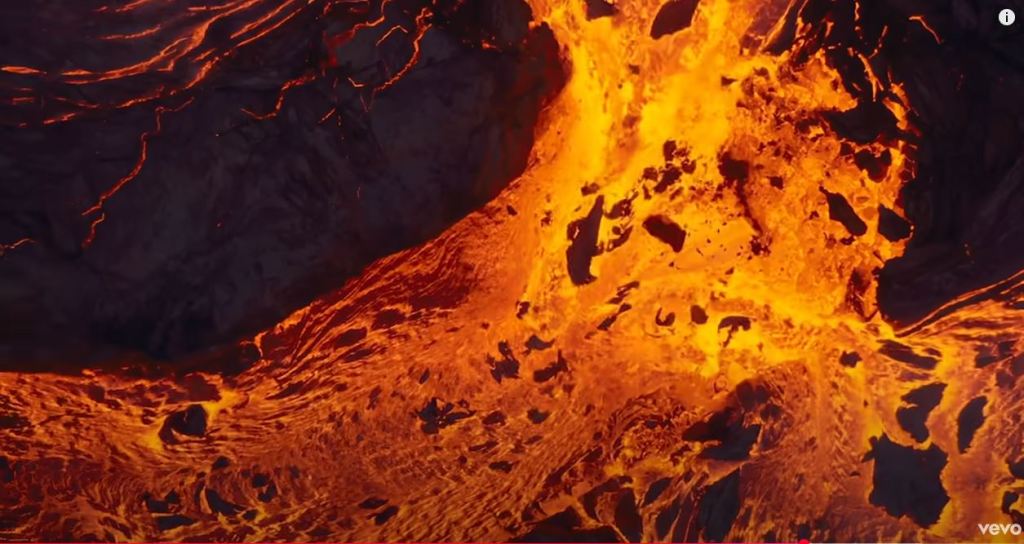
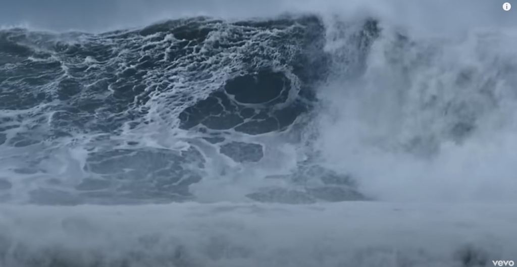
Kant on the Sublime:
Mathematic sublime: vastness overwhelming our ability to understand/ overwhelm the senses. Concepts are formed to overcome the weakness of the senses
Dynamic sublime: Feeling of the sublime is produced by mans ability to conceptualise and comprehend the powerful forces of the nature which threaten to overwhelm and reveal human fragility.
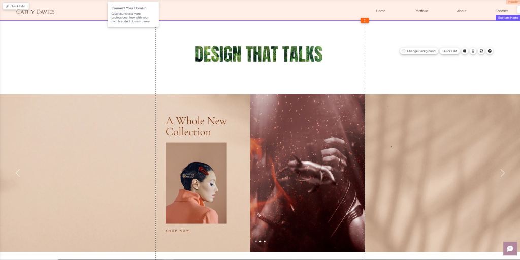
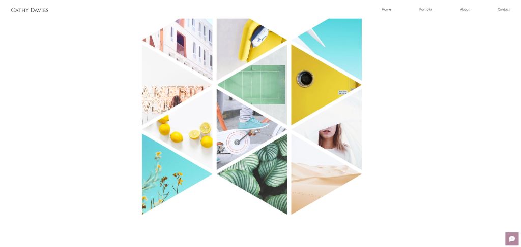
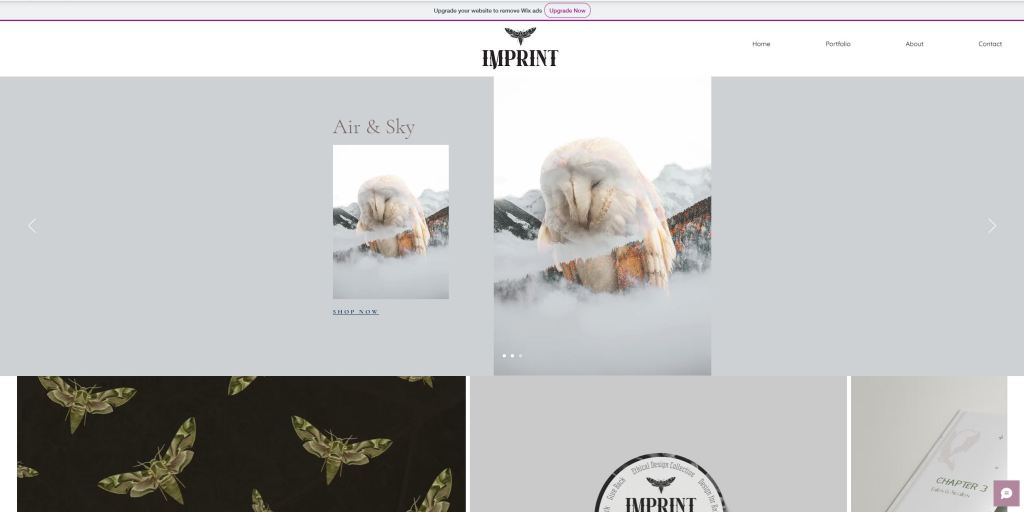
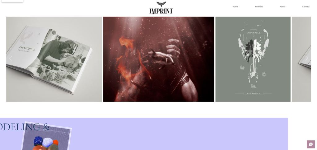
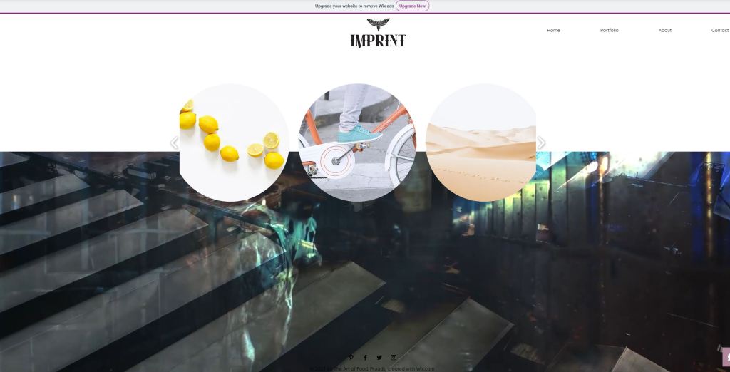
Studio Practice Experimentation – Web Design for the Imprint Collective
Imprint web design Strategy:
Being torn between focusing my project on the launch of the Imprint Collective, my own freelance practice, or my own practice under a creative business name, I decided to work on a web design strategy for Imprint to help me gauge how and where my personal practice could be positioned in its existence. Doing this helped me visualize how collaborators/volunteers could be featured on the website, acting as endorsers for the Imprint brand, making it necessary and appropriate for me to create both as part of my final project.


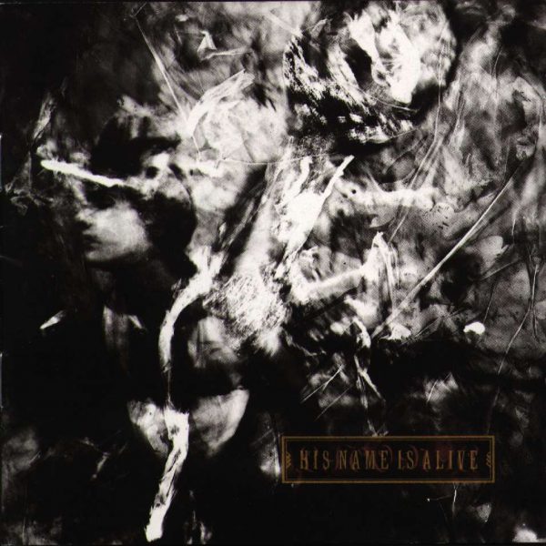
Vaughn Oliver
Workshop Challenge 1 (Reflection on Module 1):
Ideas of Categorisation in Graphic Design
After analysing designing terminology and categorisations in the context of local and global contexts, I was extremely interested by the ambiguous boundaries between graphic design and fine art, particularly in the work of Vaughan Oliver and conceptual artist Lawrence Weiner. If graphic design is characterised by the construction of messages through imagery and typography, graphic design objects that in contrast, create ambiguity and encourage subjective interpretation seem to be symptomatic of the evolving nature of design and art within a globalised contemporary landscape.
The notion of the art object as a unique artefact and physical expression of the individuals psychological and emotional dimension has been challenged by philosophical perspectives and creative movements such as Land Art or Earthworks, which revaluates the relevance of the traditional white wall gallery context. In the same way, graphic designs emulsification with other art genres, social justice movements and other causes which dismantle and redefine the role of the designer are an expression of collective human ingenuity, utilising new technologies to empower individual expression and social change. In guest lecture, Graphics, Politics and Protest, The London Design Festival, V&A, 2018, Anthony Burril and Patrick Thomas’ design practice was distinctly referred to as ‘Graphic Art’ rather than ‘Graphic Design’ or ‘Fine Art’, exemplifying how the political and social influence associated with traditional artists can manifest in practices built around digital tools and modern technologies. Does this blurring of creative classifications homogenise or democratise contemporary creativity?
The vibrant degree of cross pollination of various disciplines in D&DA award winning projects such Voice of Racism and #wombstories, made the purpose of technical classification less clear and presented further questions regarding design vs multidisciplinary art. For example, Voices of Racism, commissioned by the New Zealand Human Rights Commission came under a graphic design classification, however could be experienced and analysed as a collaborative public art project. Using digital graphic design tools such as 3D, website and app development, a multisensory experience of audio and imposing visuals facilitated an artificial experience of intense racial discrimination.
With an objective to educate the public about underlying racism, the work disturbs the senses, creates subversive emotional responses and facilitates transformative individual experiences which can empower collective social change. The underlying activism and catharsis created by this work, to me seems to cross boundaries into fine art. Similarly #wombstories encompasses various different design classifications of illustration, animation, film, advertising and app design to create a meaningful stigma tackling discussion around ‘people with wombs’.
The project empowers discussions around feminism and public health, using artwork and experiences of endometriosis sufferers to create a ‘pain dictionary’, offering women a new effective language through which to define and understand their experiences. This responds to a lack of awareness and publicly funded research into the complexity of female reproductive health, as well as holistically exploring the plethora of womb related human experiences through the use of film, animation and sound, from the embarrassment of adolescence, joy of sexual pleasure and motherhood to the grief of miscarriage and acceptance of older age. In a strange way, the poignancy of this reflection on the human condition, be it specifically female, reminded me of Bill Viola’s overwhelmingly universal Nantes Triptych, a fine art video installation simultaneously portraying real life experience of birth, life and death.
References:
MARSHALL, Kingsley. 2017. ‘The question and the thesis’ [lecture]. FLM311 for BA Film. Falmouth:
Falmouth University, 26 October 2017.
BURRIL, Anthony &THOMAS Patrick. 2018. ‘Graphics, Politics and Protest, The London Design Festival, V&A [lecture]. for MA Graphic Design. Falmouth:
Falmouth University, 1 May 2021.
IBISWORLD. 2018. ‘Brexit impact statement: UK Universities’. IBISWorld July 2018. Available at:
https://clients1-ibisworldcom.ezproxy.falmouth.ac.uk/reports/uk/brexitupdate/default.aspx?entid=4485 [accessed 22 August
2018].
D&AD Awards 2021. 2021. ‘#wombstories’. Available at: https://www.dandad.org/awards/professional/2021/234204/wombstories/https://www.dandad.org/awards/professional/2021/234204/wombstories/ [accessed 22 May
2021].
D&AD Awards 2021. 2021. ‘Voice of Racism’. Available at: https://www.dandad.org/awards/professional/2021/234096/voice-of-racism/ [accessed 22 May
2021].
Workshop Challenge 2 (Reflection on Module 1):
Art Design: Reproducible design products that are informed by or accommodate traditional experiences of art in a contemporary global context.
Vaughan Oliver’s music packaging design uses contemporary tools and processes which fall under the umbrella of graphic design to fulfil a product brief, establish brand identity and respond to the commercial demands of the music industry. However in a talk for 8×8 London, Vaughan Oliver described the musical inspiration on his practice as the ‘idea of something that changes my internal chemistry’, suggesting that his work is conceived by the abstract, transformative and subjective experience of art. Visually this has resulted in stylistic outcomes which evoke a sense of chaos and disorder, provoking mystery and enigma. Specifically in the Livonia cover, there is a distinct sense of fragmentation, transcendence and ambiguity. Although the work fulfils its commercial objective to attract an identity questioning alternative audience and promote a product, the absence of traditional design harmony, order and narrative creates deeper existential, emotional reactions which are more characterized by fine art expression and reception.
In an interview for Snub TV (February 1990), Oliver discussed with regard to his design practice, ‘I’m often asked, is it art?’. In an exhibition in Nantes, France he addressed the ambiguous boundaries in his work between art and design by emphatically contrasting presentation styles of street posters with golden baroque picture frames in a white wall gallery space. Due to the introspective, intimate nature of music, I find this an interesting example of creative cross pollination as the marketing of art itself requires inventive design solutions in order to ovoid diluted representation of the original product/ artwork.
“I’d much rather the idea was presented and printed 100,000 times in 100,000 homes than collecting dust on a gallery wall… I’m not sure of the relevance of putting it back into a gallery space again”.
– Vaughan Oliver (Snub TV, 1990).
This quote is testament to the evolution of both art and design in relation to one another in the fast changing context of global consumer driven culture.
References
OLIVER, Vaughan. 2009. Interviewed by Snub TV [online]. Available at: https://www.youtube.com/watch?v=DWrzr4nr4Vk [accessed 4 April 2021].
OLIVER, Vaughan. 2012. [online lecture] 8×8 London. Available at: https://www.youtube.com/watch?v=XOhJtt3-hr0 [accessed 4 April 2021].
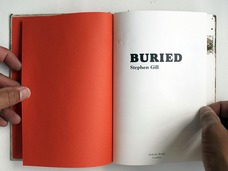

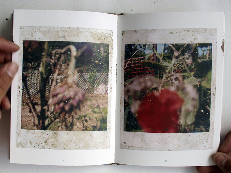
“The photographs in this book were taken in Hackney Wick and later buried there. The amount of time the images were left underground varied depending on the amount of rainfall. The depths that the pictures were buried at also varied, as did their positioning. Sometimes they were facing each other, sometimes back to back or sometimes buried singly. When burying my first batch of photographs, a passing man spotted me and asked what I was doing. Not only did I not want to give the location away of some of my buried pictures, but It just sounded a bit weird to say that I was burying photographs so replied that I was looking for newts. As soon as Id said that I looked down and saw a newt at my feet. Not knowing what an image would look like once it was dug up introduced an element of chance and surprise which I found appealing. This feeling of letting go and in a way collaborating with place allowing it also to work on putting the finishing touches to a picture felt fair. Maybe the spirit of the place can also make its mark.”
– Stephen Gill
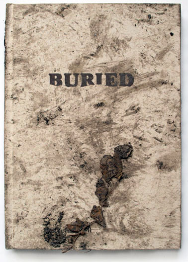
Buried
2004-2006
Photographs by Stephen Gill
Words by Stephen Gil
Edited and sequenced by Stephen Gill
Design by Melanie Mues
Published by Nobody
29 colour photographs
Housed in debossed card slipcase
Incl. 1 c-type ‘Bury your own’ print
32 pages
135 x 190 mm
Printed on G.F Smith, Naturalis, 135 gsm
Unique buried hardcover book
Printed at Push, London
Edition of 750
Published in 2006
ISBN 978-0-9549405-4-6


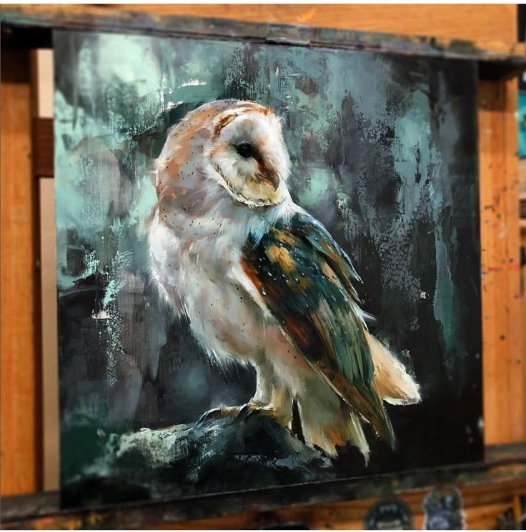
Polly Morgan (British, 1980–), Small Still Birth, 2010. Taxidermy quail chick, resin-cast balloon, wire, glass, and wood, 25 × 12 cm.
Having created my wireframes in illustrator, I decided to experiment with drag and drop interactive web builder such as wix which democratise web development and make complex animated functionalities accessible. This gave me a more detailed understanding of web functionalities and layouts possible, helping me visualise how work could be curated in a digital space to showcase
the potential of the Imprint Collaborative.


Critical Analysis
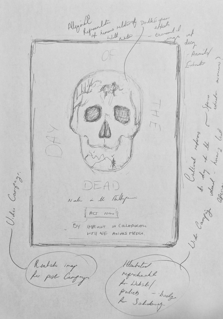
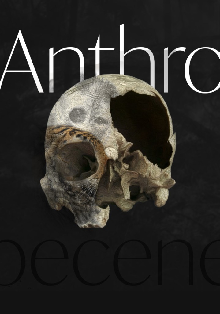
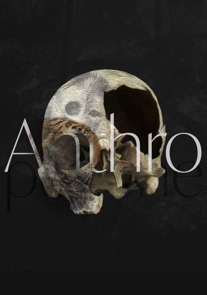
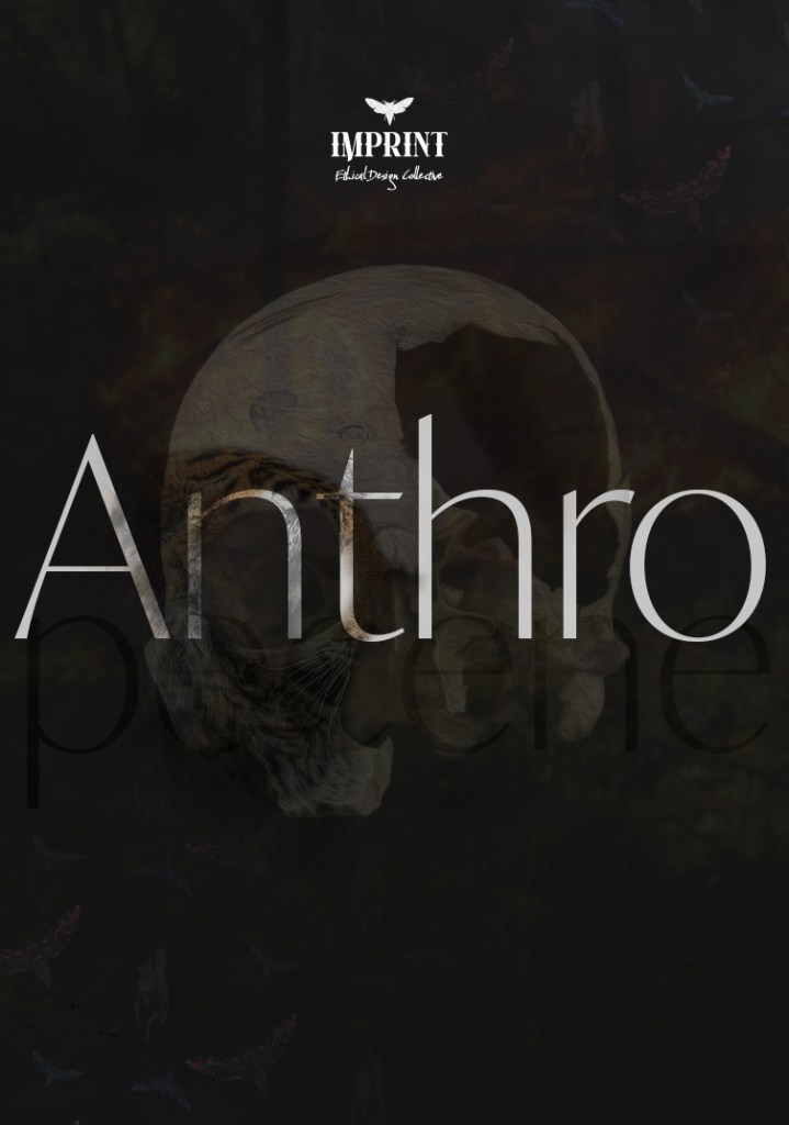
Critically analysing La Calavera Catrina and Mexican Day of the Dead imagery, inspired me to experiment with imagery of skulls in a subversive way that provides allegorical reference to not just the inevitable death and decay of human beings, but also of nature and the environment in light of human cause climate change and environmental issues.
As biodiversity loss and animal rights are complex issues which coincide in many ways, I wanted to explore this imagery in the context of a potential poster as part of a possible collaboration under the Imprint Collective.
Having decided to feature my own practice as part of the Imprint team, this project felt somewhat premature and the process highlighted a need for me to consolidate my own creative identity and ethos, in order for me to visualise how design practices could operate in relation to the Imprint Collective