Reflection on Wk 3 Case Studies: The Effect of Globalisation on Design
Despite positive attitudes that globalisation is an inevitable thing to be embraced, opening up opportunity for ‘greater collaboration’ , allowing us to work on a much ‘bigger canvas’ (Simon Manchipp, SomeOne), there were also differing opinions regarding remote interaction with clients and whether geographic distance is disruptive to the collaborative process. For example, Tom Finn from Regular Practice argued that remote interaction requires more vigilance but results in more simplified effective dialogue. Conversely Adrian Talbot and Julian House from Intro discussed the ‘dangers’, of smaller problems being made larger through lack of communication, advocating the value of ‘face to face’ meetings with client and internal staff.
Generational Perspectives
Intro’s reflections on ‘traditional passage’ and their own linear progressions from student to Junior and then onwards through the hierarchical system of midweight/ senior position, made me wonder how different generational perspectives influence globalisation. Their characterisation of the idea that ‘anyone can do anything from anywhere’ as ‘a bit troubling’, suggests a scepticism of digitisation perhaps influenced by their values of people driven business and face to face meetings. Is digitisation and globalisation a threat to localised practices? Does remote international working culture democratise the field or create higher competition and market saturation? They did continue to discuss that the dangers of digital were dependent on the nature of design work and the requirements of personal engagement with clients.
Considering the pandemic’s effects on corporate culture, I feel that remote collaboration enabled by digitisation is extremely empowering and reflective of a more progressive modern philosophy that values mental health, professional wellbeing and freedom to work more flexibly and pursue specialist/ niche opportunities beyond their locality. This was evident in case studies of local practice from the geotagging challenge, where I noticed patterns of small businesses and start ups having alternative working hours (Jack) and a greater emphasis on family an work life balance (LoveLive).
Despite Sim Winston advocating for face to face collaboration within the context of global relationships, I really loved that he also acknowledged the environmental consideration of international travel – ‘I’m not saying you should be flying around the world, because that’s another really big problem’. As the global market continues to grow, I like to hope that the digitised remote working practices developed during the pandemic will enable a more environmentally conscious international studio culture.
Ideas Wall

Revival of craft? Reflect on patterns across the history of art.
Guest Lecture: The Effect of Globalisation on Design
Harriet Ferguson of Pearlfisher
Reflection on Key Points
- Pro Globalisation: multicultural working culture – cultural diversity producing conceptual diversity – global scale of collaboration – necessary to work with people with niche skillset.
- Value of travel for cultural immersion and authenticity, eg. Taylors – Femme – stigmas and taboos – western approach – aspirational.
- Inspiration: dilemmas of global brands: plethora of visual stimuli.
- Imitation vs authenticity? Mainstream research methods such as Pintrest – popularising images and producing homogenized bland aesthetic – broaden inspiration beyond competitors to different disciplines to create original ideas
- Consumers are more design savvy and sceptical about brands – trying to appeal to multiple audiences leads to diluted brand – unauthentic – divergence from principles
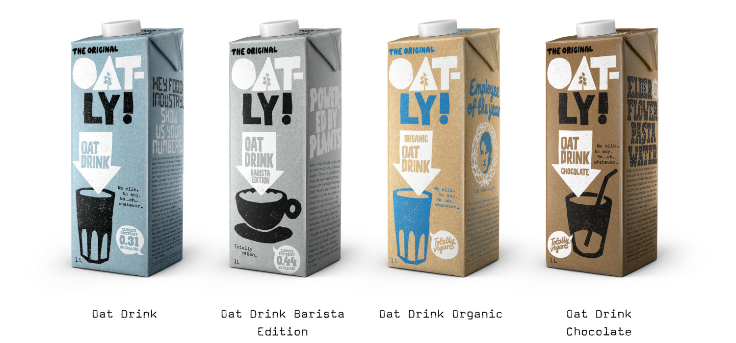
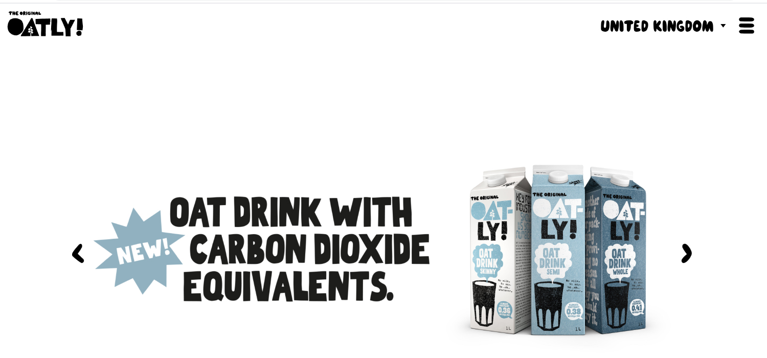
- Futures: expectations – sustainable – benefit lifestyle. Eg, Karma Cola – Oatley – strong principles – intelligent consumers want brands they can respect, based on principles and responsibilities they feel are necessary for the future.
- ‘Larger brands are more cumbersome and slower to react to this, but they will soon be feeling the pressure to do this too. We are all more aware of our impact on the planet, our brands should be doing this as well’.
- Future of brand design: authentic actions. Socially conscious brands for further study: Oatley, Beyond, Impossible.
Harriet Ferguson’s emphasis on authenticity in this lecture drew parallels with main points derived from Jeff Goodby and Rich Silverstein’s Masterclass on Tech Advertising and Creativity.
- ‘A brand is a living being, it has a soul. Feed it with emotion and truth’
- ‘Brands need to have a social conscience’ in order to connect to the consumer
- Bringing humanity to the corporate world
- Scepticism between consumers and the notion of advertising – relates to Ferguson’s identification of consumers being design savvy: ‘Advertisers think designers are stupid and Designers think Advertisers are whores’. Demonstrates the need for a human, socially conscious approach which is evidenced by action and design.
Worshop Challenge 1:
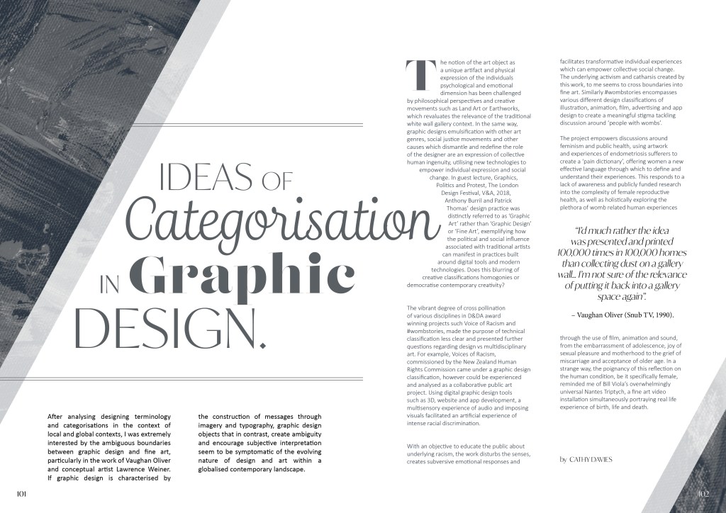
Ideas of Categorisation in Graphic Design
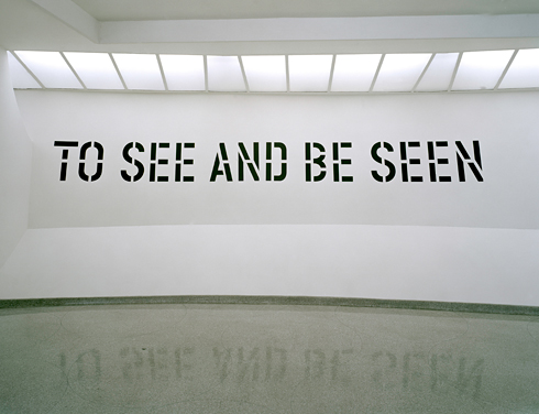
After analysing designing terminology and categorisations in the context of local and global contexts, I was extremely interested by the ambiguous boundaries between graphic design and fine art, particularly in the work of Vaughan Oliver and conceptual artist Lawrence Weiner. If graphic design is characterised by the construction of messages through imagery and typography, graphic design objects that in contrast, create ambiguity and encourage subjective interpretation seem to be symptomatic of the evolving nature of design and art within a globalised contemporary landscape.
The notion of the art object as a unique artefact and physical expression of the individuals psychological and emotional dimension has been challenged by philosophical perspectives and creative movements such as Land Art or Earthworks, which revaluates the relevance of the traditional white wall gallery context. In the same way, graphic designs emulsification with other art genres, social justice movements and other causes which dismantle and redefine the role of the designer are an expression of collective human ingenuity, utilising new technologies to empower individual expression and social change. In guest lecture, Graphics, Politics and Protest, The London Design Festival, V&A, 2018, Anthony Burril and Patrick Thomas’ design practice was distinctly referred to as ‘Graphic Art’ rather than ‘Graphic Design’ or ‘Fine Art’, exemplifying how the political and social influence associated with traditional artists can manifest in practices built around digital tools and modern technologies. Does this blurring of creative classifications homogenise or democratise contemporary creativity?
The vibrant degree of cross pollination of various disciplines in D&DA award winning projects such Voice of Racism and #wombstories, made the purpose of technical classification less clear and presented further questions regarding design vs multidisciplinary art. For example, Voices of Racism, commissioned by the New Zealand Human Rights Commission came under a graphic design classification, however could be experienced and analysed as a collaborative public art project. Using digital graphic design tools such as 3D, website and app development, a multisensory experience of audio and imposing visuals facilitated an artificial experience of intense racial discrimination.
With an objective to educate the public about underlying racism, the work disturbs the senses, creates subversive emotional responses and facilitates transformative individual experiences which can empower collective social change. The underlying activism and catharsis created by this work, to me seems to cross boundaries into fine art. Similarly #wombstories encompasses various different design classifications of illustration, animation, film, advertising and app design to create a meaningful stigma tackling discussion around ‘people with wombs’.
The project empowers discussions around feminism and public health, using artwork and experiences of endometriosis sufferers to create a ‘pain dictionary’, offering women a new effective language through which to define and understand their experiences. This responds to a lack of awareness and publicly funded research into the complexity of female reproductive health, as well as holistically exploring the plethora of womb related human experiences through the use of film, animation and sound, from the embarrassment of adolescence, joy of sexual pleasure and motherhood to the grief of miscarriage and acceptance of older age. In a strange way, the poignancy of this reflection on the human condition, be it specifically female, reminded me of Bill Viola’s overwhelmingly universal Nantes Triptych, a fine art video installation simultaneously portraying real life experience of birth, life and death.
References:
MARSHALL, Kingsley. 2017. ‘The question and the thesis’ [lecture]. FLM311 for BA Film. Falmouth:
Falmouth University, 26 October 2017.
BURRIL, Anthony &THOMAS Patrick. 2018. ‘Graphics, Politics and Protest, The London Design Festival, V&A [lecture]. for MA Graphic Design. Falmouth:
Falmouth University, 1 May 2021.
IBISWORLD. 2018. ‘Brexit impact statement: UK Universities’. IBISWorld July 2018. Available at:
https://clients1-ibisworldcom.ezproxy.falmouth.ac.uk/reports/uk/brexitupdate/default.aspx?entid=4485 [accessed 22 August
2018].
D&AD Awards 2021. 2021. ‘#wombstories’. Available at: https://www.dandad.org/awards/professional/2021/234204/wombstories/https://www.dandad.org/awards/professional/2021/234204/wombstories/ [accessed 22 May
2021].
D&AD Awards 2021. 2021. ‘Voice of Racism’. Available at: https://www.dandad.org/awards/professional/2021/234096/voice-of-racism/ [accessed 22 May
2021].

Scotland 1986
Worshop Challenge 2:
Art Design: Reproducible design products that are informed by or accommodate traditional experiences of art in a contemporary global context.
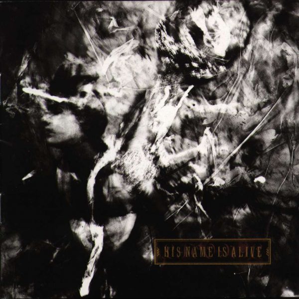
Vaughan Oliver’s music packaging design uses contemporary tools and processes which fall under the umbrella of graphic design to fulfil a product brief, establish brand identity and respond to the commercial demands of the music industry. However in a talk for 8×8 London, Vaughan Oliver described the musical inspiration on his practice as the ‘idea of something that changes my internal chemistry’, suggesting that his work is conceived by the abstract, transformative and subjective experience of art. Visually this has resulted in stylistic outcomes which evoke a sense of chaos and disorder, provoking mystery and enigma. Specifically in the Livonia cover, there is a distinct sense of fragmentation, transcendence and ambiguity. Although the work fulfils its commercial objective to attract an identity questioning alternative audience and promote a product, the absence of traditional design harmony, order and narrative creates deeper existential, emotional reactions which are more characterized by fine art expression and reception.
In an interview for Snub TV (February 1990), Oliver discussed with regard to his design practice, ‘I’m often asked, is it art?’. In an exhibition in Nantes, France he addressed the ambiguous boundaries in his work between art and design by emphatically contrasting presentation styles of street posters with golden baroque picture frames in a white wall gallery space. Due to the introspective, intimate nature of music, I find this an interesting example of creative cross pollination as the marketing of art itself requires inventive design solutions in order to ovoid diluted representation of the original product/ artwork.
“I’d much rather the idea was presented and printed 100,000 times in 100,000 homes than collecting dust on a gallery wall… I’m not sure of the relevance of putting it back into a gallery space again”.
– Vaughan Oliver (Snub TV, 1990).
This quote is testament to the evolution of both art and design in relation to one another in the fast changing context of global consumer driven culture.
References
OLIVER, Vaughan. 2009. Interviewed by Snub TV [online]. Available at: https://www.youtube.com/watch?v=DWrzr4nr4Vk [accessed 4 April 2021].
OLIVER, Vaughan. 2012. [online lecture] 8×8 London. Available at: https://www.youtube.com/watch?v=XOhJtt3-hr0 [accessed 4 April 2021].
10 different types of graphic design practice today:
- Illustration
- Editorial design
- Motion graphics
- UX design
- Web design
- Typography
- Brand Identity
- Environmental design
- Packaging design
- Infographics


Editorial Review: Experimentation and Development
Reflection on Feedback: Design Colleagues, Valentte, Nantwich UK
Experiment with use of colour and texture: Although I incorporated a duotone canvas painting texture into the editorial review to reference the analysis of graphic designs relationship with the broader cultural arts, I felt that the design felt quite bland and didn’t reflect the energy of the copy. I was encouraged to explore colour and alternative layouts as the text wrap looked quite awkward and non stylised.
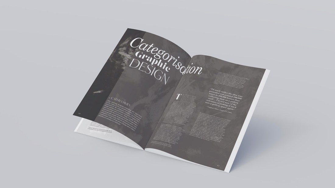
Further Development: In response to peer feedback I tried using Vaughan Oliver’s Livonia Album cover to create more textural depth and I also revised the layout to have a more deliberative oversized title which dominates the spread. I feel that the second version has a slightly more sophisticated tone of voice, however due to the artworks colour pallet, it was hard to eye drop contrasting tones.

Final Outcome
In response to peer feedback, I used Vaughan Oliver’s Livonia Album cover to create more textural depth and I also revised the layout to have a more deliberative oversized title which dominates the double spread. I used a richer pallet inspired by the hues in the artwork, which I feel creates a slightly more sophisticated tone of voice, however I know that I need to be braver and more strategic with colour theory application. This task has motivated me to study in greater depth, the conventions of editorial design so that I can break them in meaningful and visually arresting ways. With regard to professional practice, the use of artist images during this task has also raised questions for me around copyright which I would like to clarify for the future.

