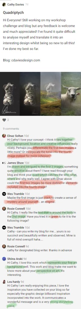
Workshop Challenge
Who: Passionate creative, BA Hons Fine Art Graduate (Loughborough University) inspired by nature and animals. Interested in socially responsive design for social good. As a design student with a fine art background I’m interested in the theoretical boundaries between art and design. The case study on Intro Design inspired me to reflection further on the tensions between both disciplines in contemporary creative practice.
“You (Julian House) tread a very fine line between graphic design and art, you are part artist, part illustrator, you’re a bit of a one off in that respect“ – Adrian Talbot.
What: Junior Designer at a company specialising in organic plant based skin care and home fragrance. Painter, sculptor, introvert and dyslexic.
Reflections on Sam Winston, the relationship between dyslexia, creative process and studio culture:
“Instead of that (dyslexia) becoming a problem I guess I was fascinated by that and that led me into design and typography and language and writing… an interest in problem solving and being dyslexic sort of made me who I am… I need that silence… in which I can basically just think in an uninterrupted way”.
Being able to relate to Sam Winston’s need for ‘silence’ in studio culture as a result of his unique learning/ working style, I’d like to incorporate a sense of isolation, deep introspection into the workshop response with a dark colour pallet and segmented images.
Where: Between Staffordshire Moorlands and Cheshire Peak District. Local design operates on a much smaller scale across smaller independent companies who take advantage of the beauty of the landscape for tourism, hospitality and outdoor leisure. Occasional exposure to Greater Manchester – vibrant busy city with dense population and more liberal mindedness which influences design landscape with increased political design eg, Viva! (see below) and Extinction Rebellion etc.
Why: Design appeals to my instinct to visually and practically problem solve and engage in outcome driven process. Having a background in fine art, language and literature, I am interested in psychological responses to imagery and visual story telling. In this way I resonated strongly with Michael Wolff’s emphasis on how ’emotion’ is arguably the most important element of successful graphic design as a communicative tool.
Idea Generation: Initial Attempt
For the workshop challenge I was inspired by traditional renaissance and medieval quadriptychs in addition to Bill Viola’s Martyrs and Nantes Triptych which uses composition and figurative imagery to create a cathartic narrative about the human condition.
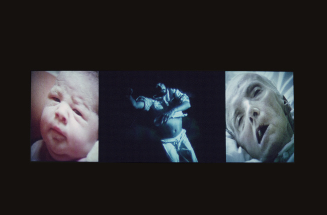
Bill Viola, Nantes Triptych, 1992
Video/sound installation
Critical Reflection
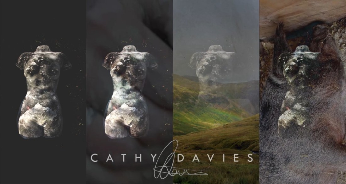
In order to represent aspects of my creative identity which are largely informed by nature, I used an image from a previous project where I cast my own torso in ice and organic materials (earth, leaves etc). This references a pivotal point in my practice as it marked a divergence from traditional painting and sculpture towards ephemeral materials and experiencing art as process. It also widened my understanding of how art and design can exist beyond the original subject as the photograph became an artwork in its own right and sparked an interest in digital art, design and post production techniques.
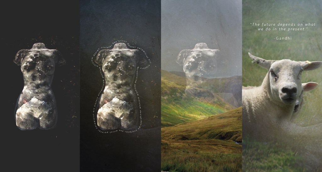
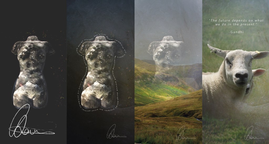
Being situated between the Staffordshire Moorlands and Cheshire Peak District, I am heavily inspired by the landscape, so I incorporated landscape photography through blended layers to create an ethereal tone. The concluding image captures a poignant moment I had photographing a ewe guarding her young. Being very engaged in contemporary issues such as climate change and animal rights, I am motivated by design as a communicative tool which offers sense of agency and purpose in response to cultural change.
Development
Rather than representing my name through traditional type I decided to use my hand drawn signature as it’s more personal and organically created. I also experimented with repetitions of this to imitate fine art attributions, and liked how they married the pieces together and emphasised the traditional quadriptych feel.
Local Design Inspiration
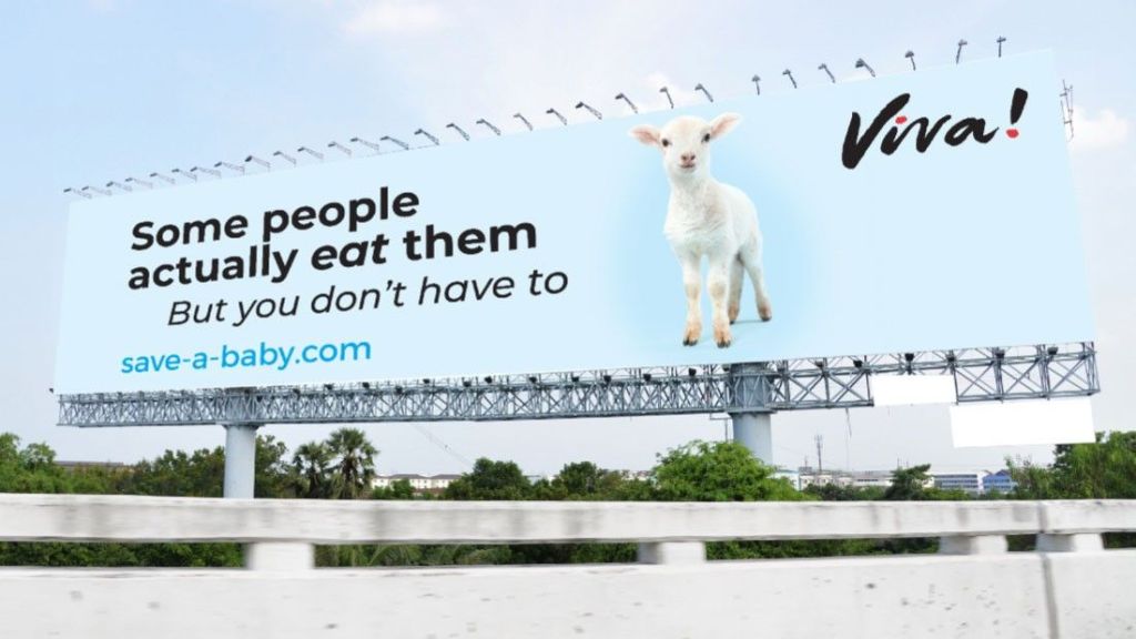
This weekend I drove past this example of graphic design that used direct pastoral imagery and calming blue hues to communicate an animal rights message. The scene applies a sense of tranquillity, calmness and freedom to an agenda which is easily perceived as prohibitive of consumer rights and confrontational. I liked the ‘attractivist’ perspective of this design and how it empowers optimism, compassion and moral discussion rather than creating a sense of accusation or desperation.
Ideas Wall and Tutorial Feedback Reflection
In response to feedback from other students regarding ‘differentiation’ I chose to be more consistent with the torso image, creating compositional balance by incorporating an alternating pattern of still image and video overlays. After my tutorial with Stuart, I felt more empowered to bring my fine art experience to the task, therefore inspired by Bill Viola’s use of video to create poignant narrative, I filmed footage of myself creating in clay to express the act of making for the ‘what’ aspect of the quadratic.
In the same way for ‘why’ I filmed footage of a dreaming pig on the farm my office is located at, which I felt was poignant as it relates to design being a form of communication, agency and creative activism regarding things that are important to me (animals, animal rights and welfare). His dream state also connotes imagination and the psychologically benefits of creativity to me.
Final Outcome
Evaluation
I really enjoyed the video making process and how it produced a more filmic response which was more reflective of my fine art perspective. I would like to explore this in more depth in future tasks. During my tutorial, Stuart suggested being more ‘painterly’ with typography. Even though I adjusted my use of type and added more interactive transitions to accommodate the tone of the work, I feel that I could have been more expressive with it. In the future I’d like to be more experimental with type, specifically through motion graphics and hand illustrated typography.
